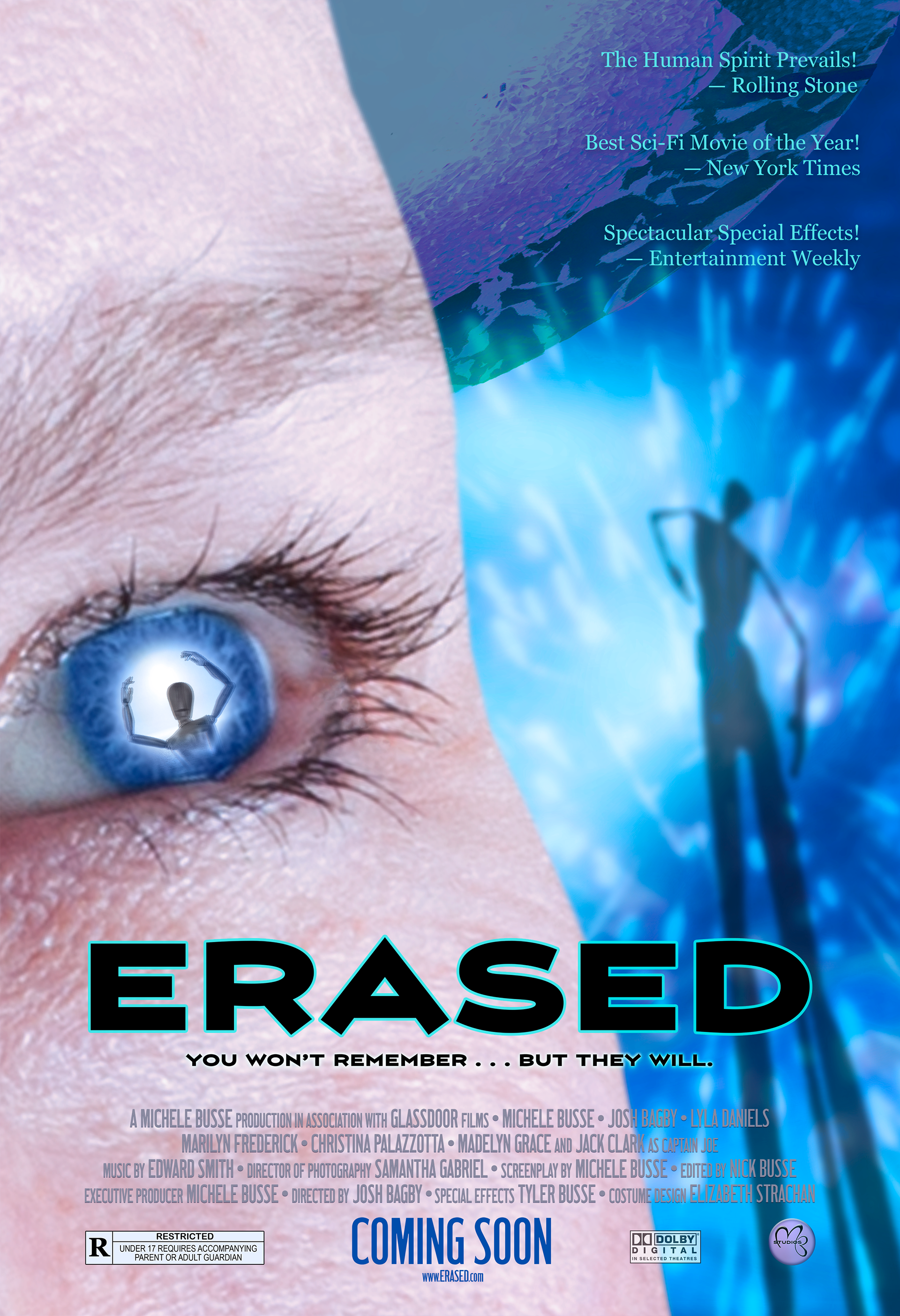
Student Project - "ERASED" Movie Poster
For this project, I designed a poster for an original movie idea. The poster was to be used in a magazine ad, so reviews also needed to be included. I was required to use multiple images that were my own, including one of myself (I am the main actor). I chose a sci-fi genre and used blending modes, clipping masks, and other Photoshop tools to create the mood/tone of the movie. Colors and fonts are meaningful to the title and help set the mood/tone as well. Credits, rating, website URL, studio logo and other common content were included. The title also included a tagline to give a hint to what the movie is about. A brief synopsis of the storyline and plot are included below.
SYNOPSIS: Karen is a scientist working on a cure for Alzheimer's disease. She makes a horrifying discovery. The memories of people are being slowly and deliberately erased by a microscopic parasite with an origin that is unknown. Like a computer virus, this parasite steals a person's memory and then erases it. She must find out what the source is before it infects her as well, and time is running out. As she studies this parasite, she realizes that it is not from this planet. Aliens from another planet are preparing to integrate with the donor brains that are now vacant. They have studied the memories taken from humans so they can perfectly emulate them without suspicion. What they don't understand is that humans are more than just their memories. Captain Joe, a retired army captain, whose wife has been a victim of this parasite, joins Karen in the battle to rid the planet of the alien invasion.

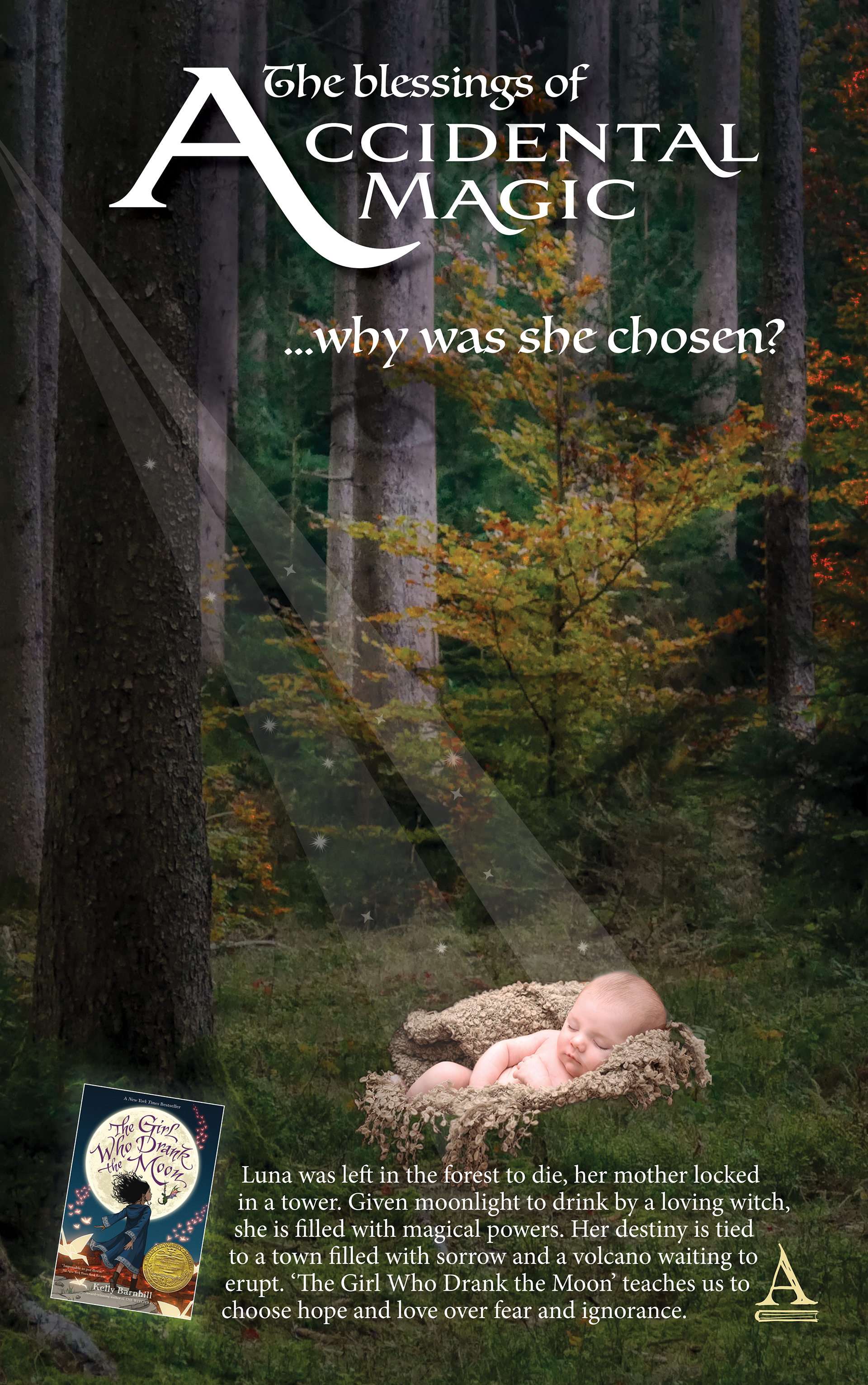
Student Project
Advertisement Layout Design to promote Reading
Advertisement Layout Design to promote Reading
CASE STUDY: The newspaper 'The Telegraph', was founded in the year 1855 and has a circulation of 460,054. The paper has a new idea to advertise a book, any book, to encourage people to read more books. Today, people are reading fewer books, so to promote reading habits, and promote publishers and all the talented writers around the world, the newspaper will run these creative ads.
This design is a 1/4 page, color ad for the newspaper's book reading section. Graphics, headlines and other copy are unique and used to grab the reader's attention and get them interested in reading my chosen book, 'The Girl Who Drank the Moon'. This is not an advertisement to sell the book, but rather to visually convey what it is about. I set the stage, introduced the main character, and set the tone and mood through layered and blended images. The headline also gives a clue to what the story is about, as well as a teaser to entice the reader to find out more. The fonts chosen are meaningful to the storyline and also help to set the tone and mood. A small image of the book's cover, as well as the logo for the publisher, are included to help the reader identify the book and were required elements.
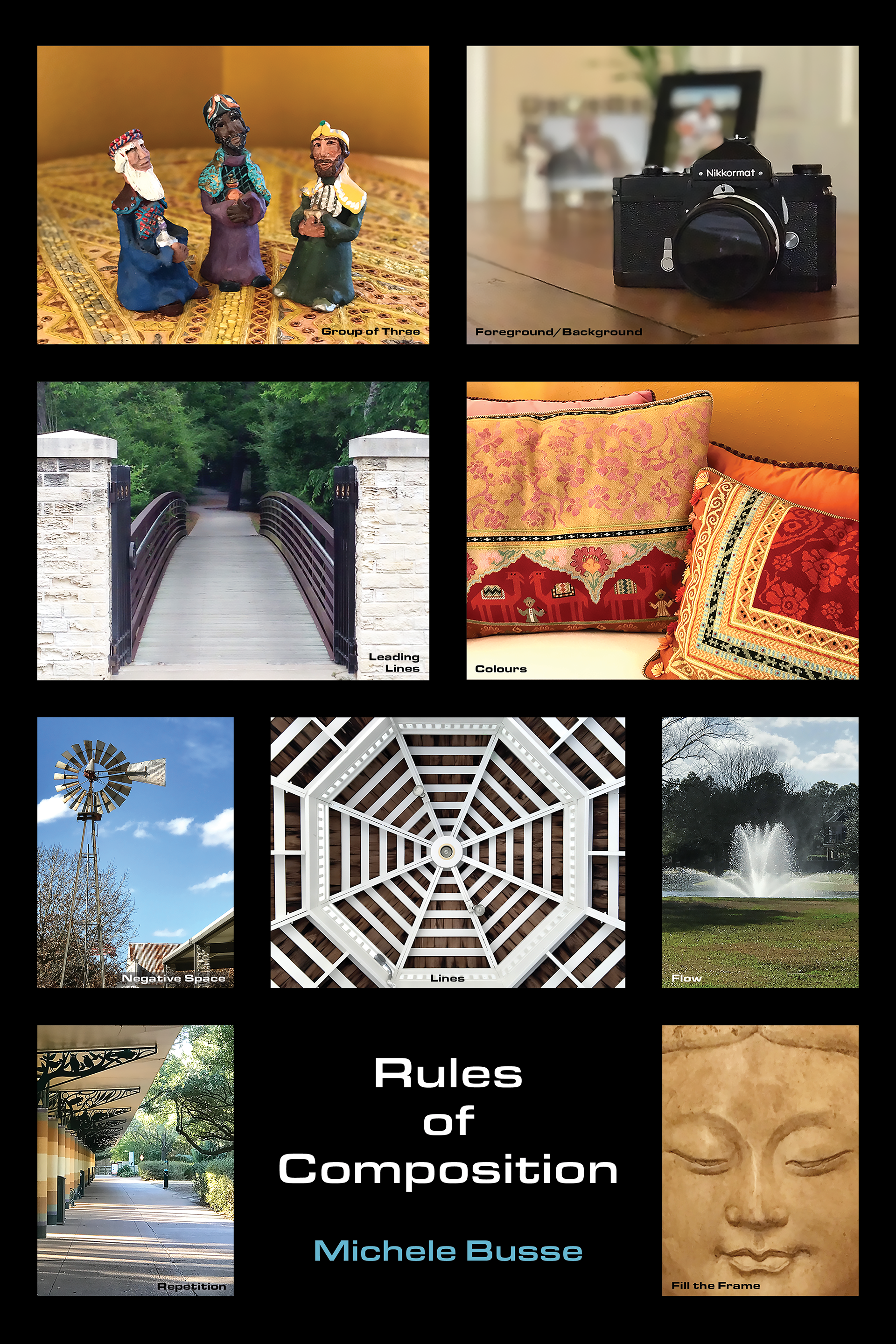
Student Project - Rules of Composition Poster
This poster is a layout of different Rules of Composition in photography. Each photo is labeled with its particular rule. The photos are laid out in a grid pattern with a black background. The Eurostile font was used to give the poster a modern feel.
student project - Cinco de Mayo Mural
This is a watercolor I painted of a Mexican Folk Dancer. I scanned the image and placed it into Photoshop. Using the vanishing point tool, I placed the image on a wall to create a mural effect. The font used for the typography has a hand painted quality to it that makes it look authentic.

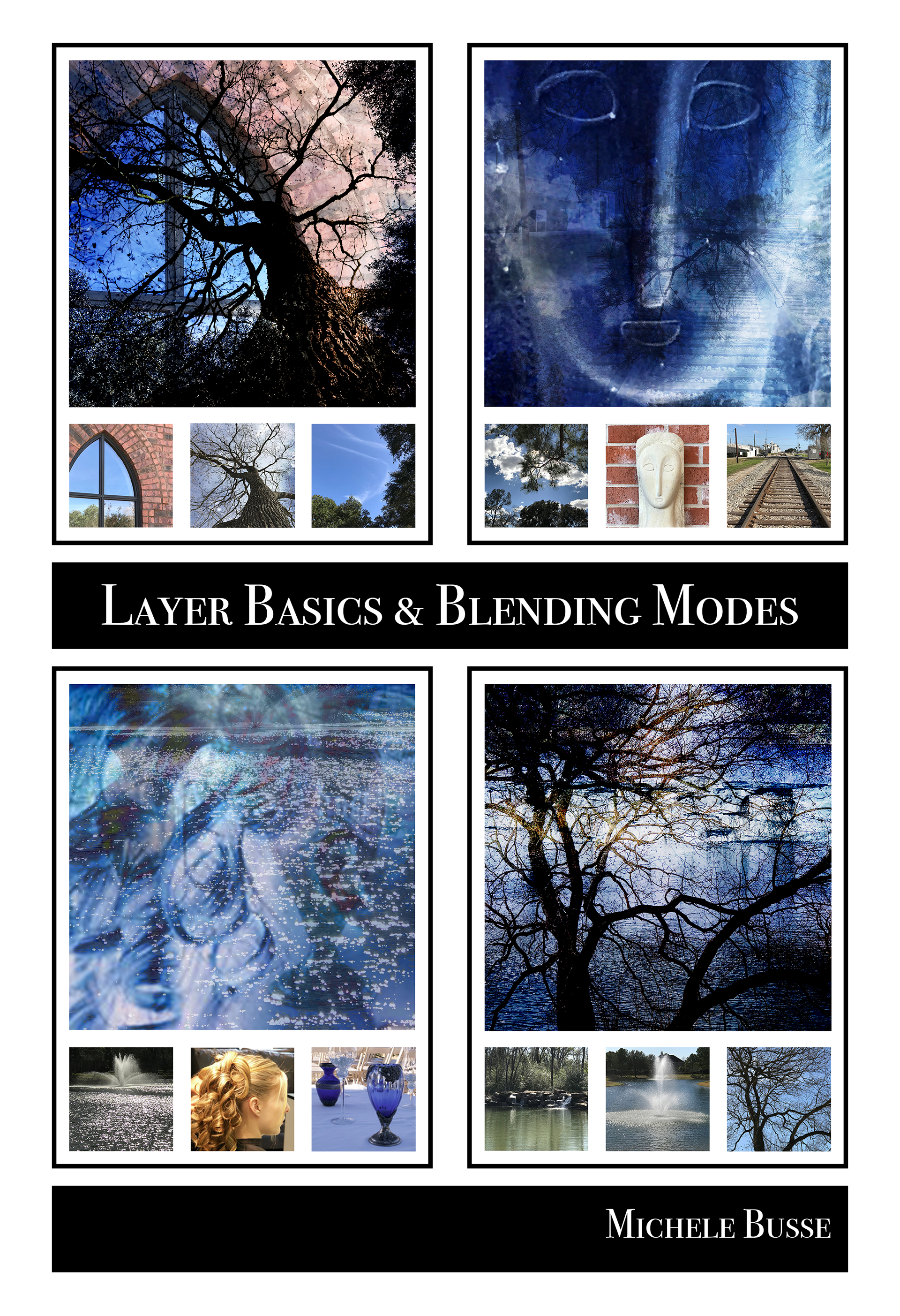
student project - Blending modes
This project was an experiment in using different blending modes. It shows the original photos with the blended version. By placing the images on different layers, the blended version takes on completely different mood/tone and colors.