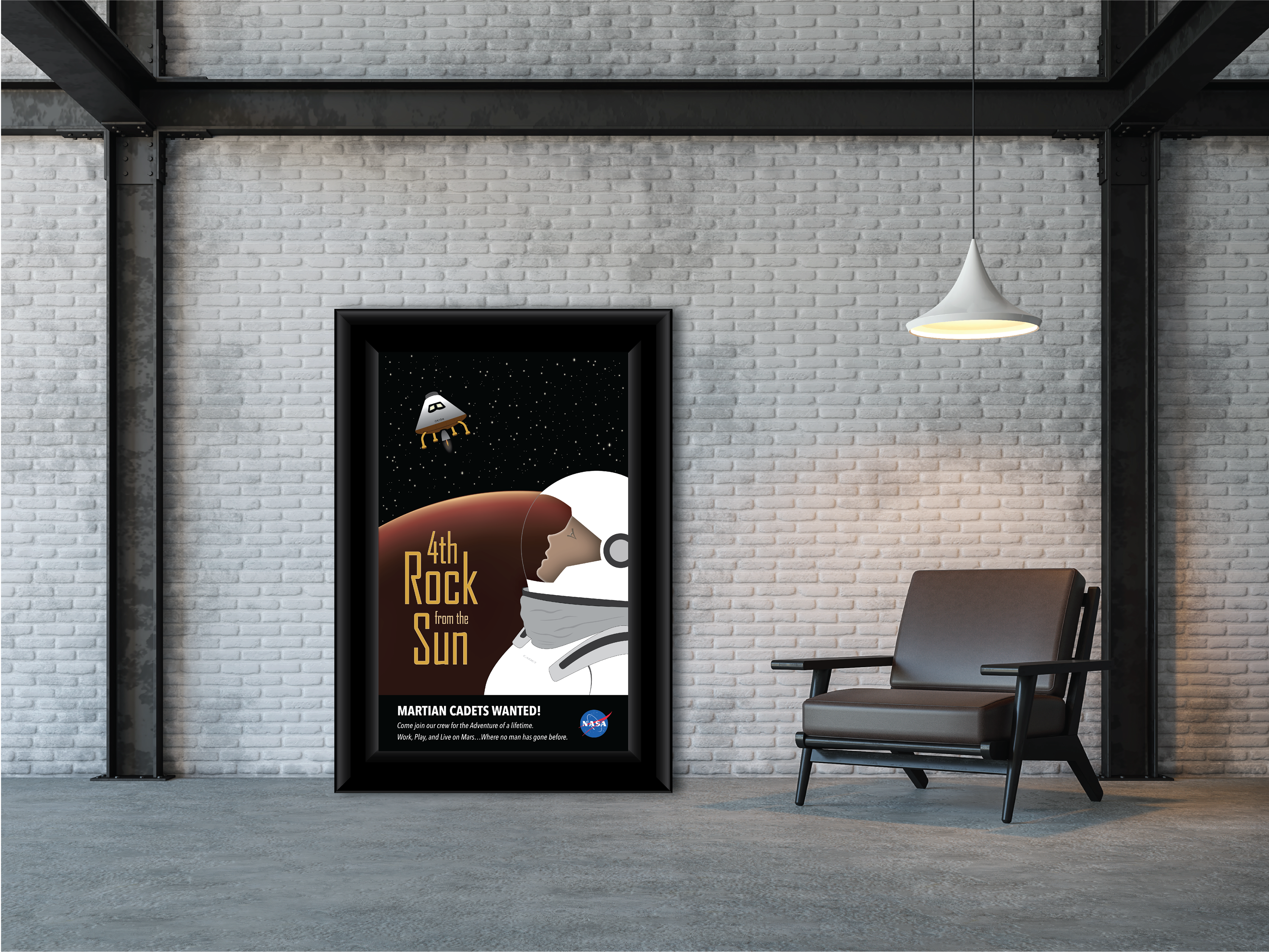
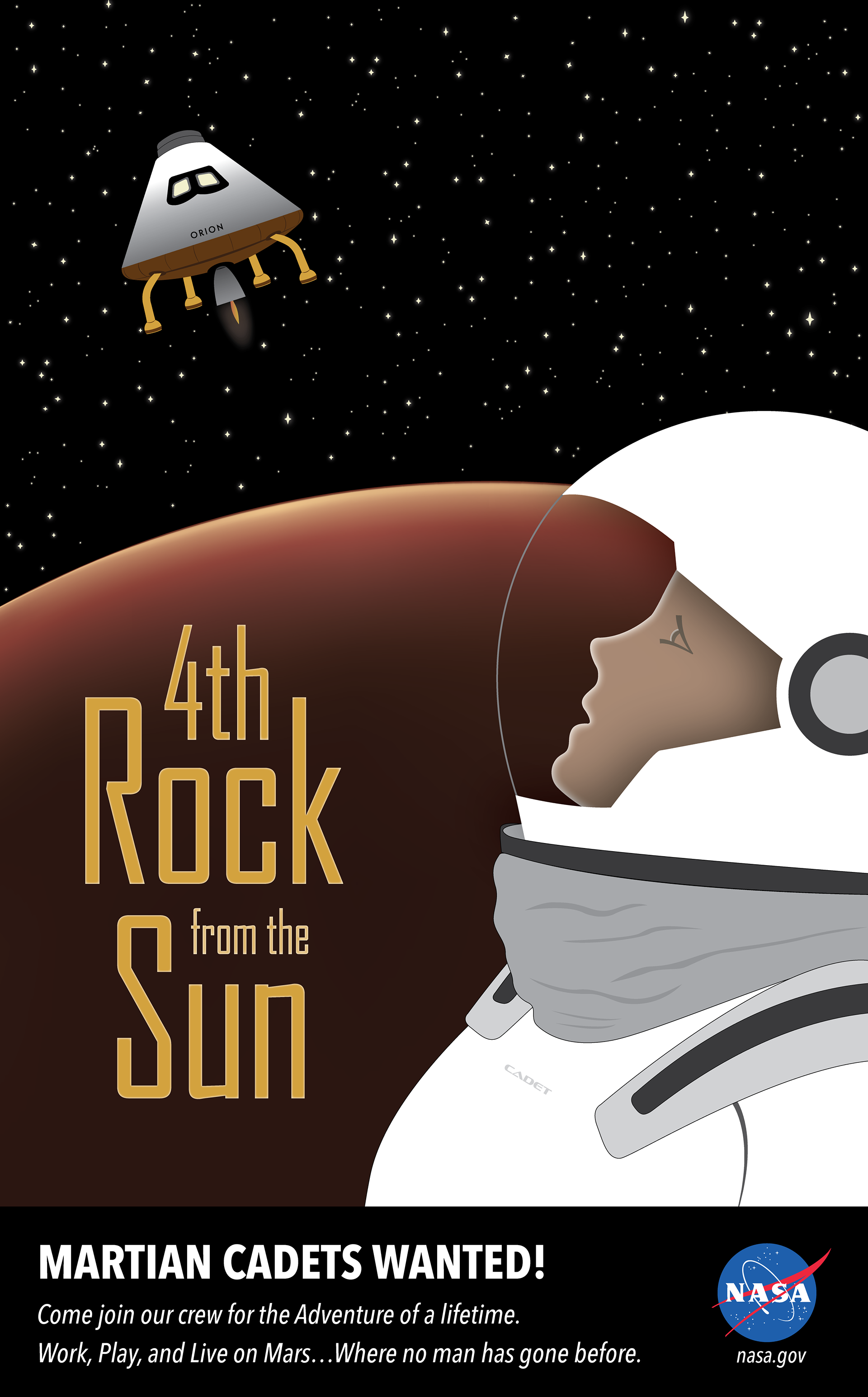
STUDENT PROJECT - 4TH ROCK FROM THE SUN POSTER
This poster was designed to get students interested in the NASA Mars exploration program. My concept was to create a recruitment poster for Martian Cadets. It features a Martian Cadet watching with anticipation as the Orion spacecraft hovers above mars. It leaves the viewer wondering…Is it arriving? Is it leaving? What is its purpose? The typography supports the overall theme and provides a call to action. I chose sans-serif fonts for their more modern feel and illuminated the headline using an inner glow effect.
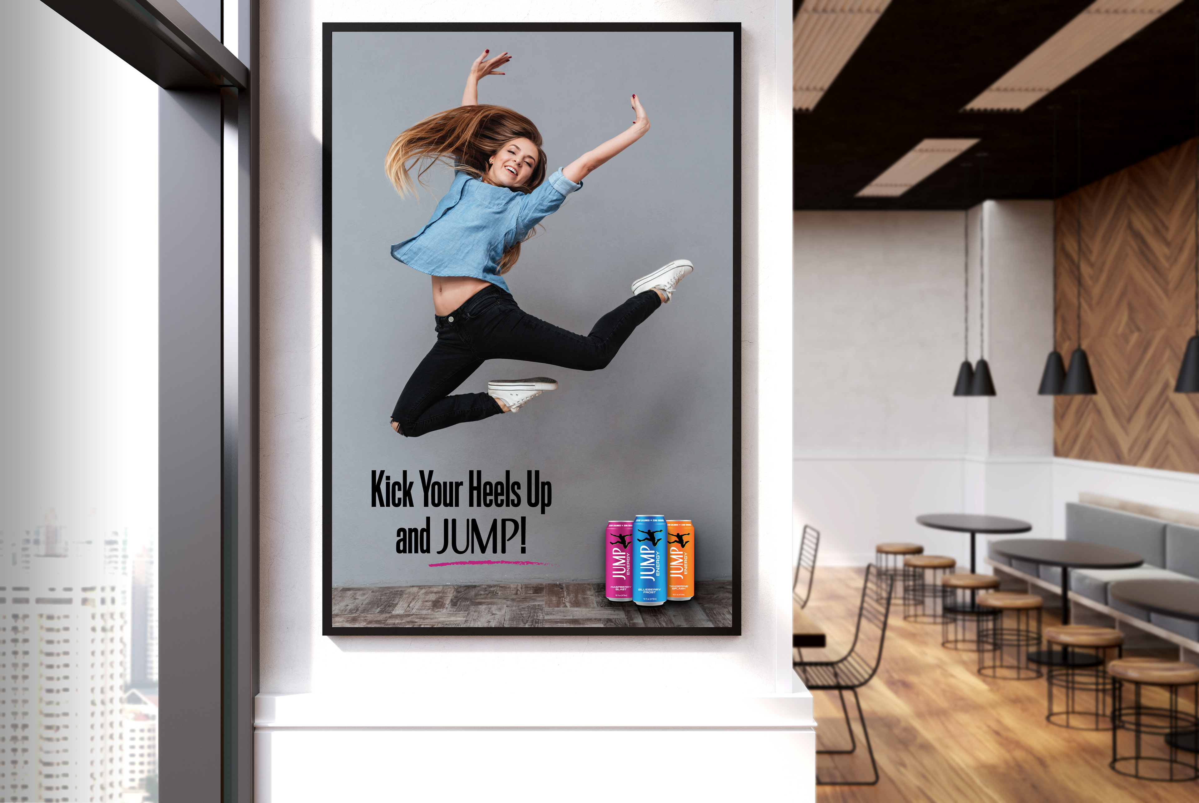
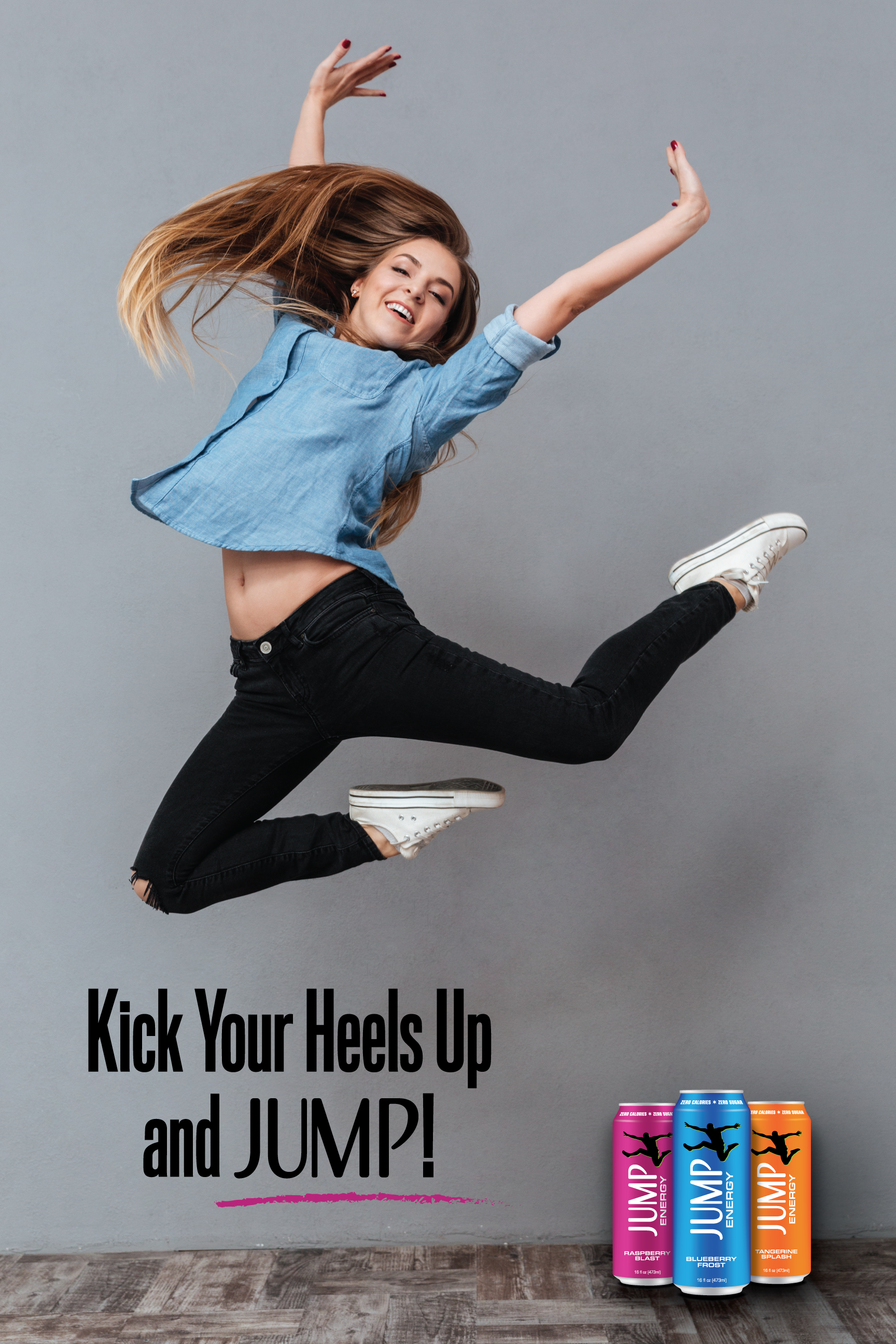
STUDENT PROJECT - PACKAGE DESIGN FOR JUMP ENERGY
This poster is part of a package design project that involved creating a unique identity for an energy drink. JUMP ENERGY is a new, fictitious energy drink. It comes in three different flavors and is available in 16oz. cans. It is being marketed to adults who are seeking to get a youthful boost of energy while quenching their thirst. The tagline is taken from the lyrics of the song "Shout" by The Isley Brothers. Instead of "Kick Your Heels Up and Shout", the word shout is replaced with Jump. This helps to form an emotional connection of joy and fun associated with the drink, and engrains the brand into the consumer's memory.
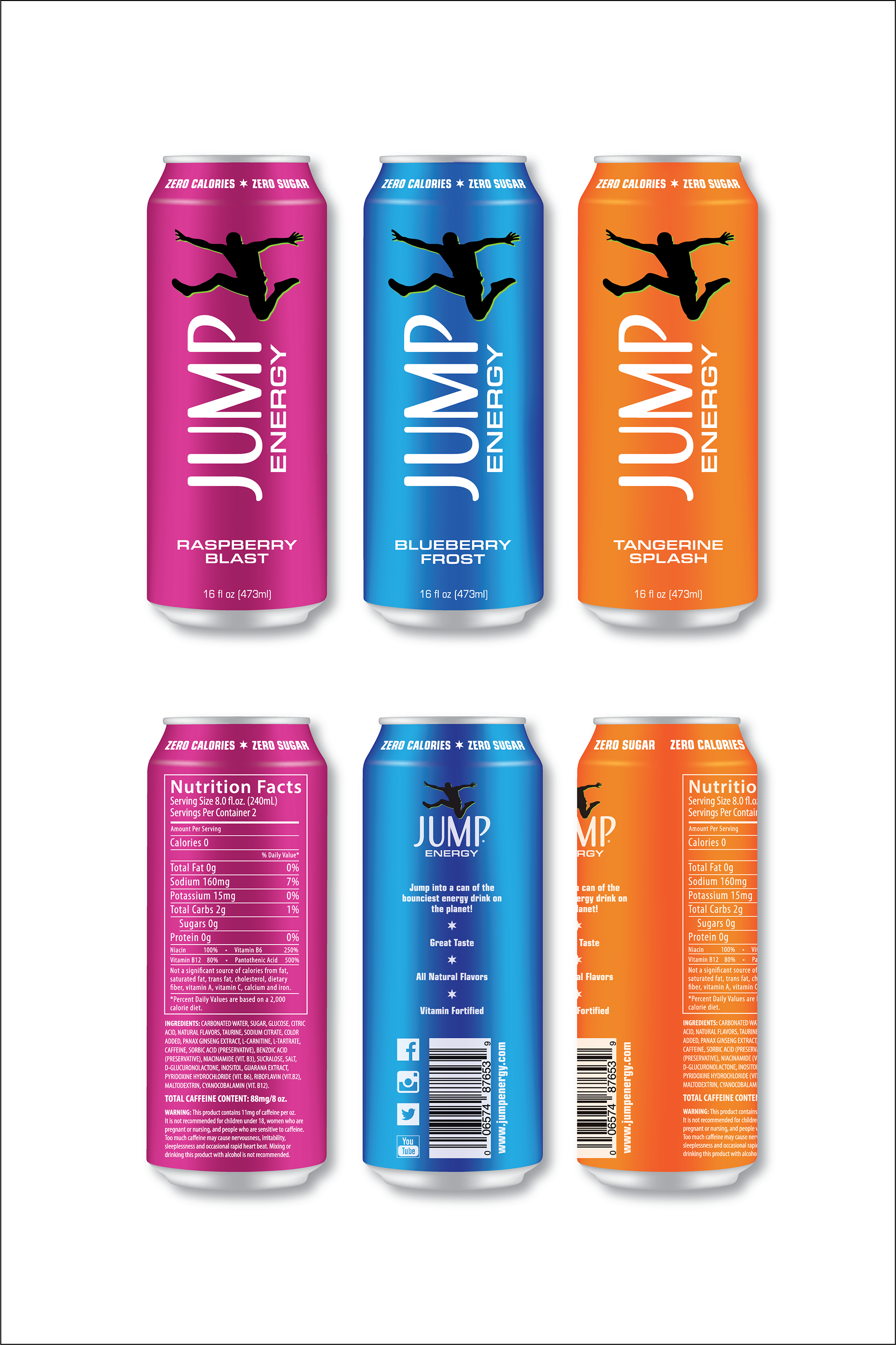
This mockup is part of the package design project for JUMP ENERGY drinks and shows a rendering of each different flavor available and also shows the cans from different vantage points.
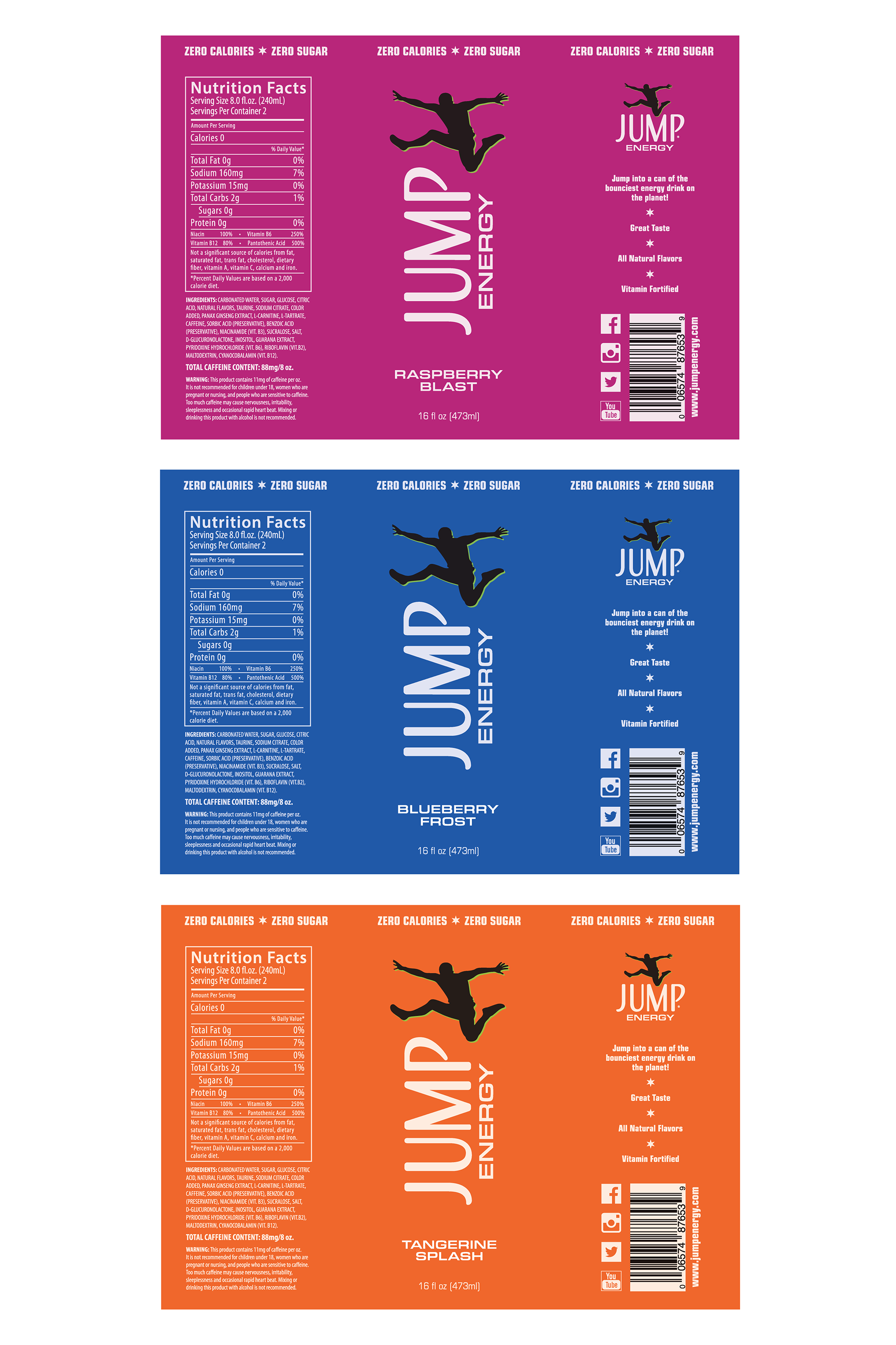
Here is the layout for the labels for JUMP ENERGY drinks. The logo captures the intrinsic characteristics of the drink…having so much energy, you just want to JUMP. The colors were chosen to capture the main quality of each flavor. Each label includes all the necessary nutritional facts, social media icons, barcodes, and a website address. The labels are designed according to the printer's specifications for shrink sleeves that fit a standard 16oz. can.
STUDENT PROJECT
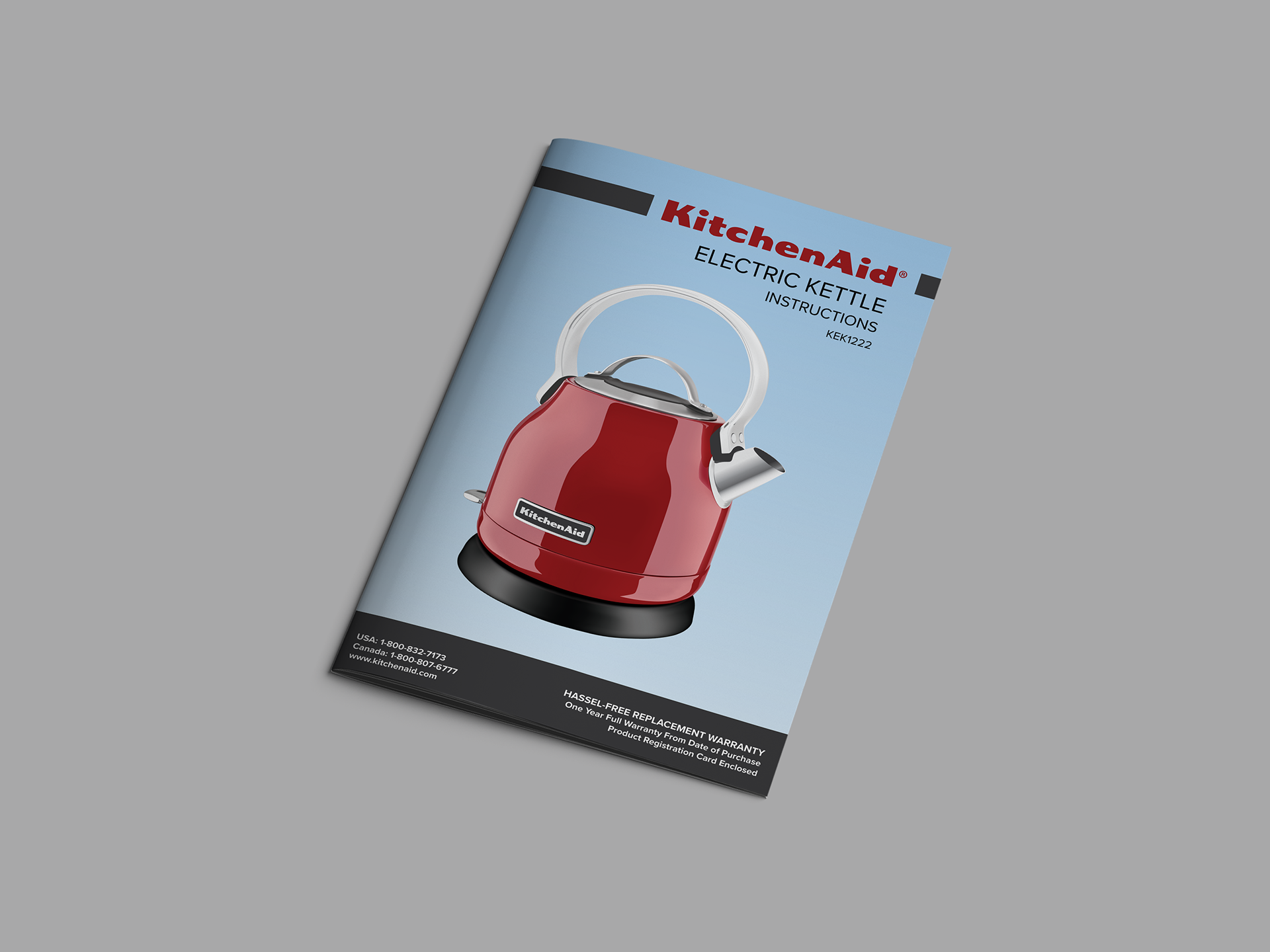
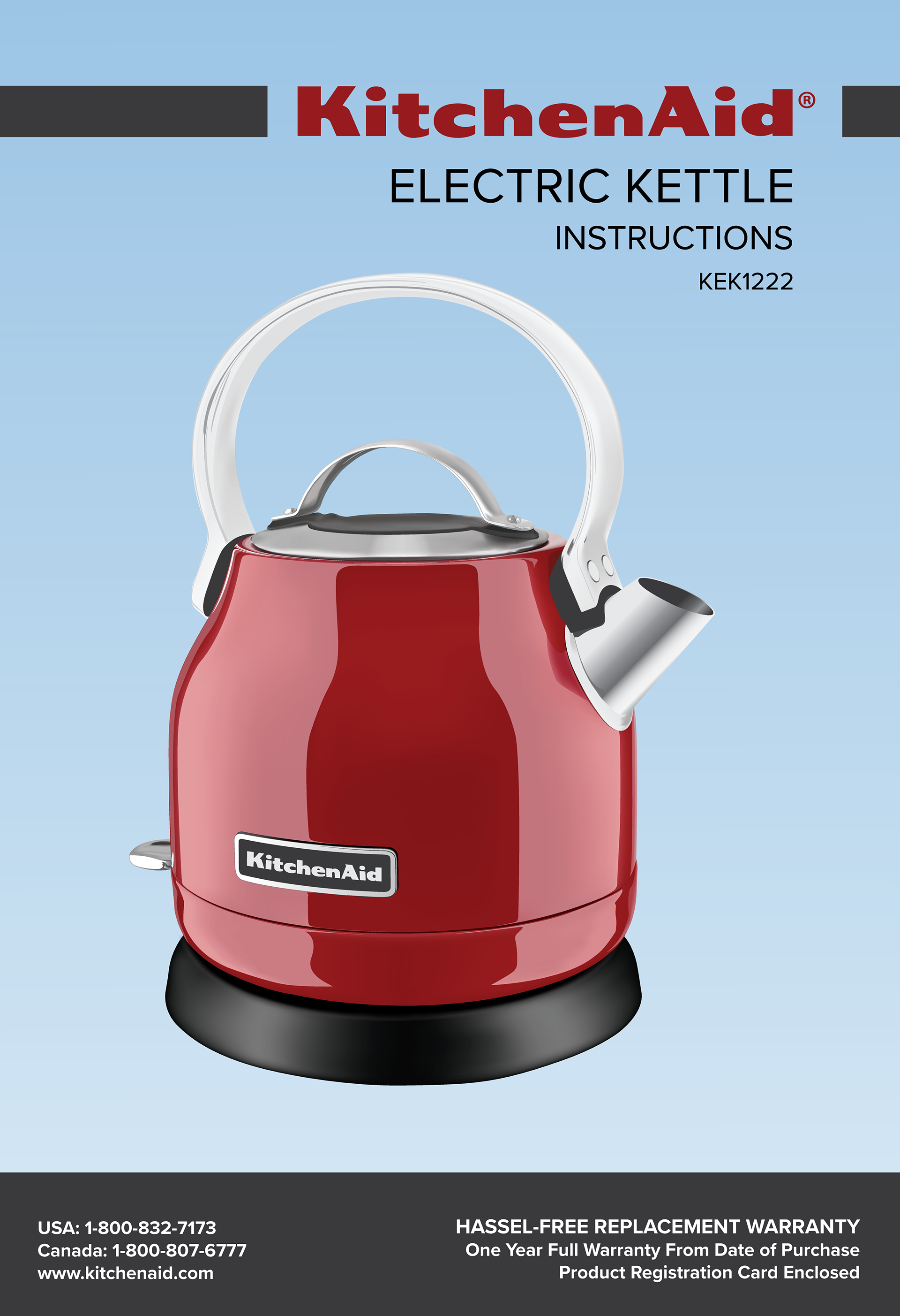
Instruction Manual Cover for Kitchenaid Kettle
Instruction Manual Cover for Kitchenaid Kettle
For this project, I designed and illustrated the cover for an instruction manual for a Kitchenaid kettle. The kettle is rendered using the gradient mesh tool to create a realistic graphic representation. The overall layout and typography was chosen to reflect the Kitchenaid brand. Since they use a custom font for their logo, it required tracing each letter individually. I also used the company's red signature color to keep their brand identity consistent.
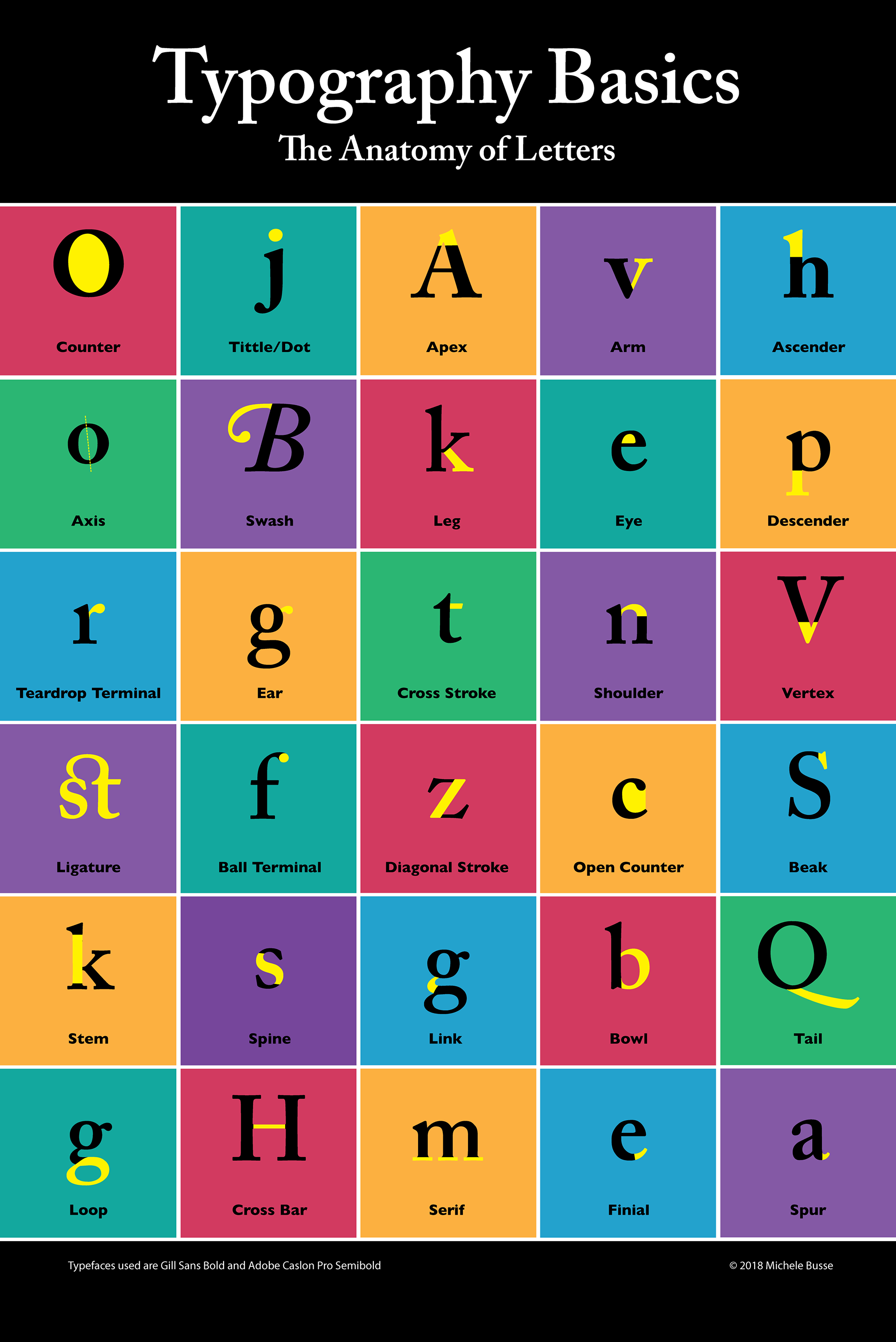
STUDENT PROJECT - Typography Basics Infographic
As a graphic designer, I love learning all the different terms for the parts of letters. My favorite is the tittle. I also love using lots of color in my projects, so this gave me an opportunity to do that. This infographic is to help other designers learn about the anatomy of letters. I used a grid of squares with six different colors for the backgrounds of each square. The bright yellow is used to identify the part of the letter for each term. This is a simple layout, but informative and nice to look at.
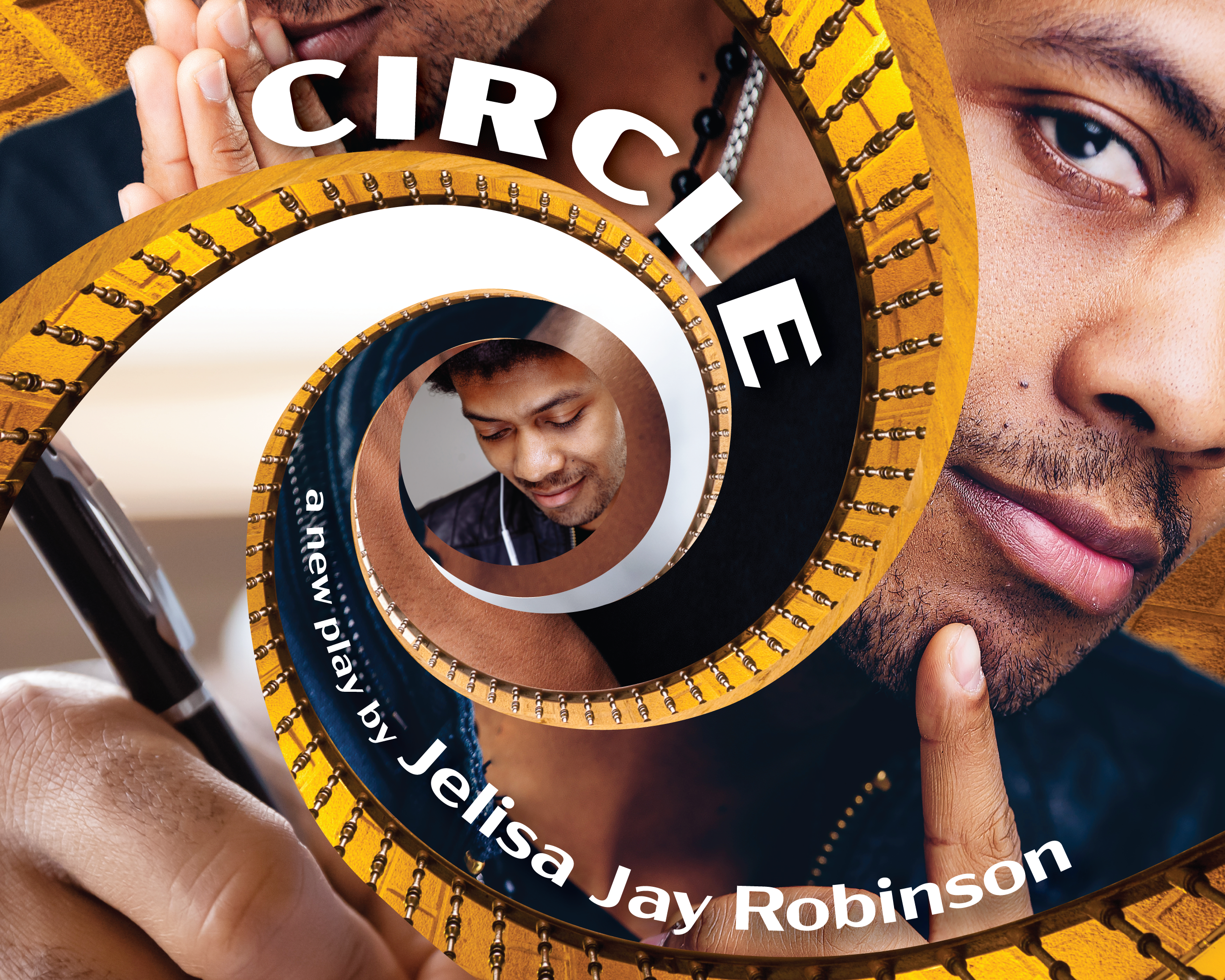
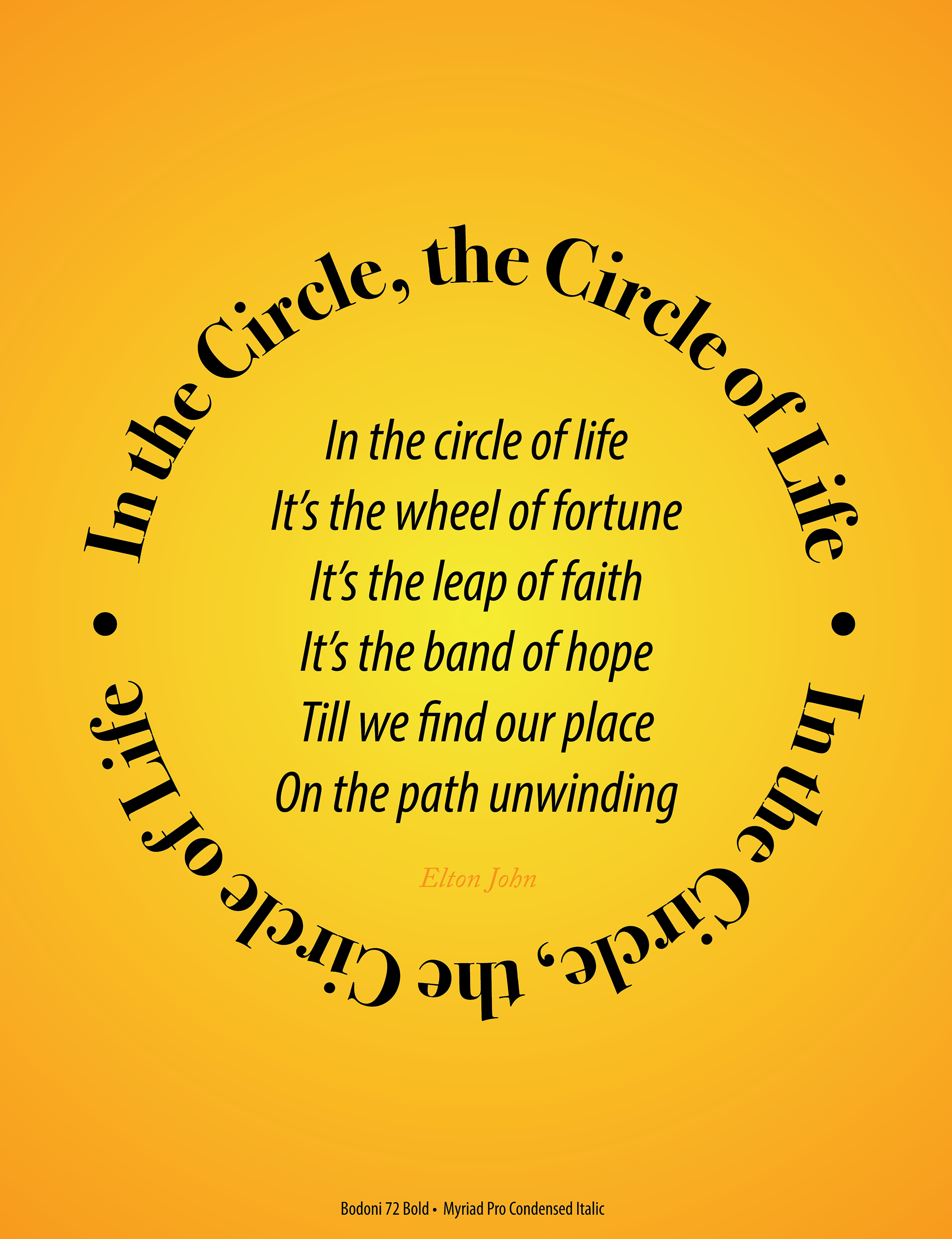
STUDENT PROJECT - Elton John's Circle of Life Song Lyrics
This was a typography project meant to convey the meaning of the lyrics of a song. The song is about finding your place in the circle of life. I placed the title lyric in a circle around the chorus lyrics with a golden radial gradient behind it. The music has a soaring, expanding feel to it that fills you with a sense of belonging. The warmth of the colors and the expansion outward reflects this feeling. It also reminds me of the movie "The Lion King" which the song was originally written for. The Myriad Pro Condensed font was chosen for its clean structure…the building blocks of life. The Bodoni font was chosen for its more joyful, creative flair that gives life meaning.
STUDENT PROJECT
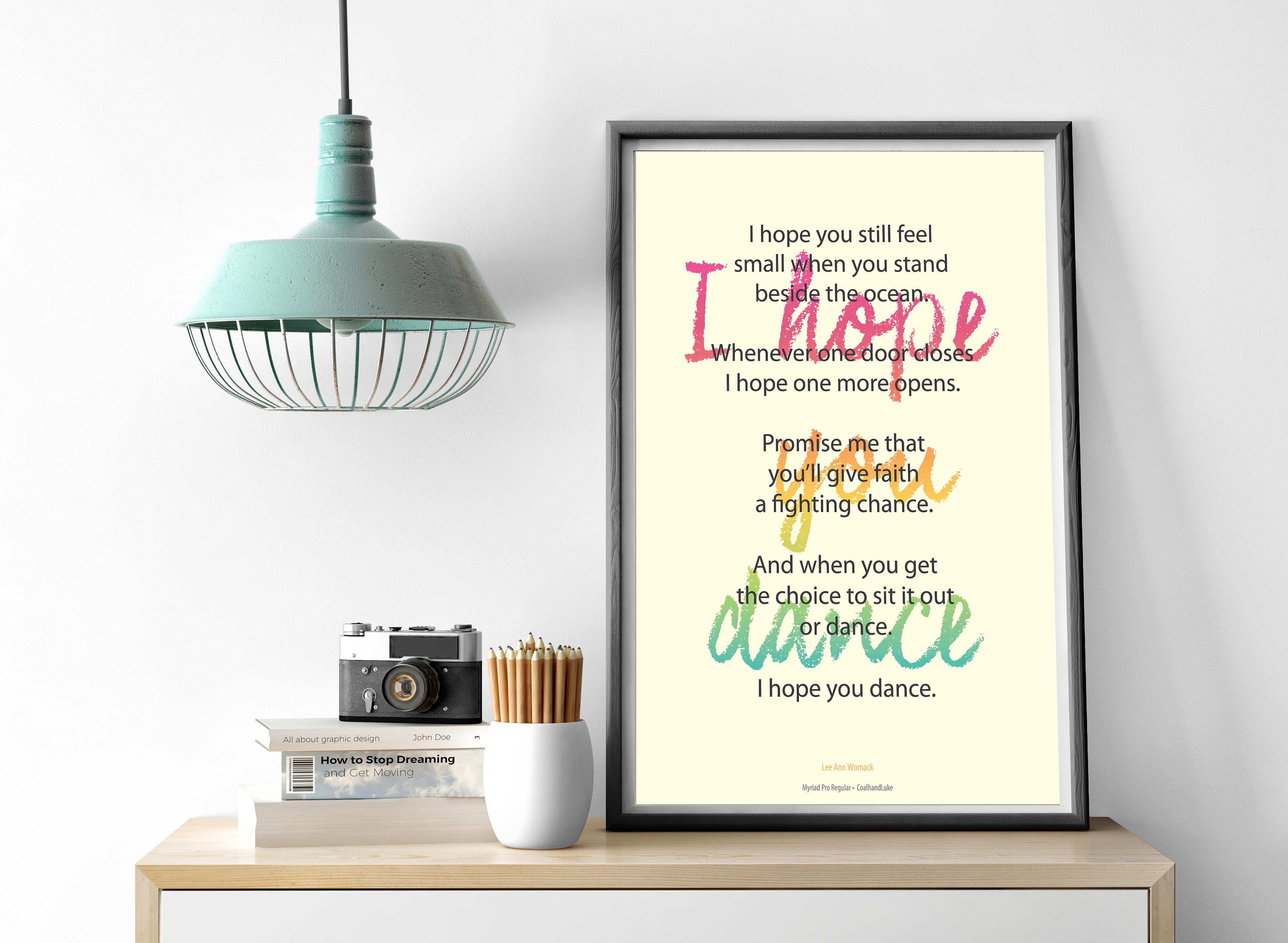
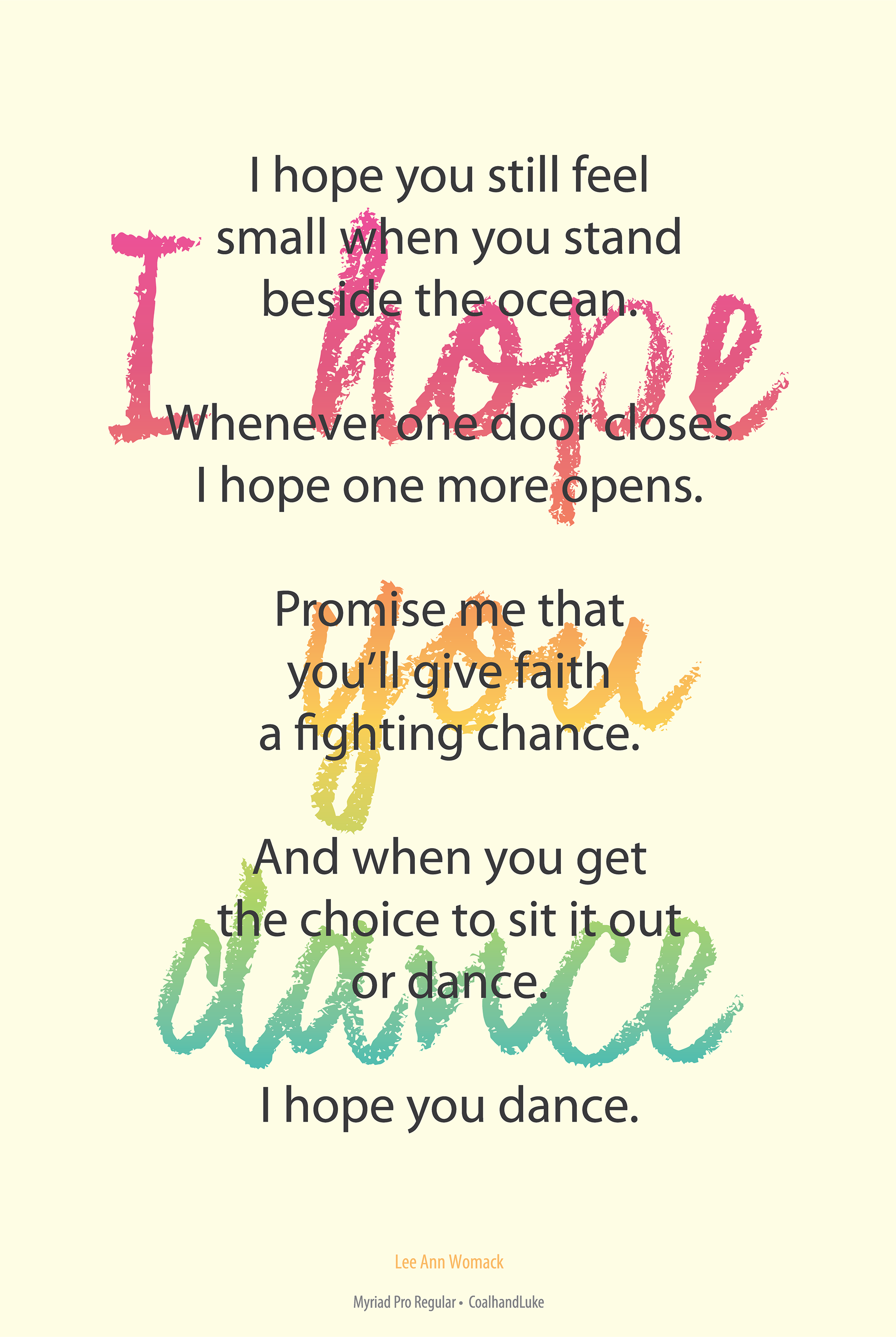
Lee Ann Womack's I Hope You Dance Song Lyrics
Lee Ann Womack's I Hope You Dance Song Lyrics
This was a typography project meant to convey the meaning of the lyrics of a song. The song is about taking chances and trying something new. Much like a rainbow after a storm, from difficulty comes inspiration. I used a rainbow gradient for the title lyric behind the chorus lyrics. The music has a sweeping flow to it that makes you want to dance and gives you hope. The Myriad Pro font was chosen for the chorus lyrics to make it more readable with the title lyric behind it. The CoalhandLuke font was chosen for its raw, hand written quality, much like the feelings conveyed in the music.