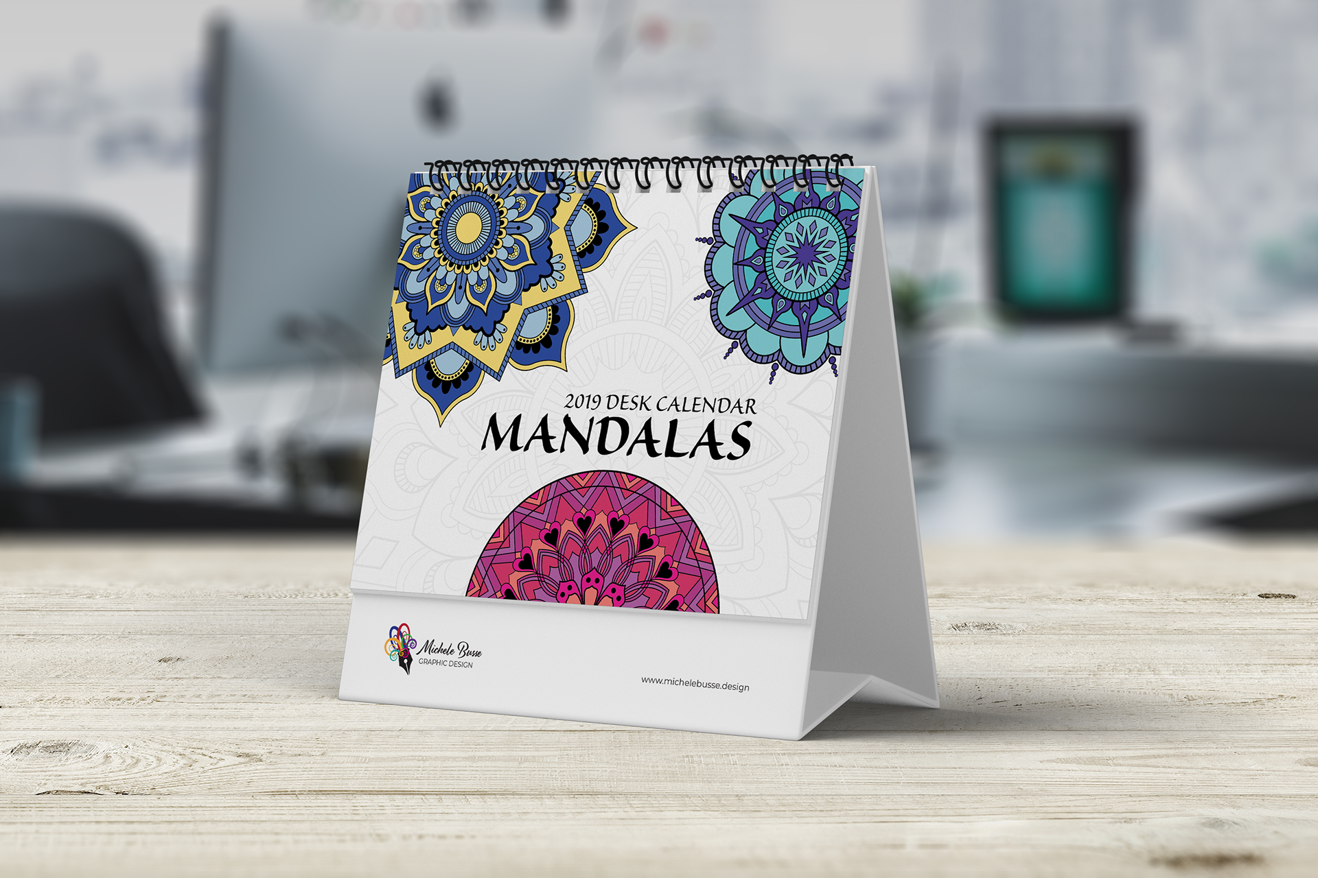
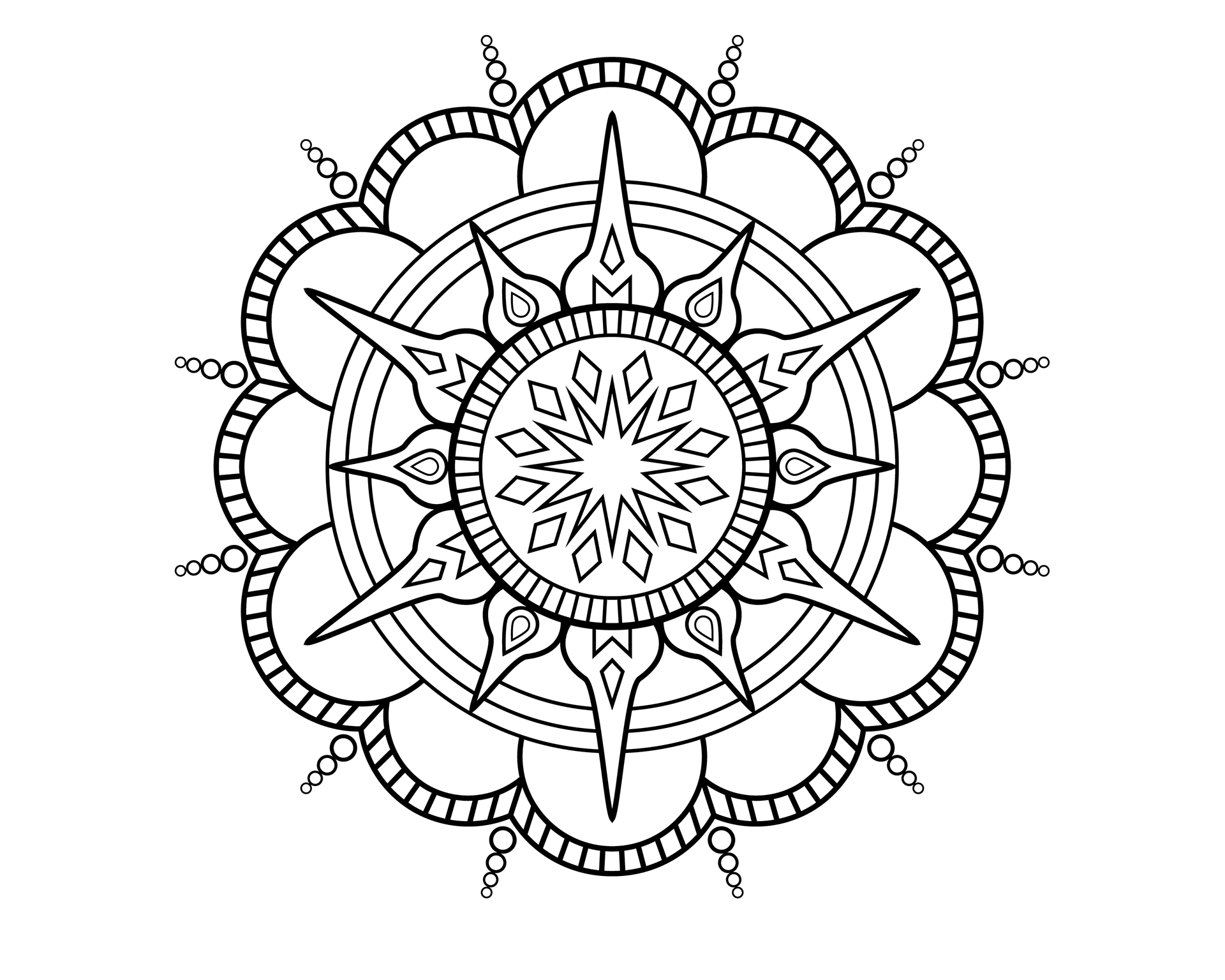
2019 Mandala Desk Calendar
This is a 2019 13-Month Desk Calendar. Each month has a different Mandala design. On the back of each month, there is a black and white version for the user to color their own. The back of the calendar explains what a Mandala is and how best to use the coloring pages. The Mandalas were created in Illustrator and then placed into the InDesign layout. This calendar received the 2019 Graphic Excellence Award for Best Student Design from The Printing Industries of the Gulf Coast.
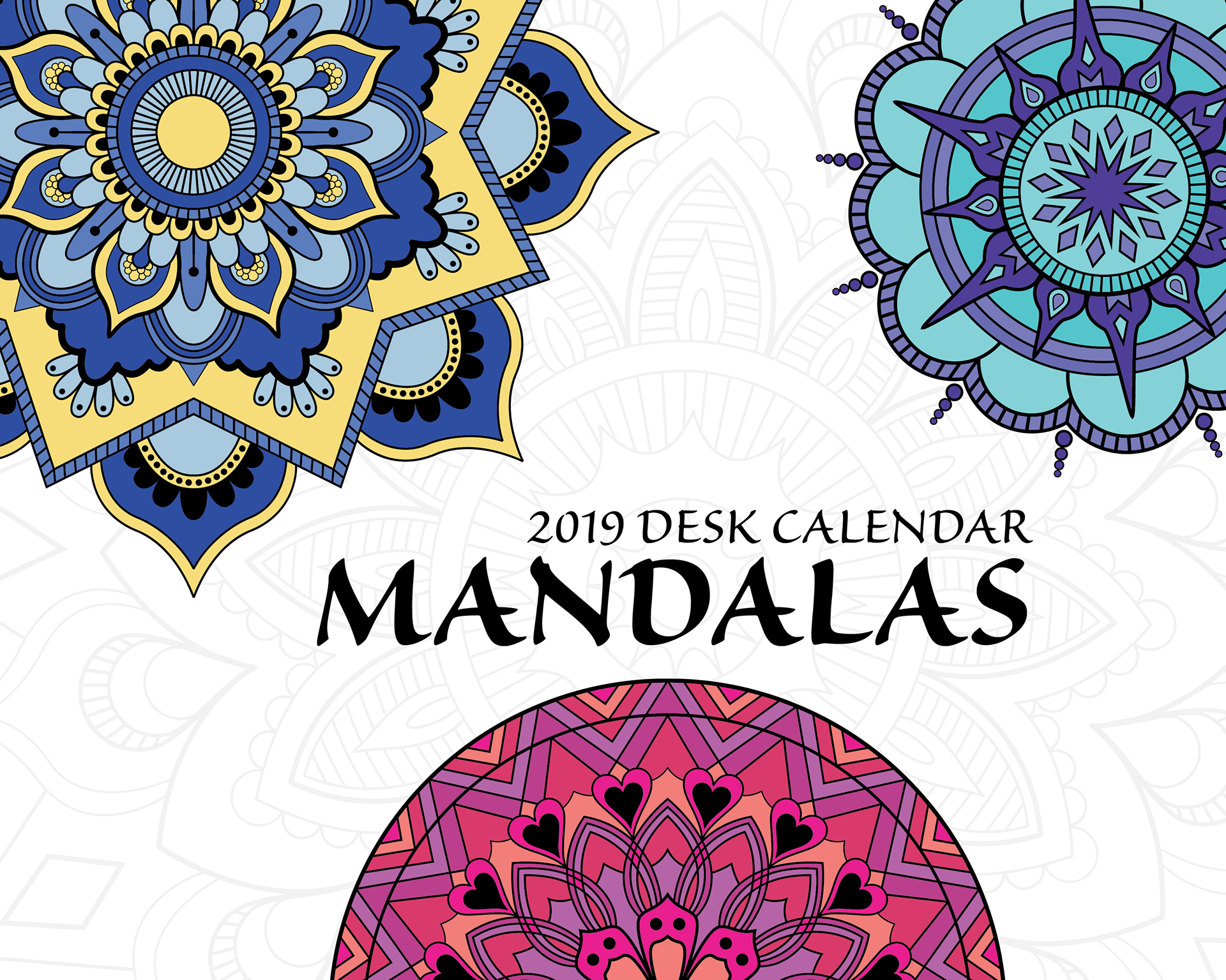

Front and Back Pages

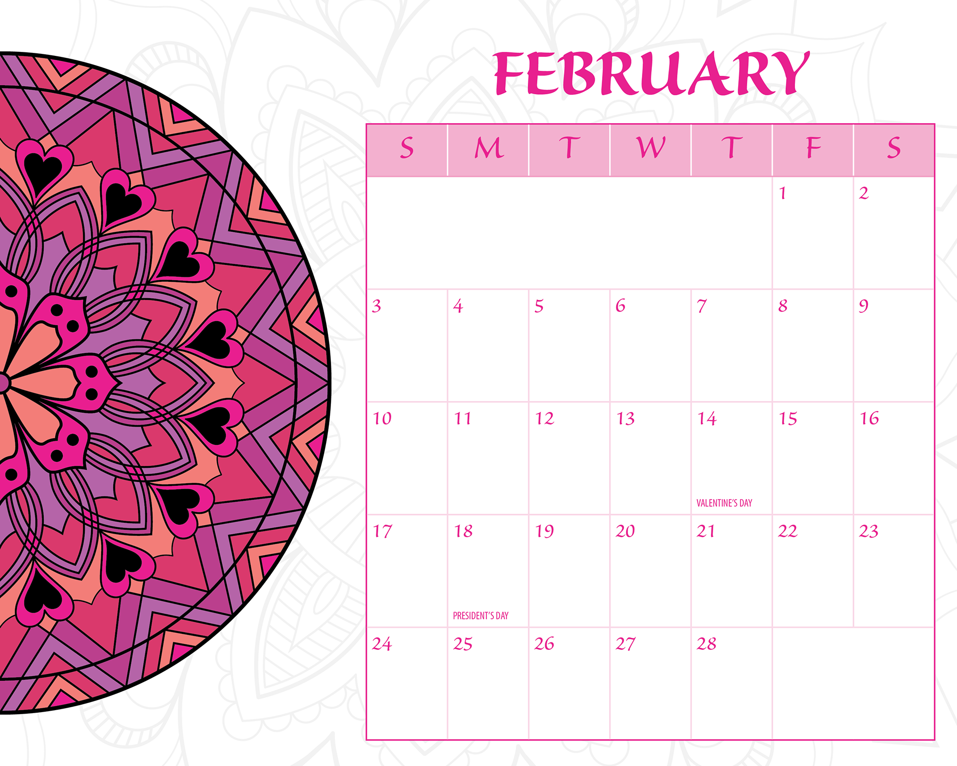

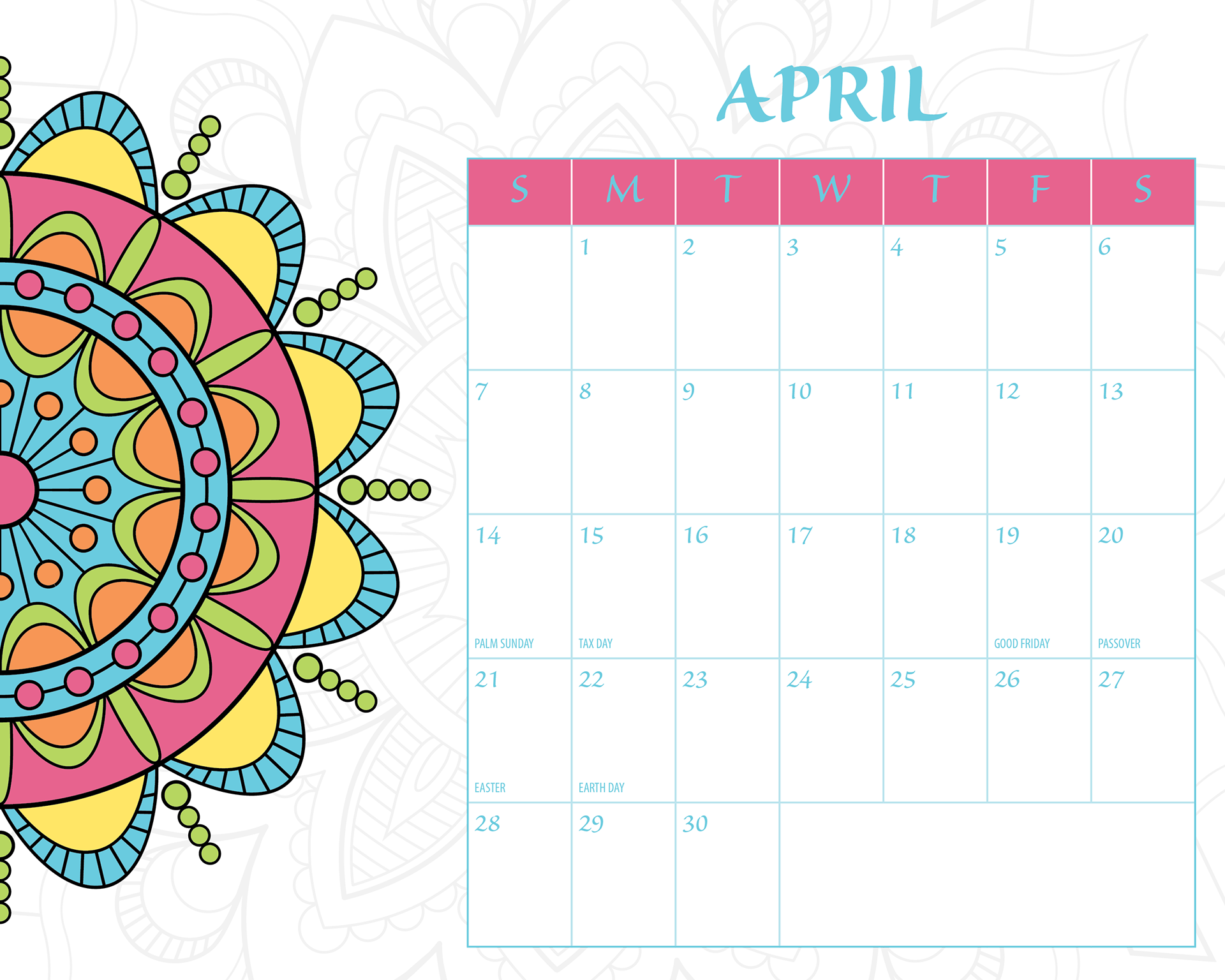
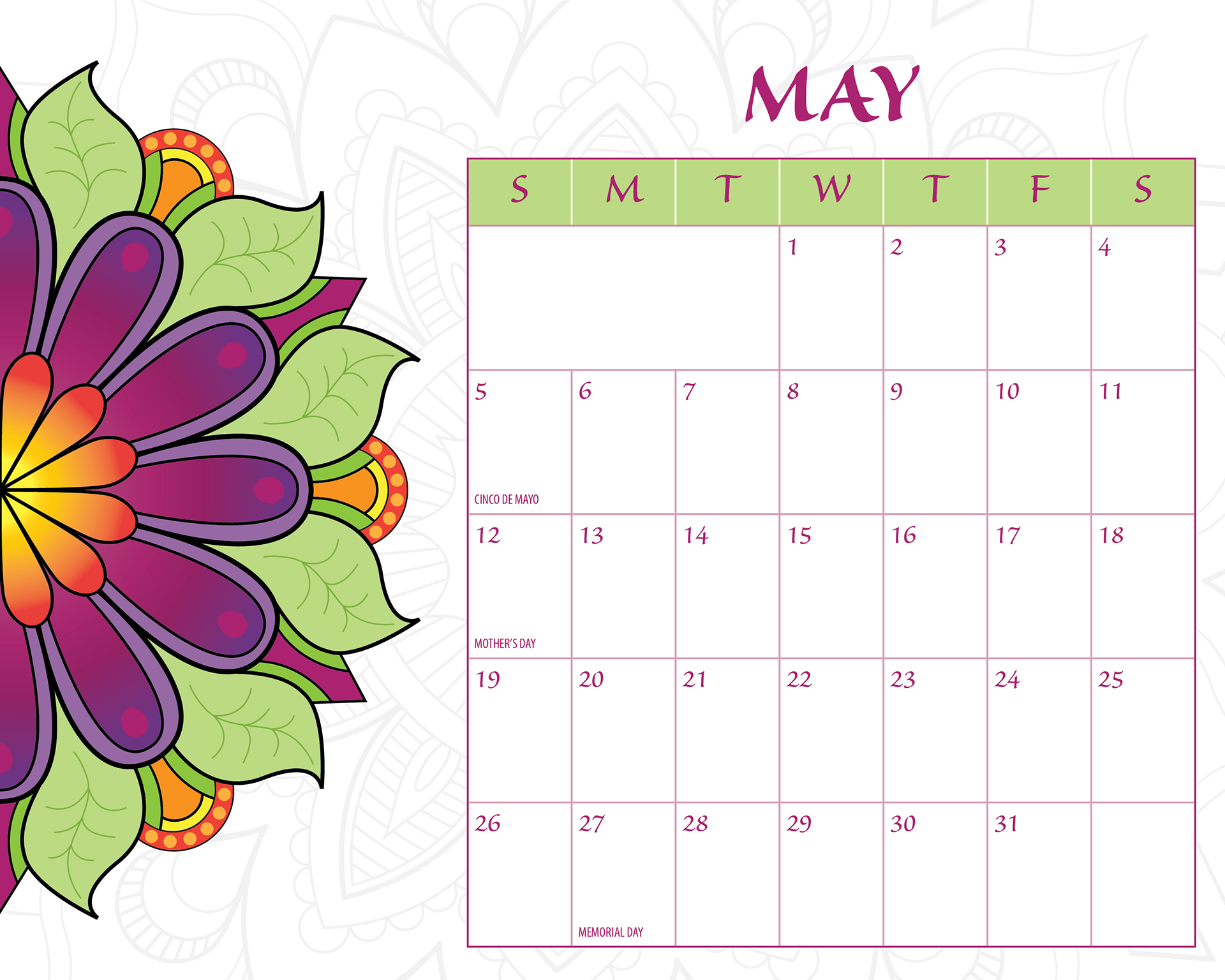


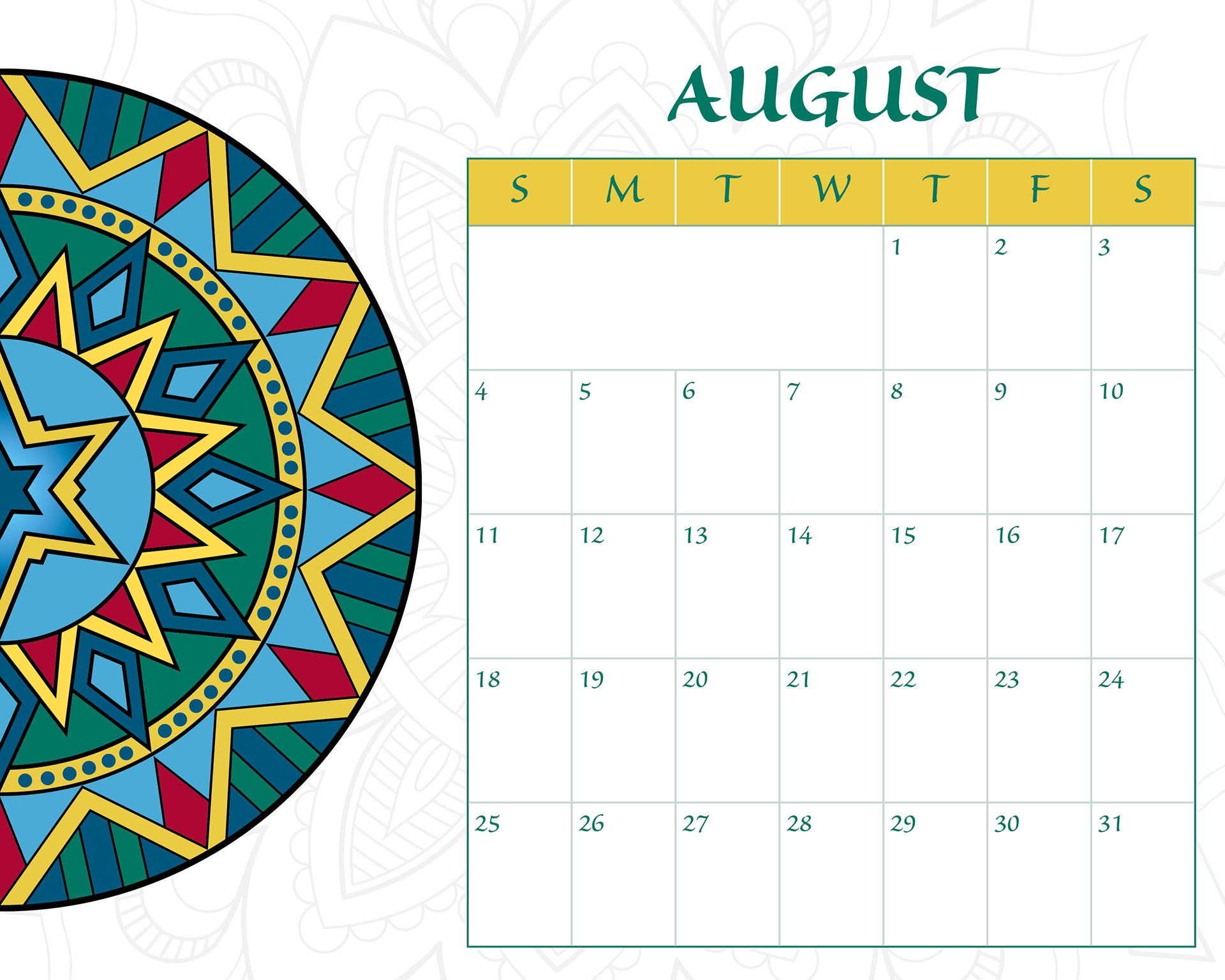

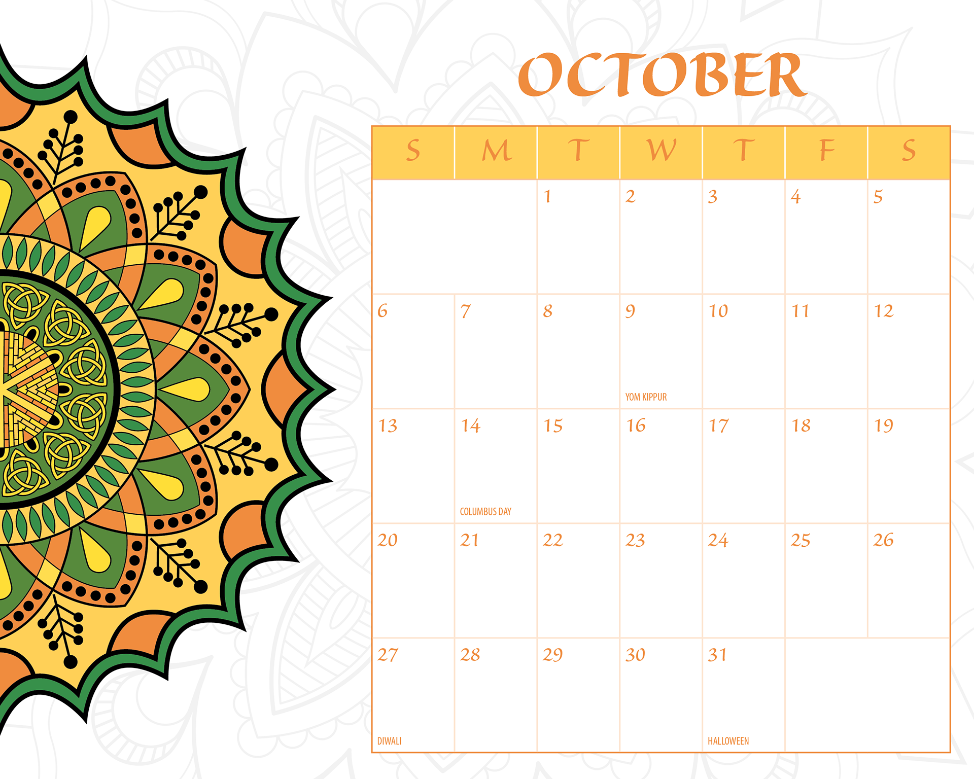

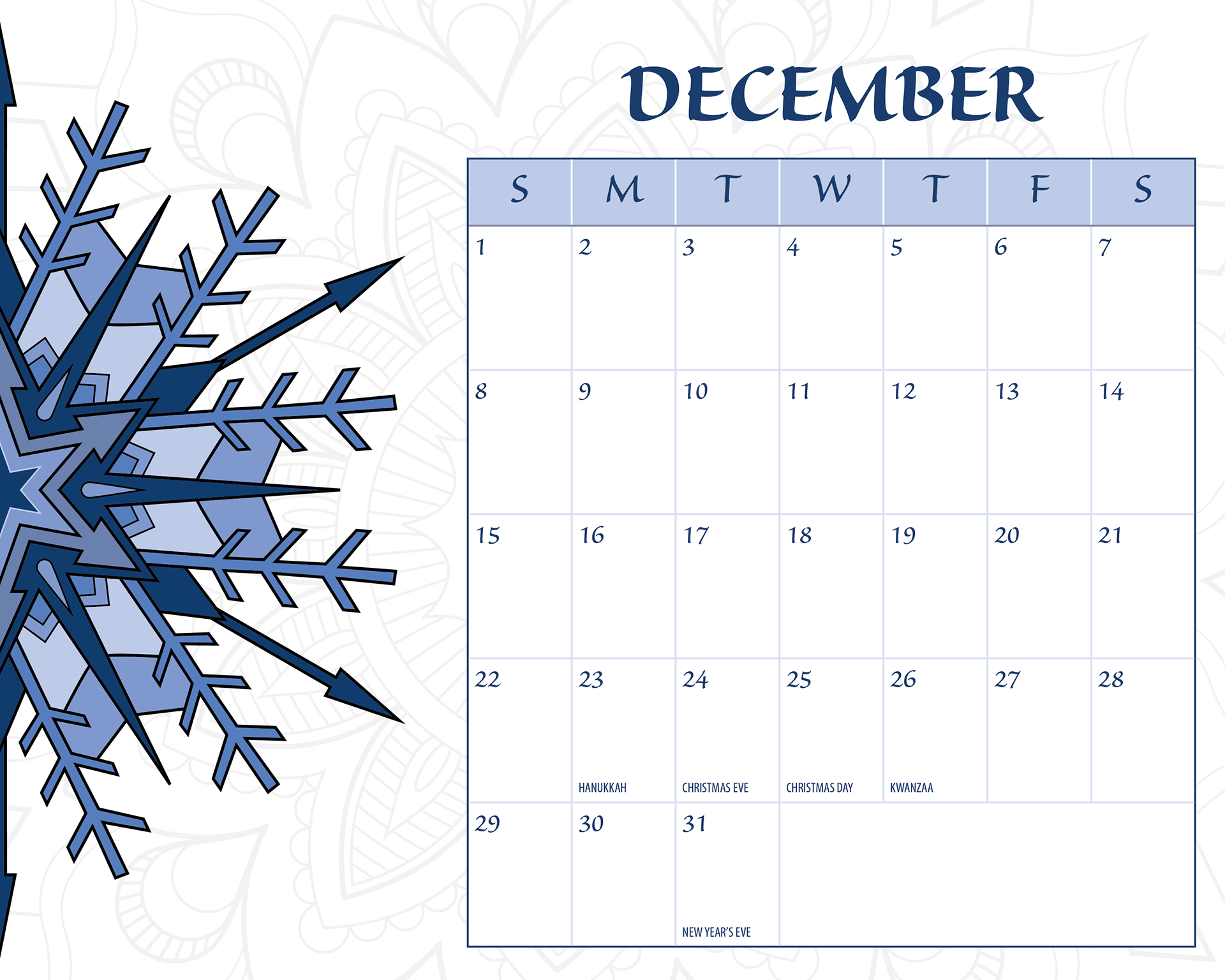

Calendar Pages


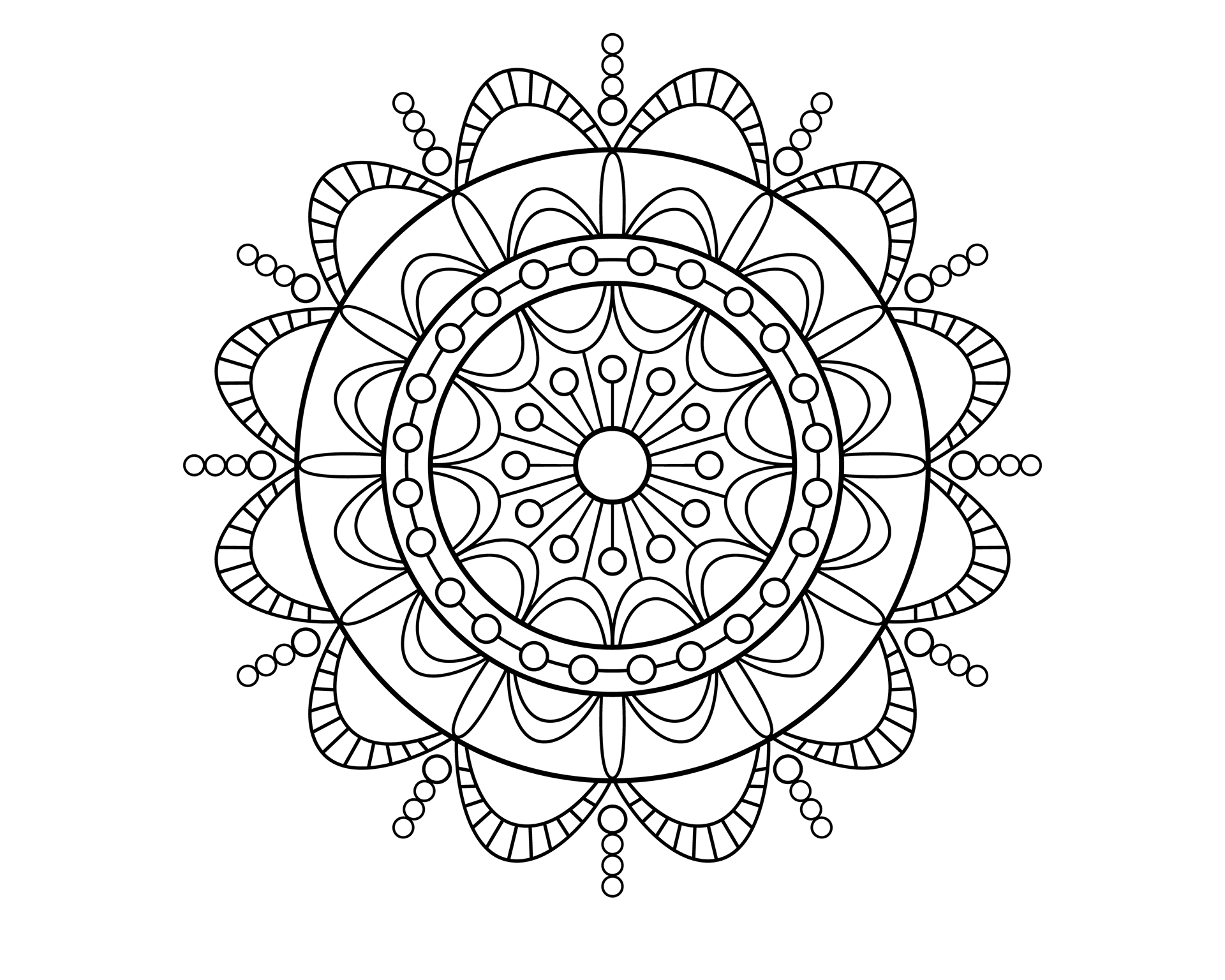
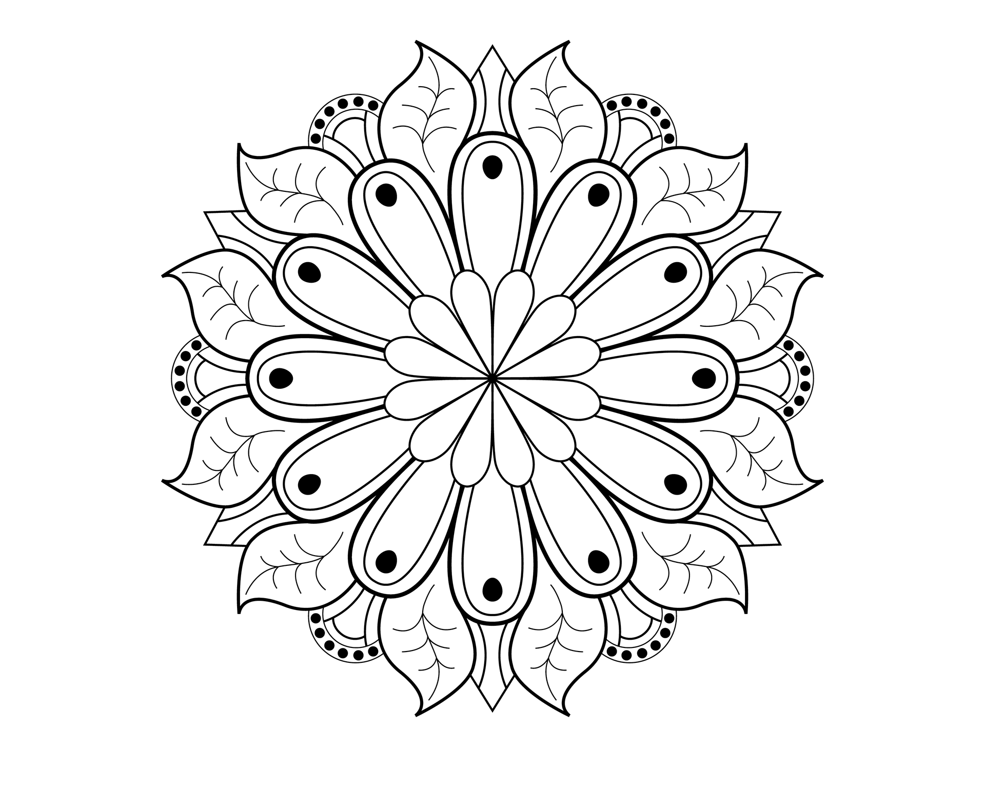
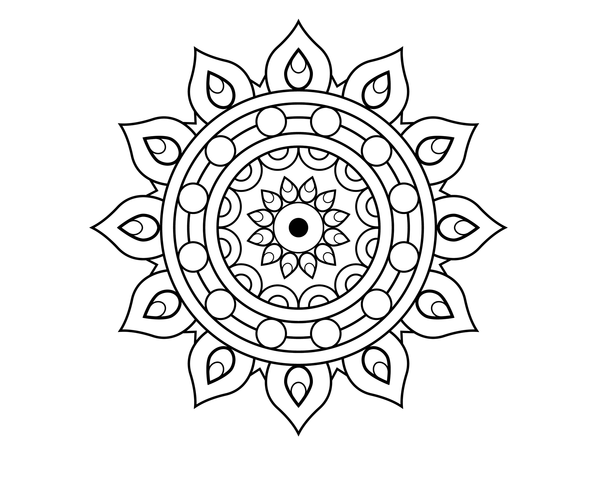
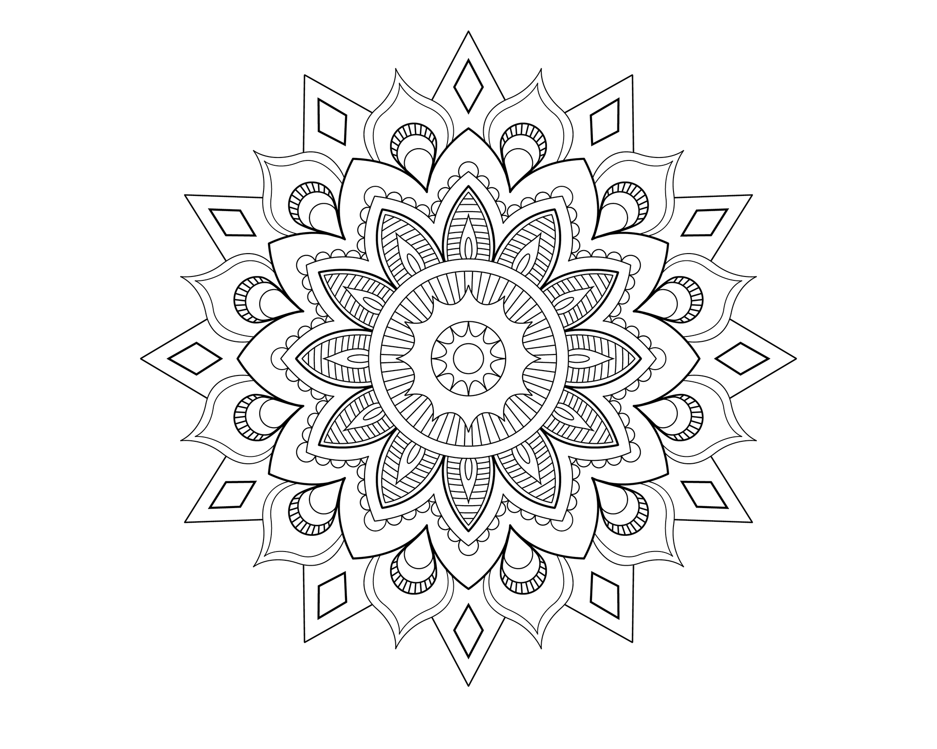
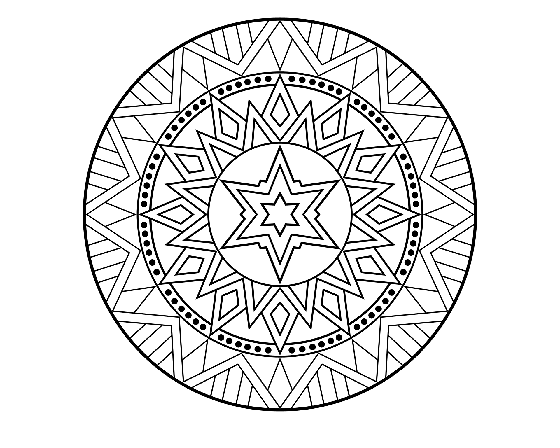
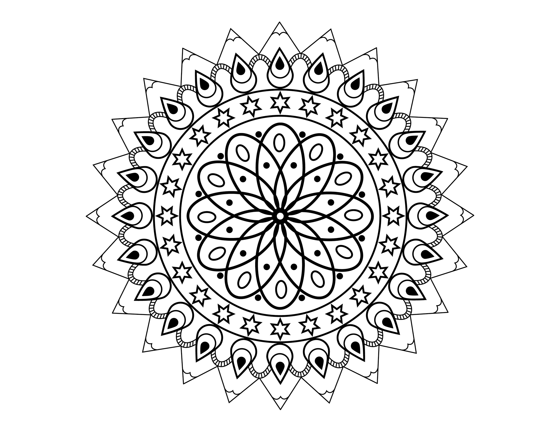
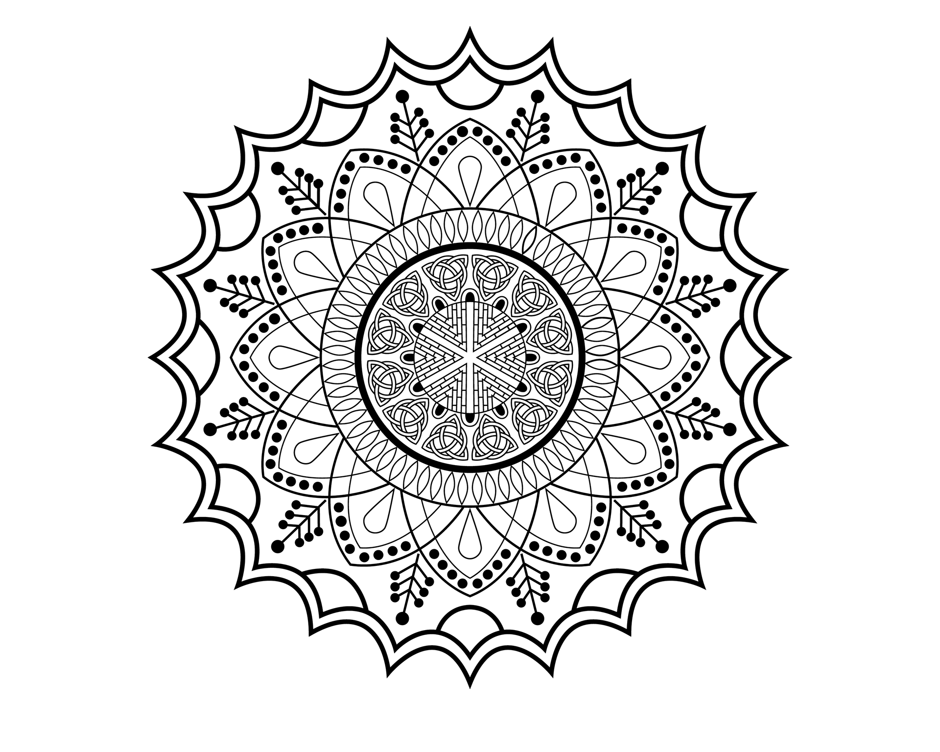
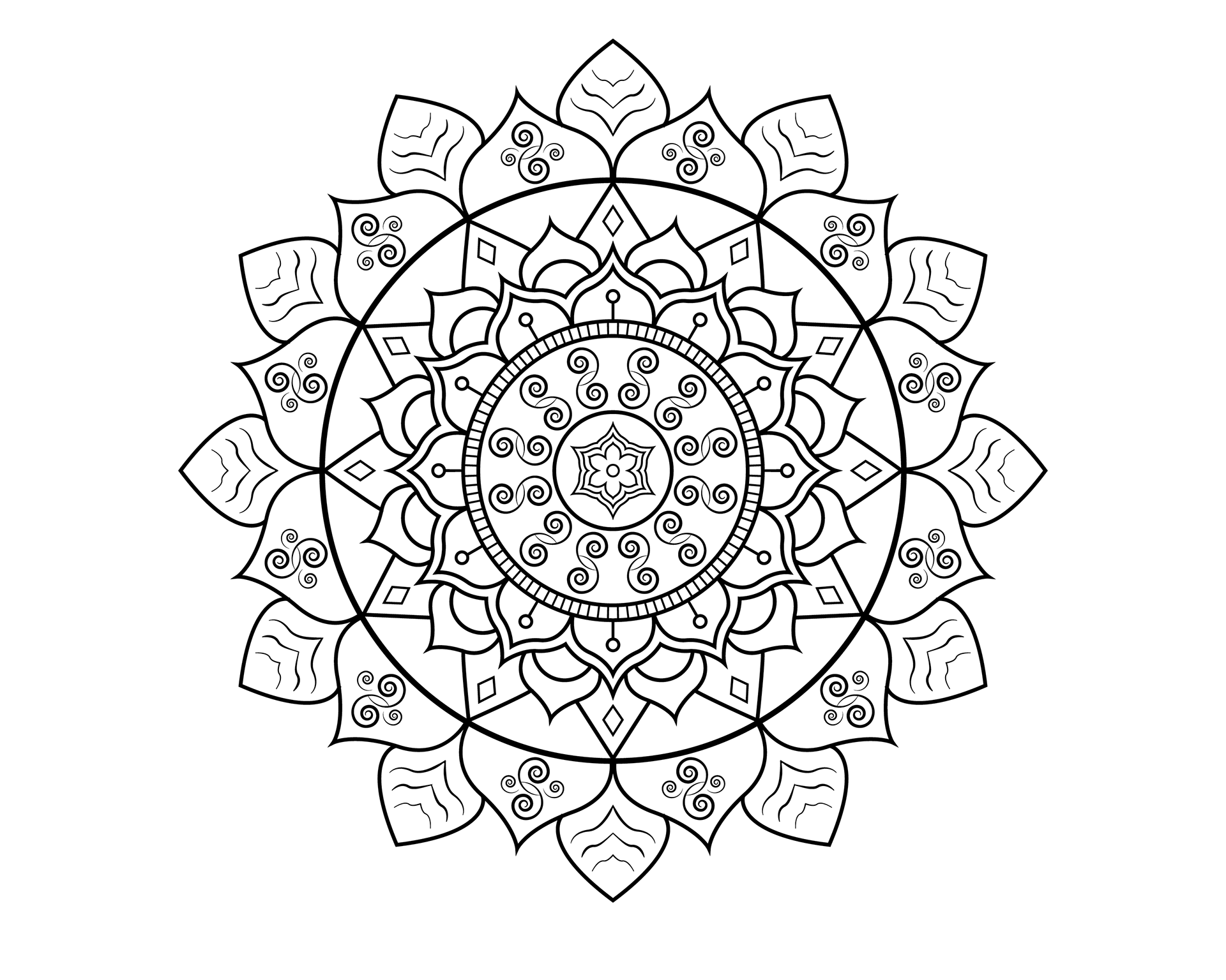
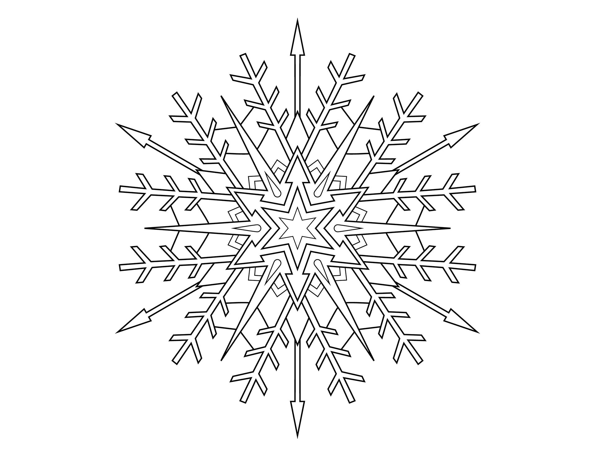
Black and White Coloring Pages
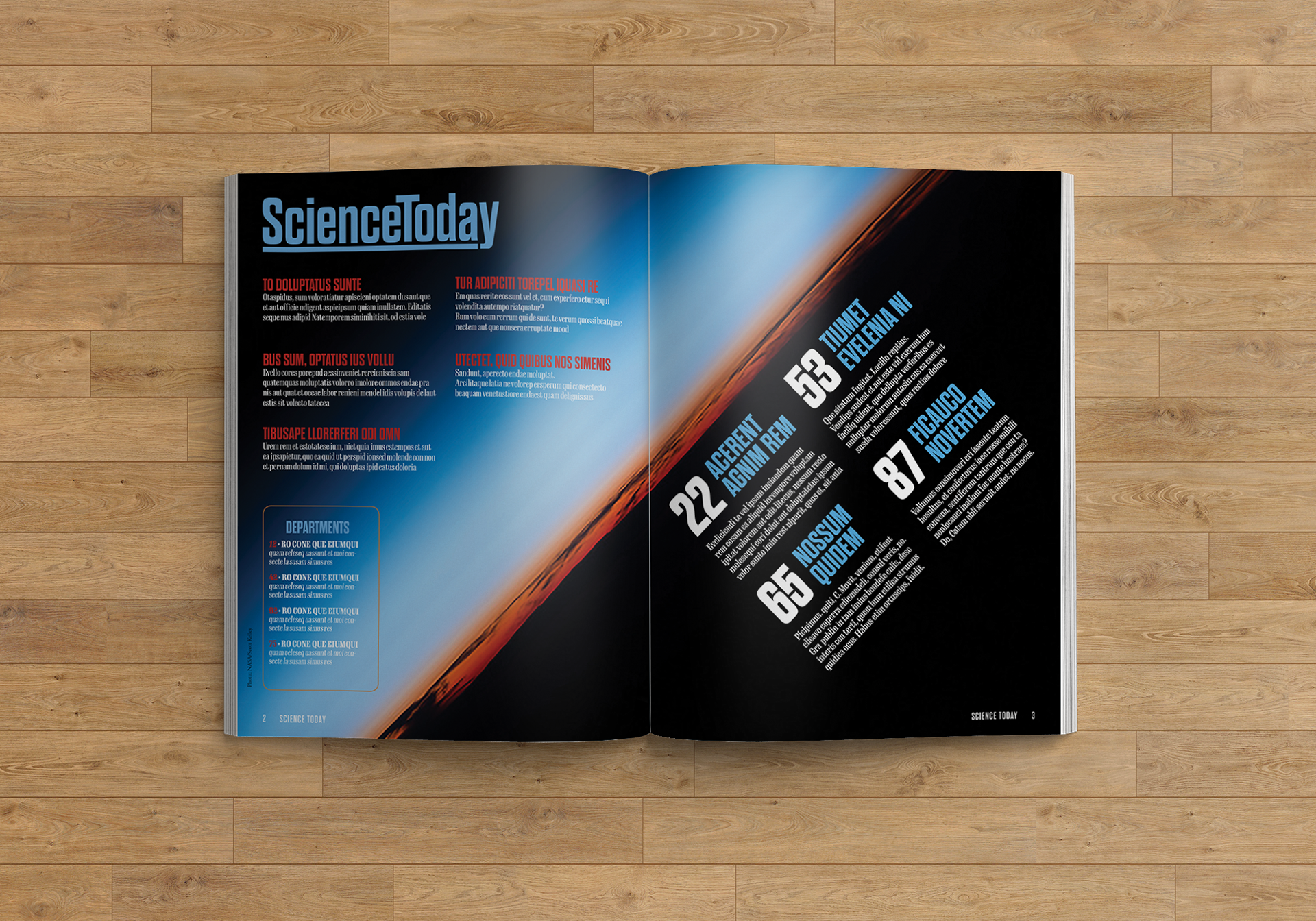
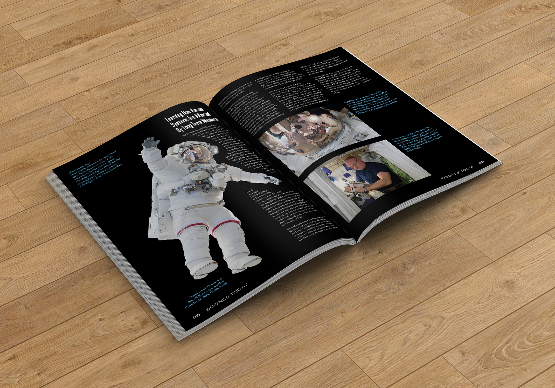
Student Project - ScienceToday Magazine Project
This was a student project that included a cover design, a table of contents, and a four-spread article about Scott Kelly's Year In Space.


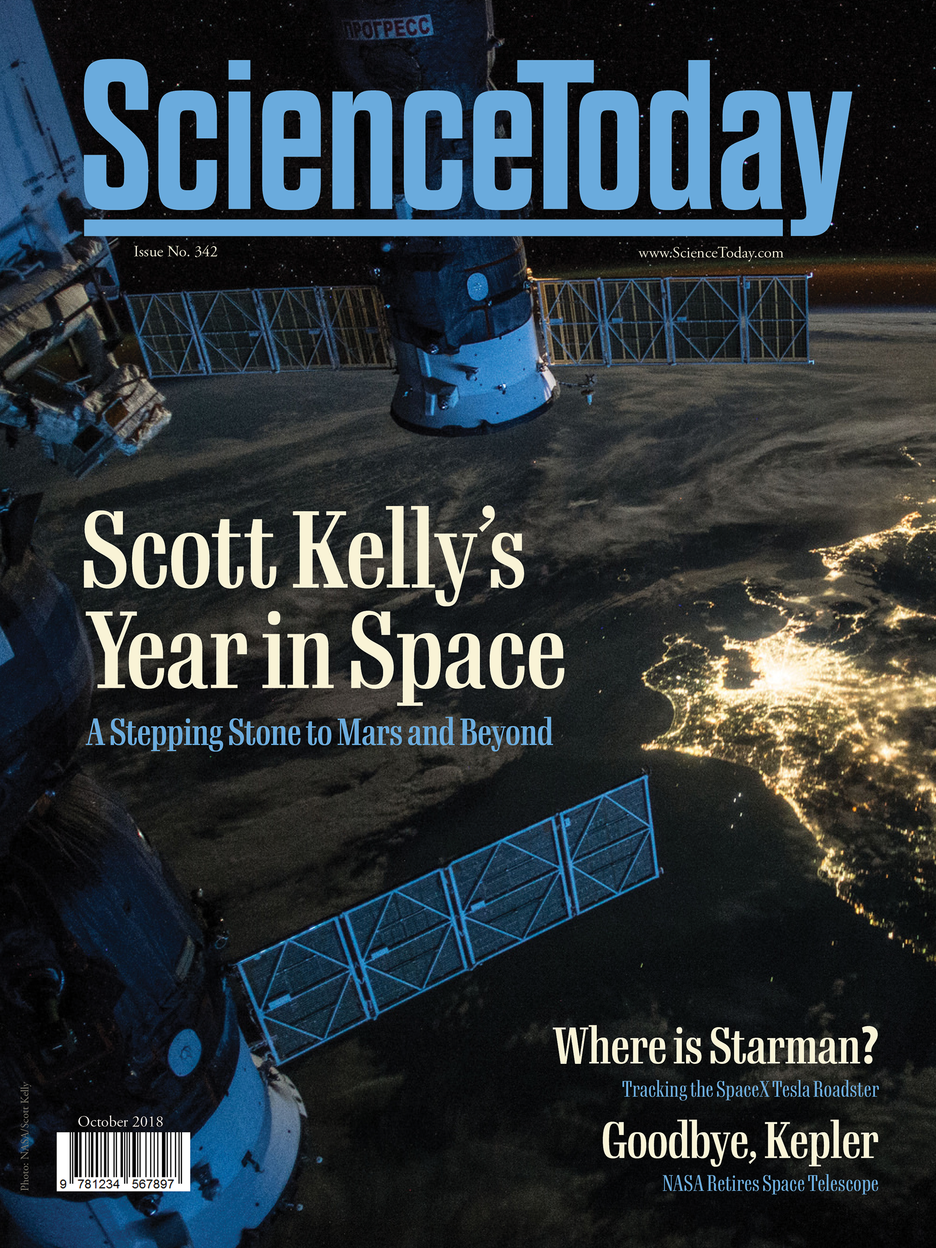
For the cover, I first designed the masthead, and then found an image that went with the main article. Other elements include headlines and subheads for articles, issue date and number, photo credit, and barcode. I chose a font for the headlines that has a similar x-height as the masthead to give harmony and balance to the overall layout. I also used the same color palette as the background image.
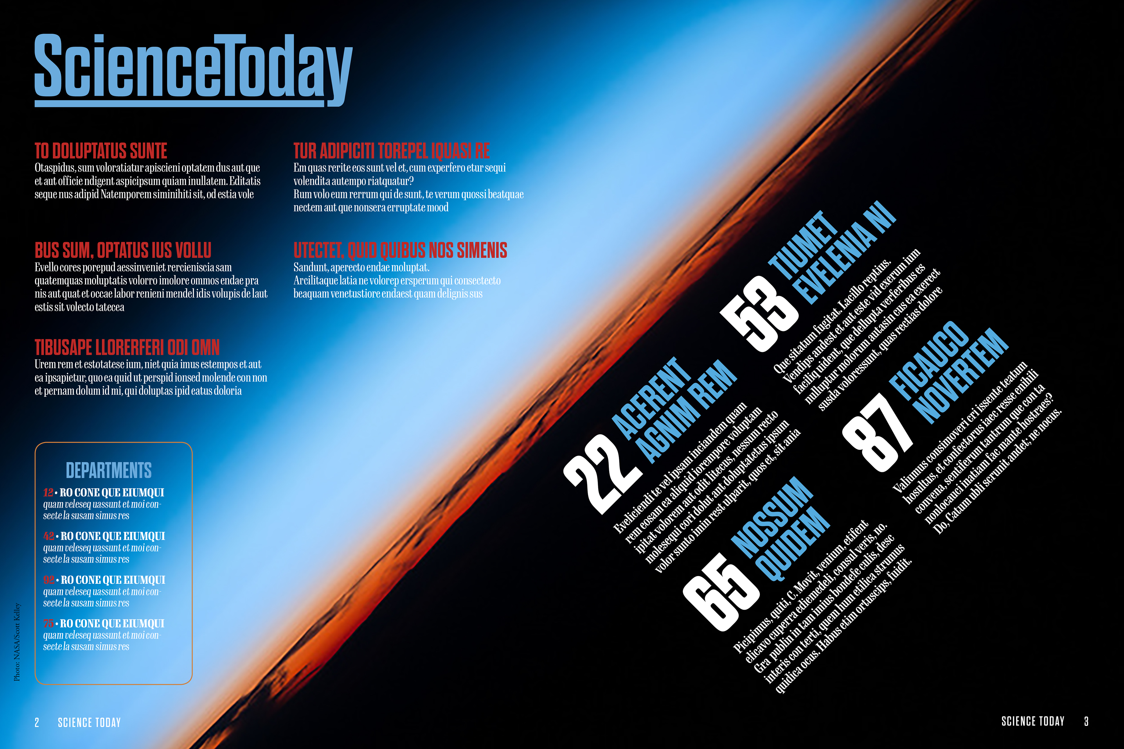
The background photo for the table of contents spread has a strong line through the middle and provided a great design element to place my type around. Using a grid, I placed the main articles on a diagonal. Sub-articles were placed in columns, and department articles were put into a box. Everything is unified by the colors and fonts.

The opening spread for the Scott Kelly Article is dominated by the beauty of the image and the headline and subhead of the article. The photo credit is placed on the following page.
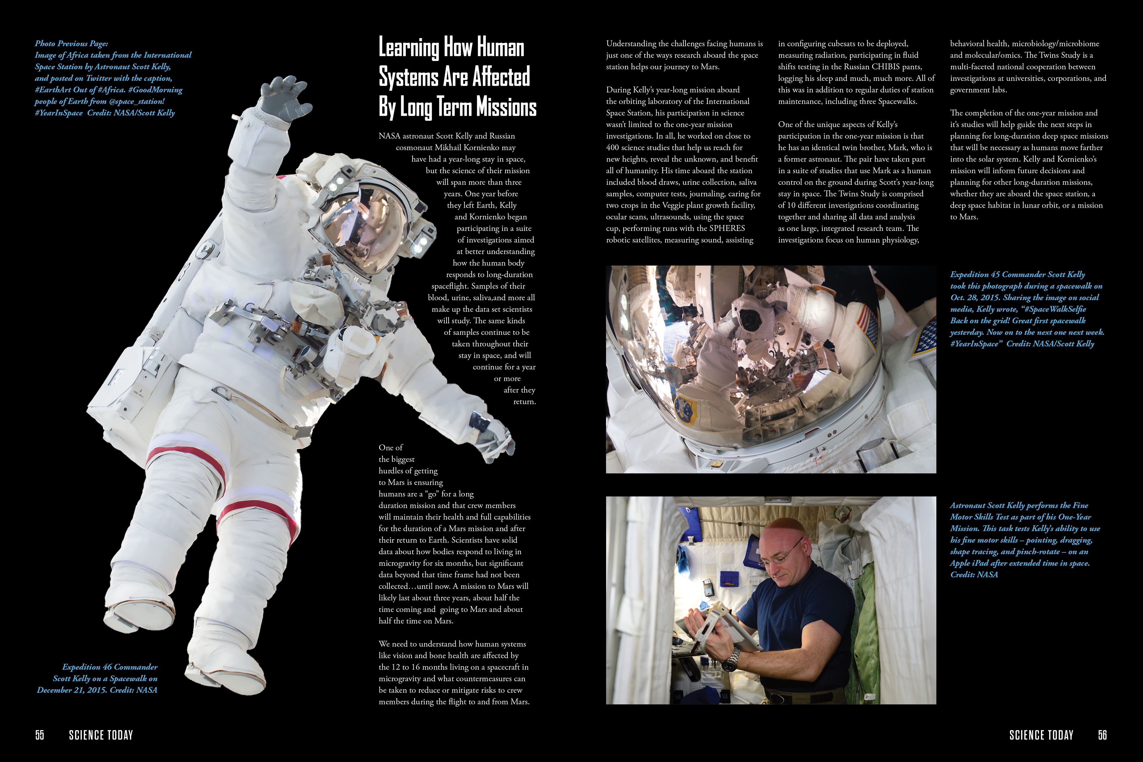
The second spread of the series features an image of Scott Kelly on a spacewalk. I felt that a black background contributed to the feeling of space. The text wraps around him as he floats in space. Photo credits are set in blue italic type to make it easier for the reader to separate information. The folio contains the name of the magazine and page numbers.
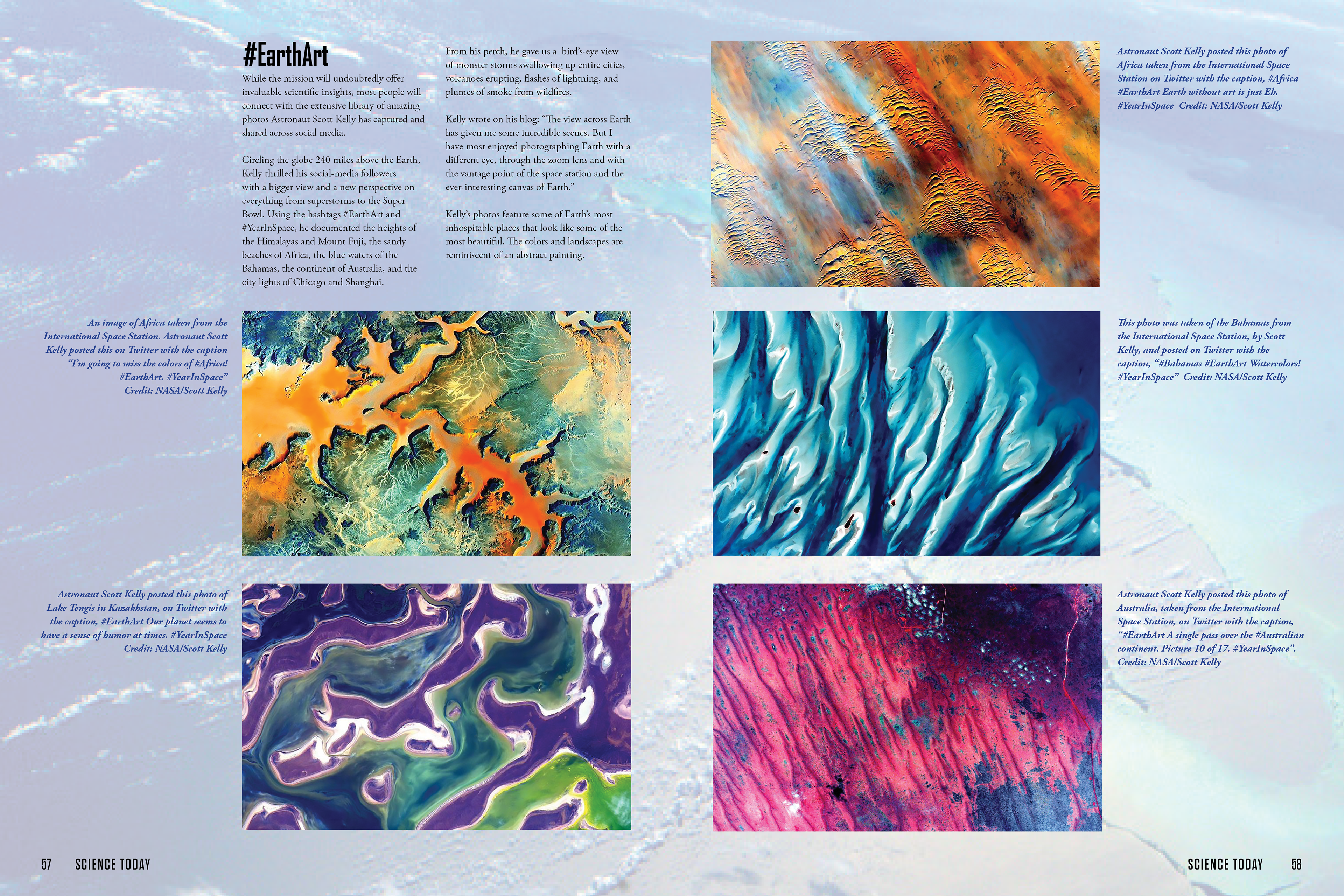
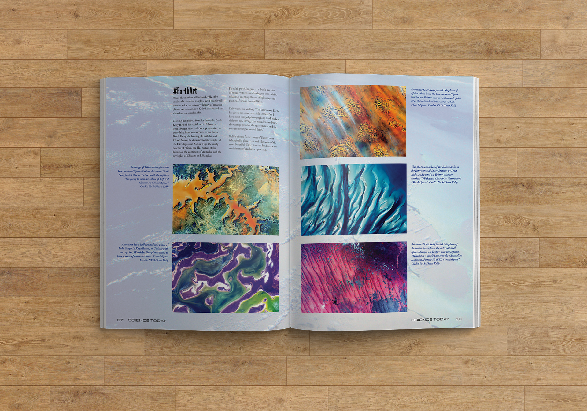
The third spread features images that were part of a series called #EarthArt and accompanies a subhead of the article. The background contains an additional image that has a very low opacity applied to it. This helps to give the page some texture and dimension. The photo credits follow the established pattern of the previous page with blue italic type, and the folio also contains the name of the magazine and page numbers.
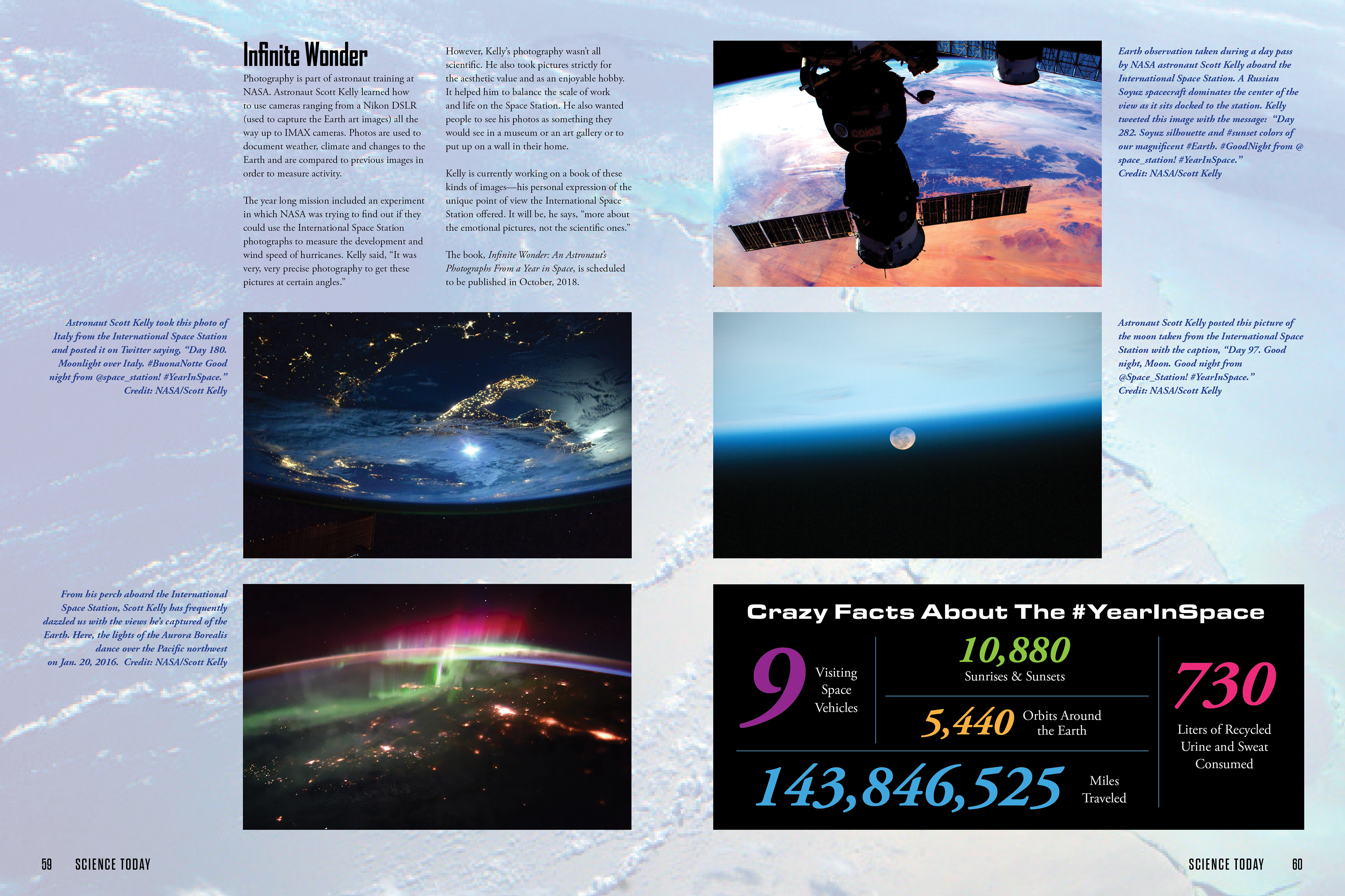
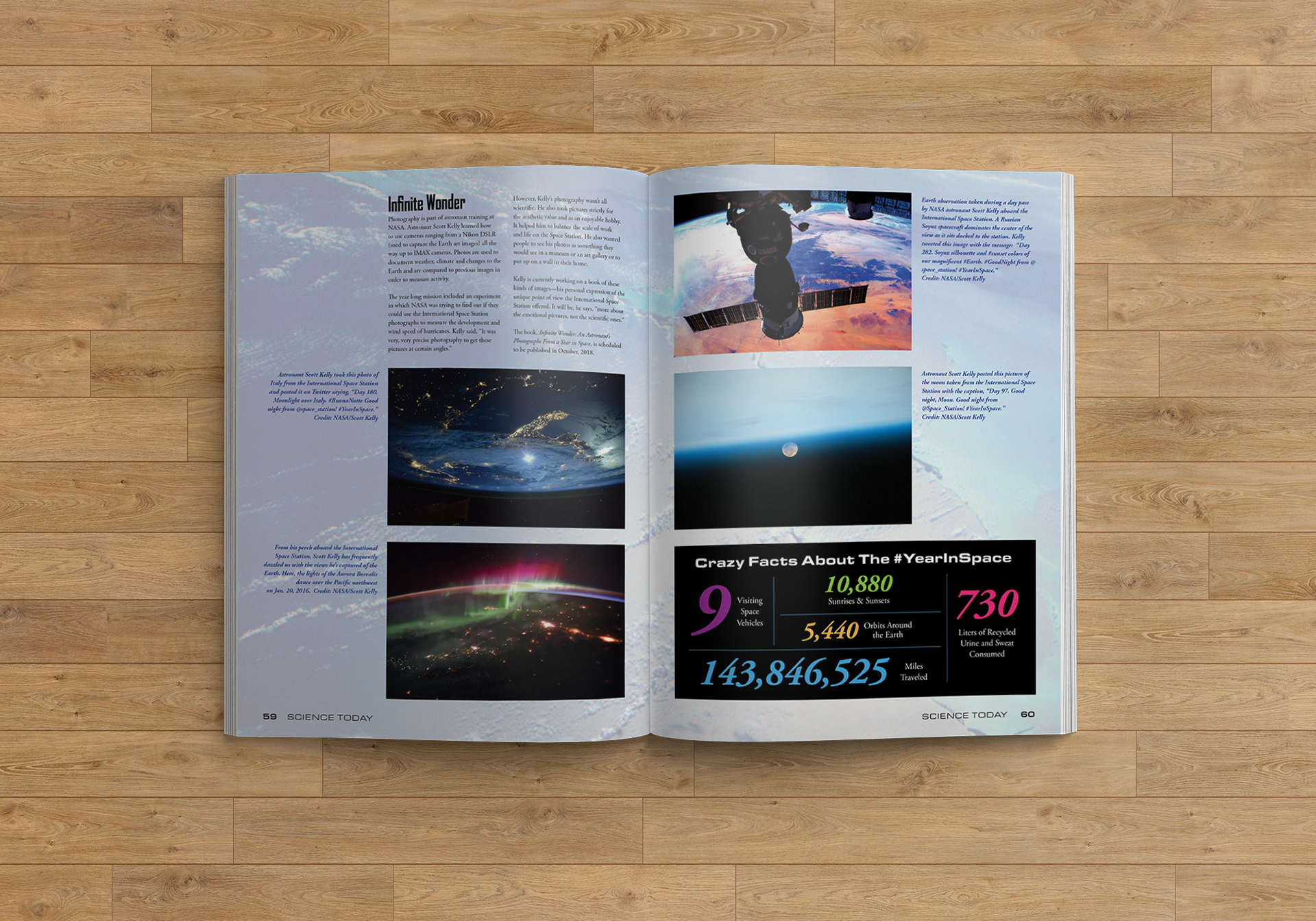
The final spread features additional images taken by Scott Kelly while living on the space station. There is an added infographic that includes some interesting facts about the year in space. The background, photo credits, and folio follow the same pattern as the previous spreads.
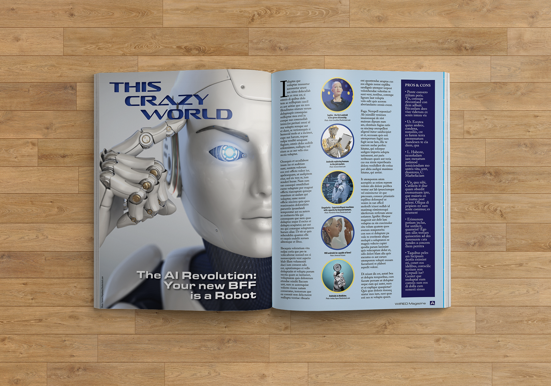
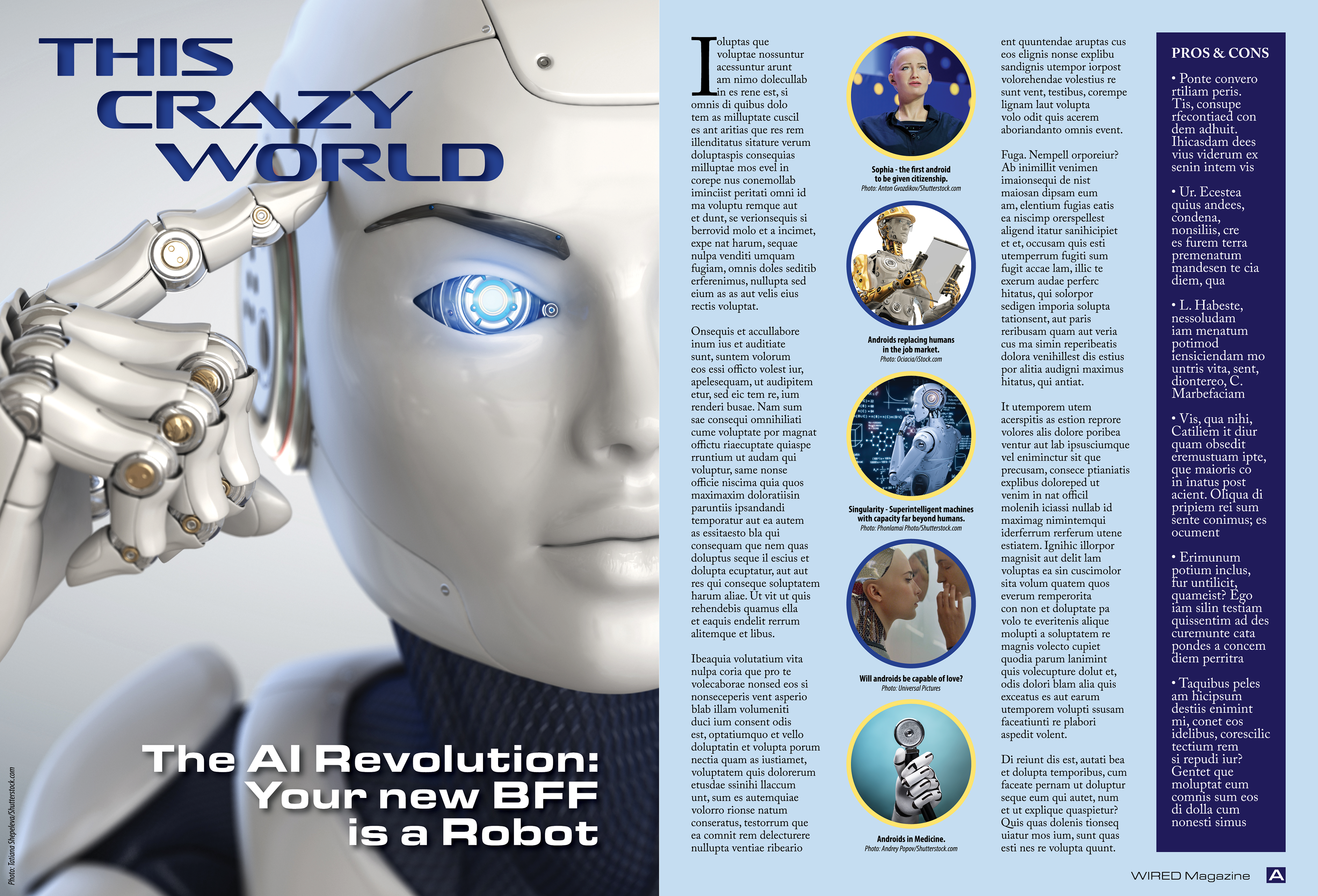
Student Project - This Crazy World Magazine Spread
CASE STUDY: Wired is a monthly American magazine, published in print and online editions, that focuses on how emerging technologies affect culture, the economy, and politics. Owned by Condé Nast, it is headquartered in San Francisco, California, and has been in publication since its first issue in March/April 1993.[2] (Wikipedia)
The average reader of WIRED magazine is between the ages of 30–50 and has an income of $75,000 or greater, and works in the computer or high tech industry. The goal of this design is to increase readership both in numbers and in scope. As noted above, currently the readership is between the ages of 30 and 50, with reader’s average income at $75,000. The goal is to attract more readers between the ages of 20–30 with an income starting at $30,000.
Since this age group is very comfortable with technology and will most likely be effected by artificial intelligence, I felt this would be a good subject to get their attention. The layout includes relevant images that grab your attention and the subhead uses language that they are familiar with. The colors and fonts support the overall theme and tone.
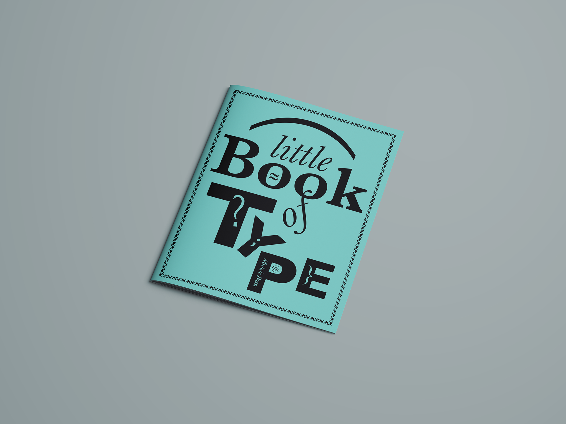
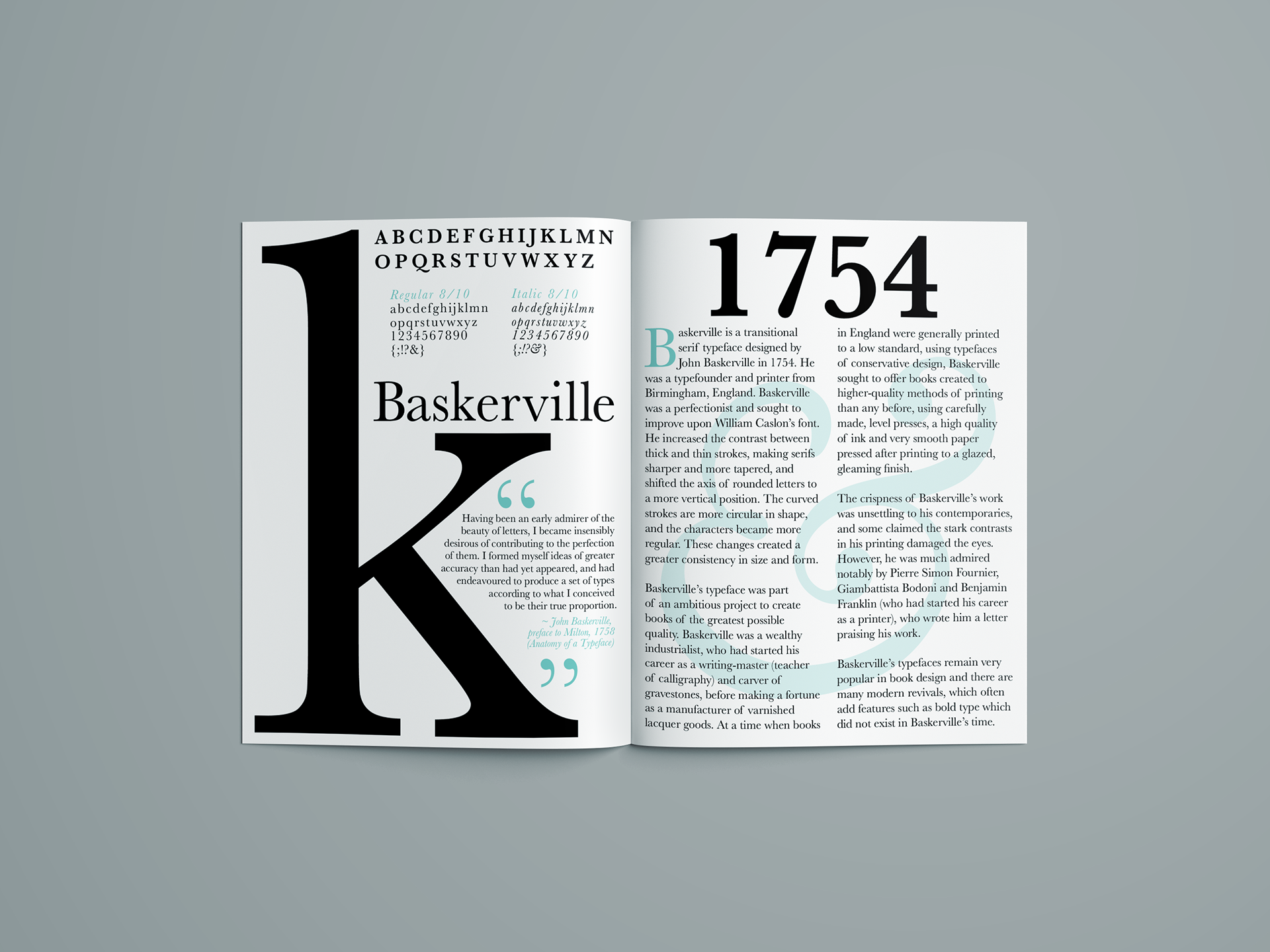
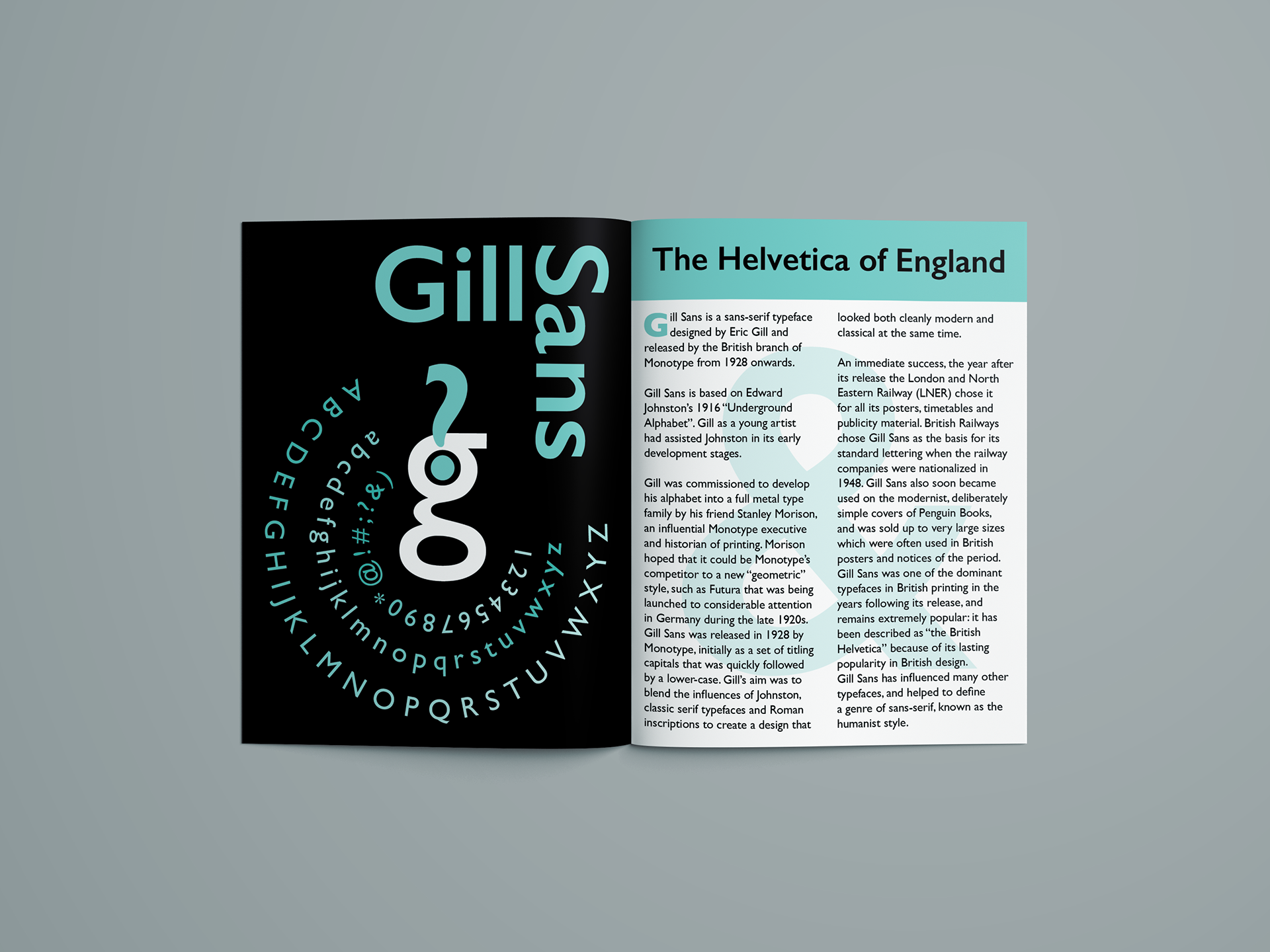
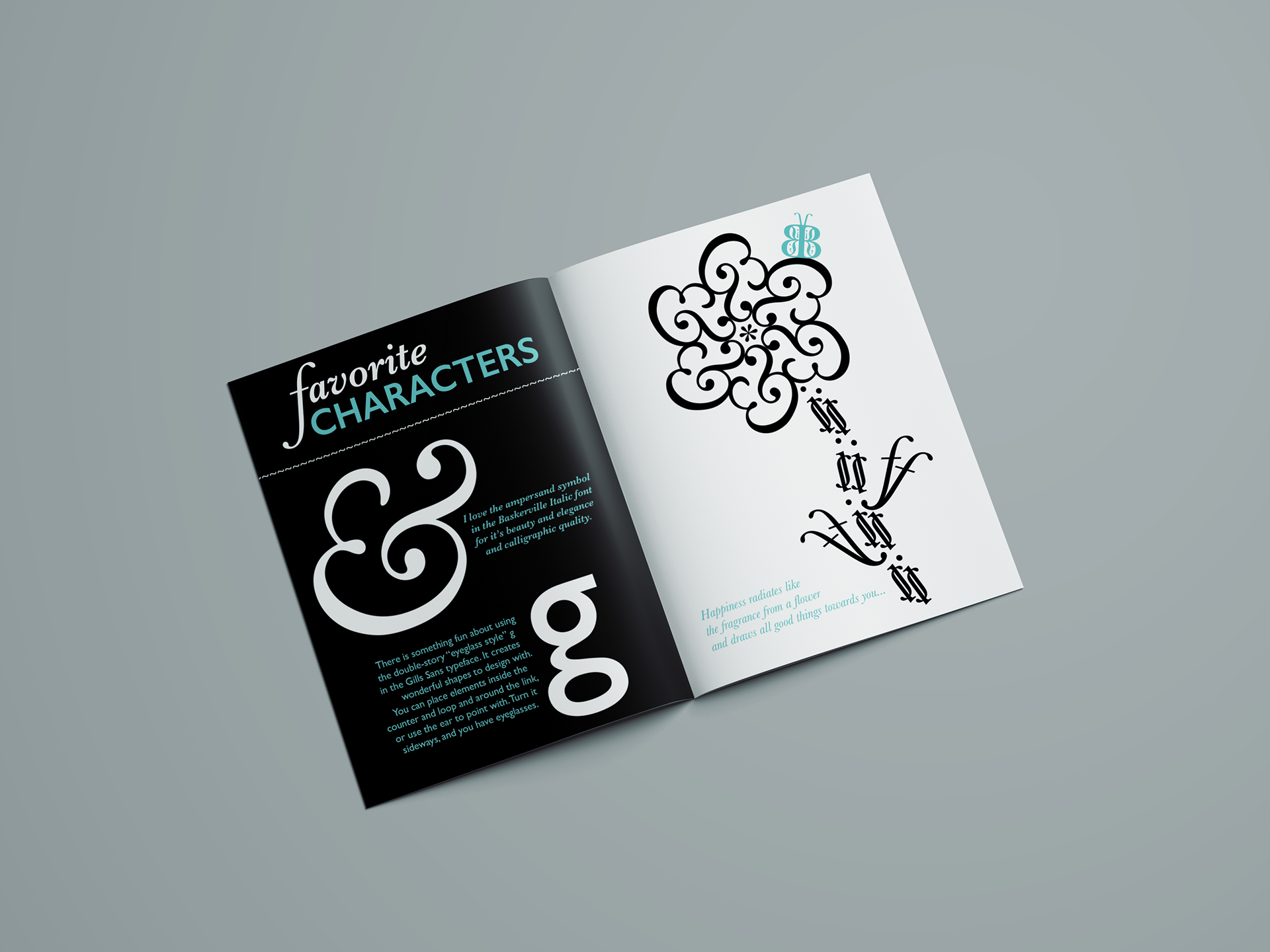
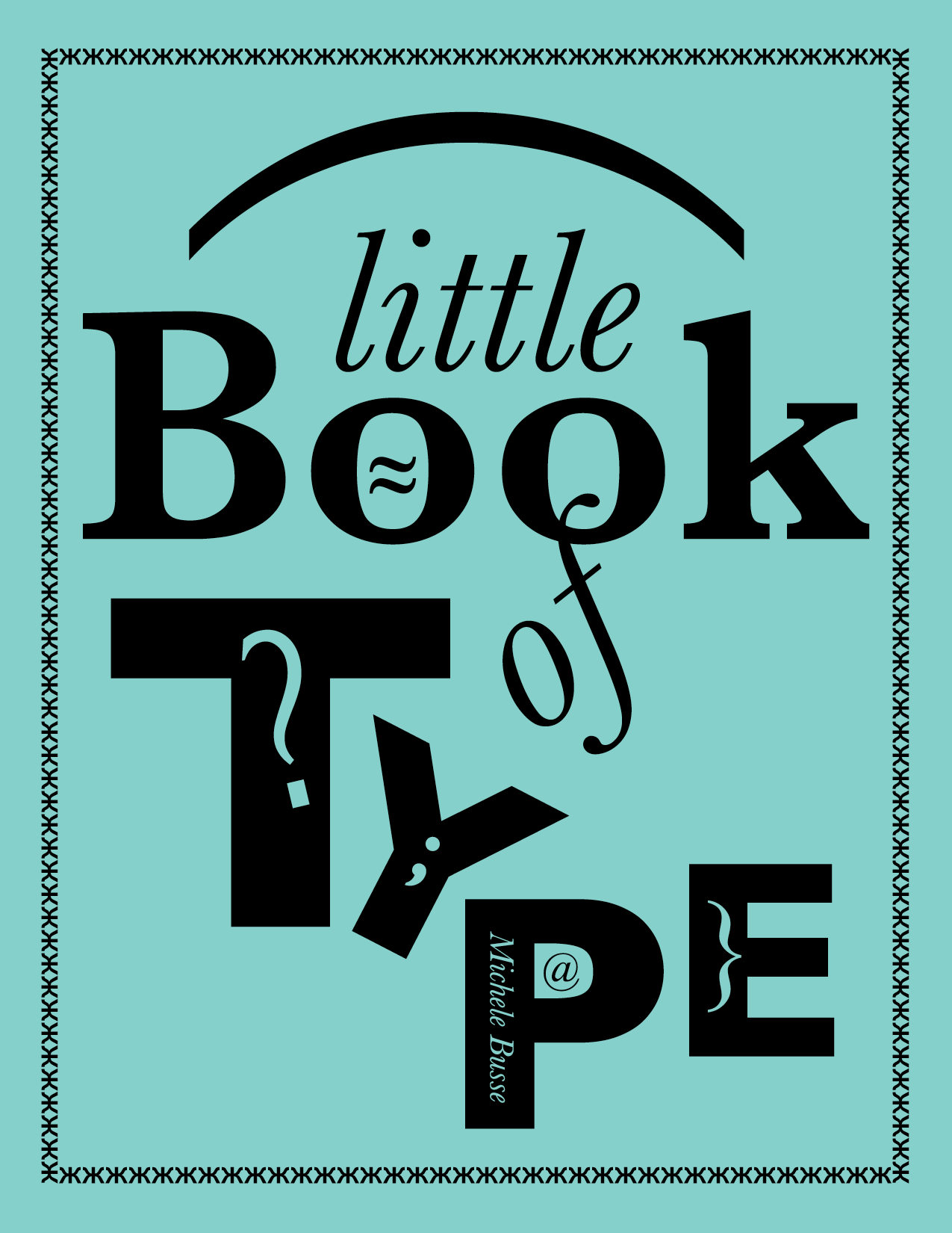
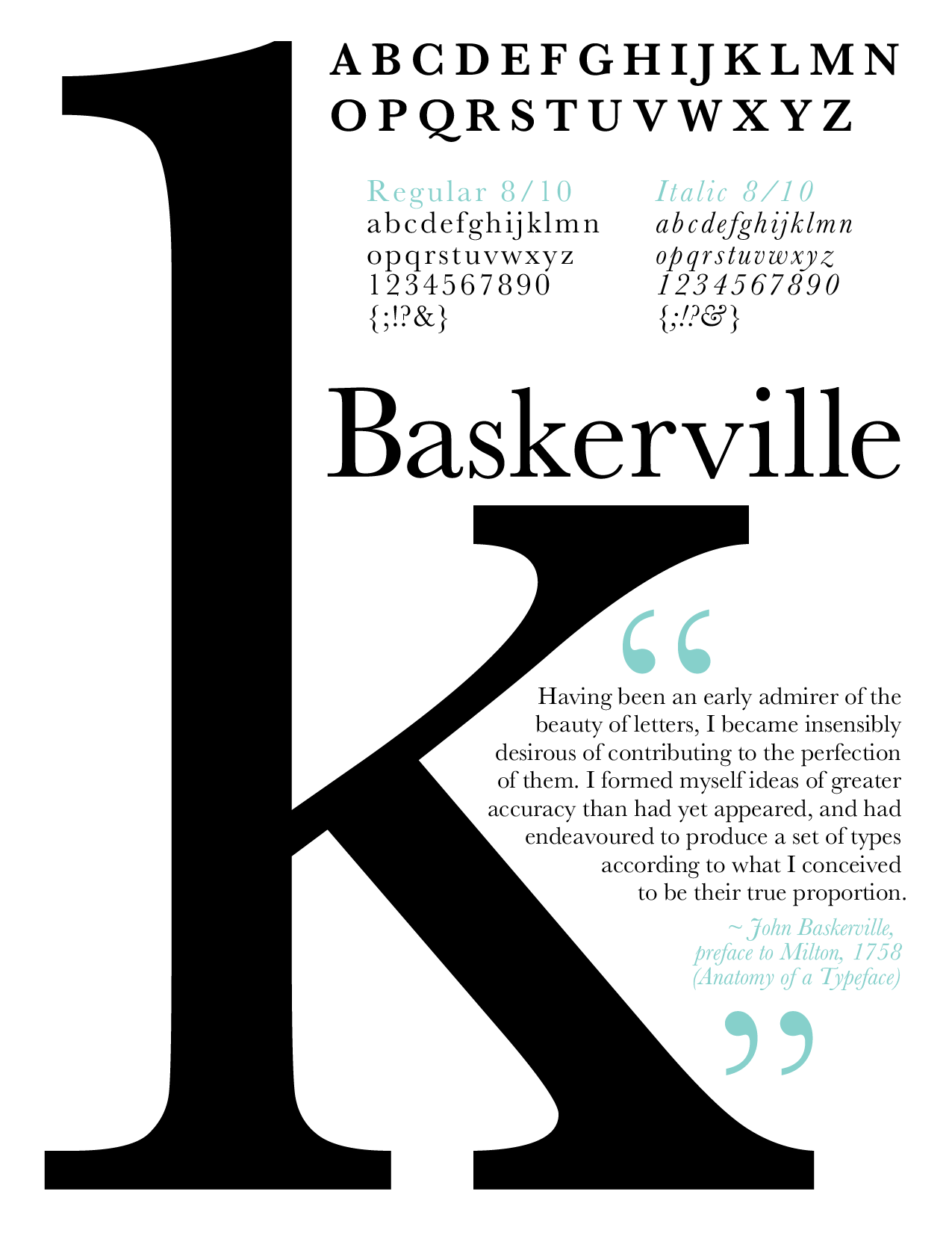
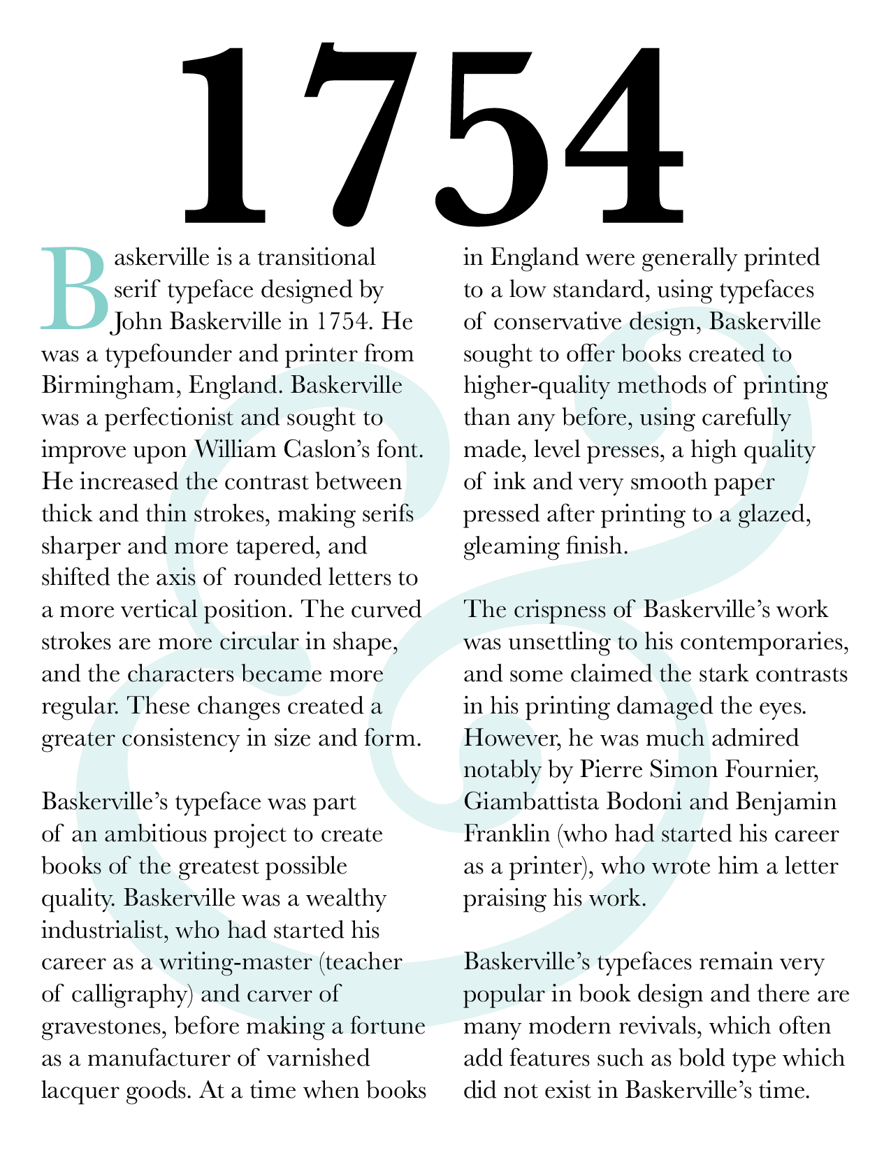
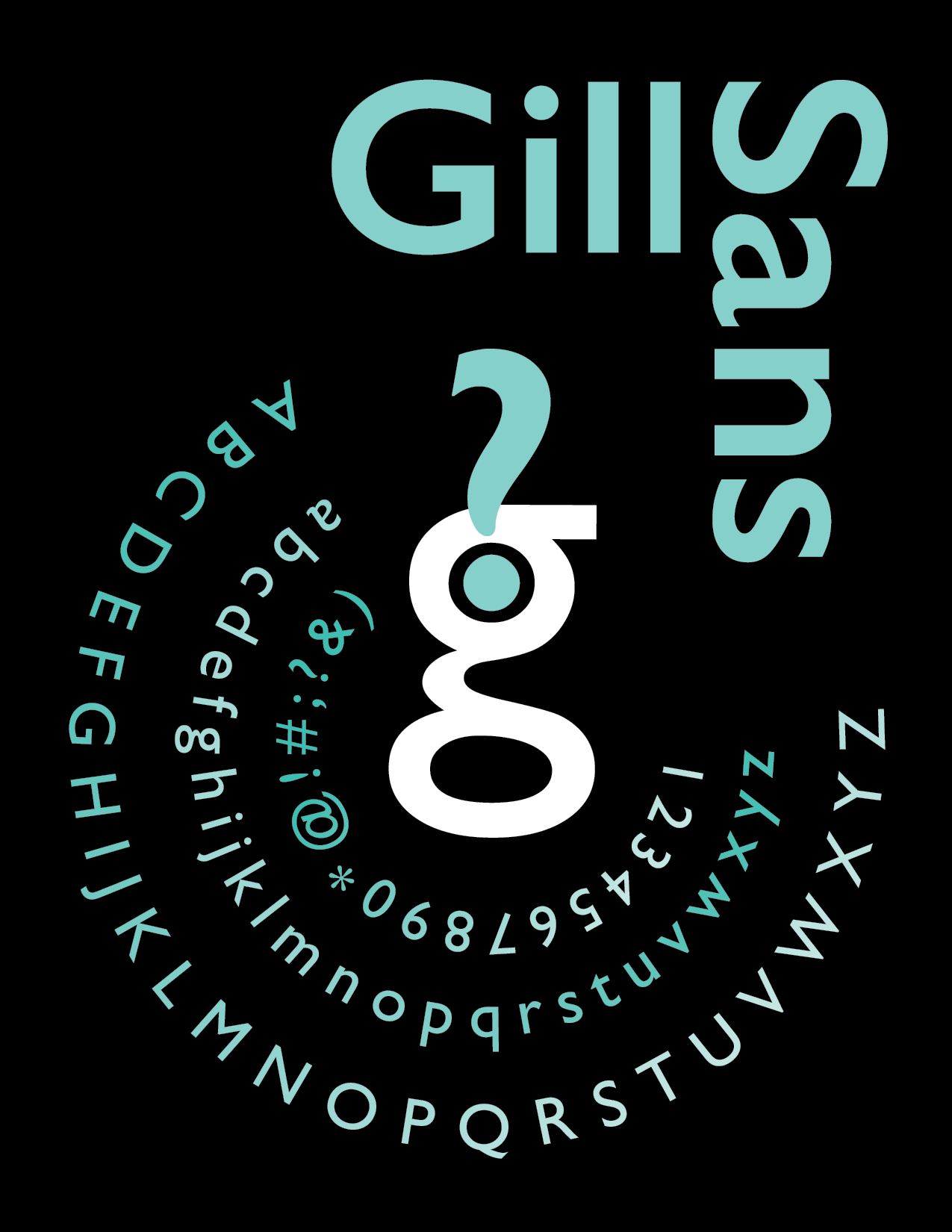
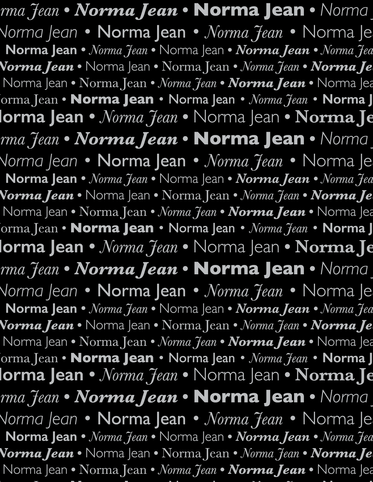
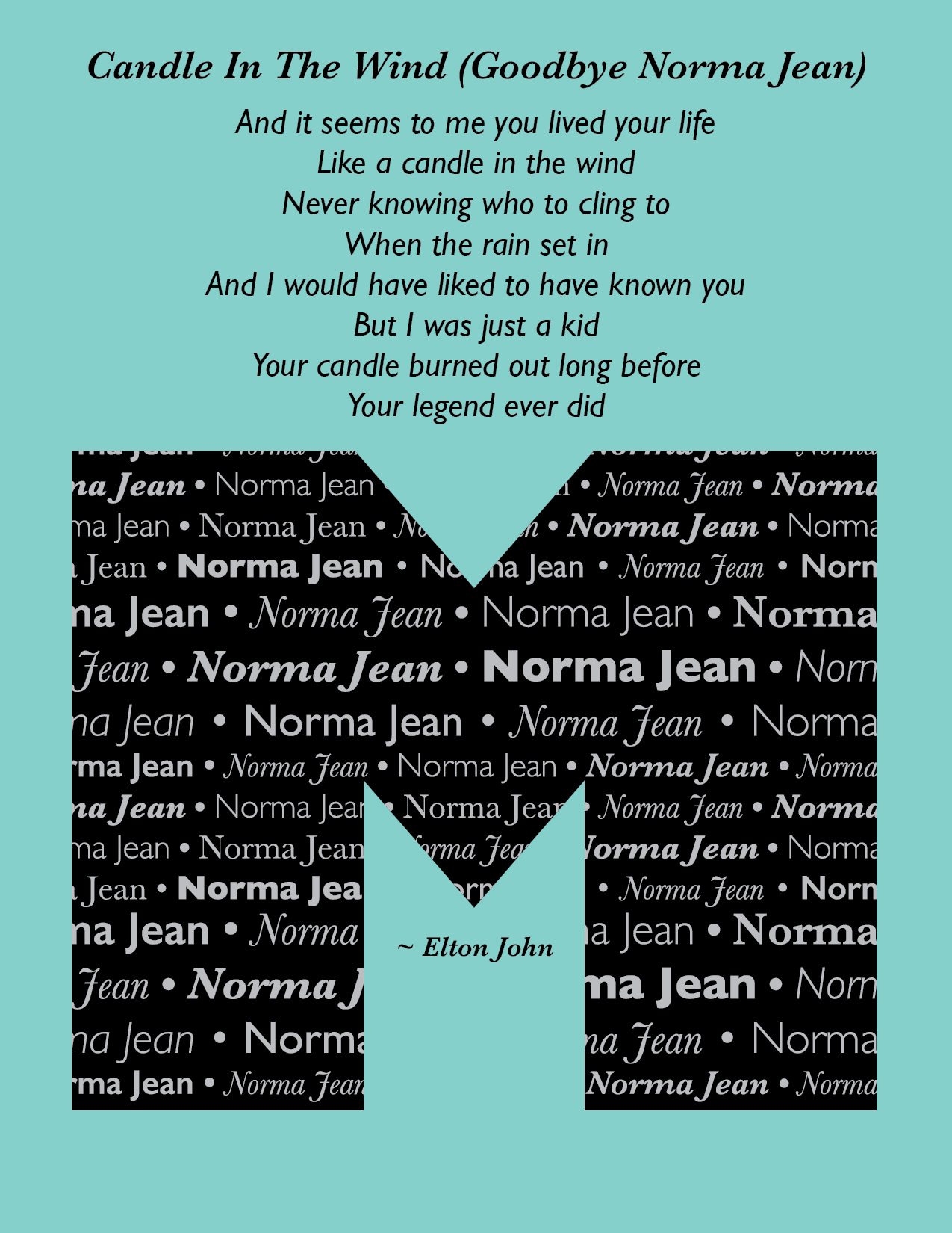
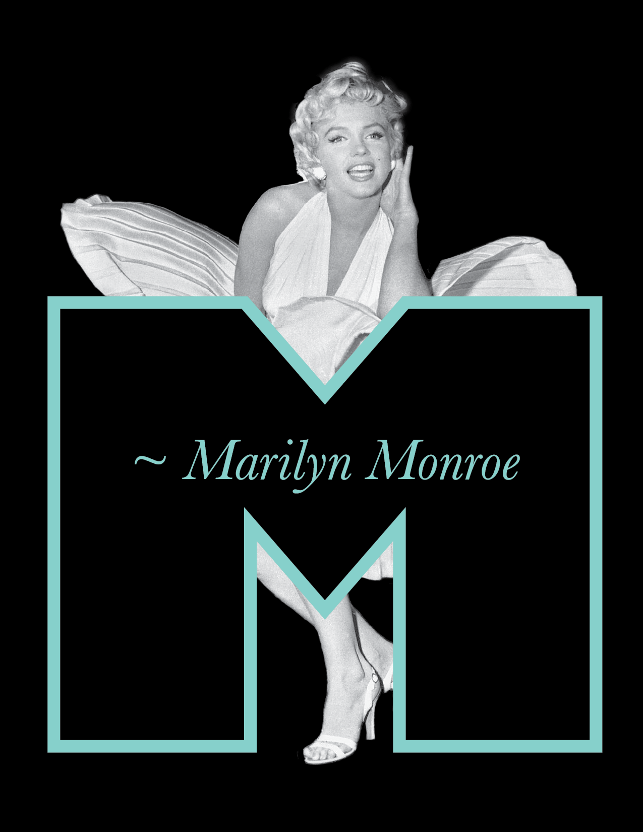
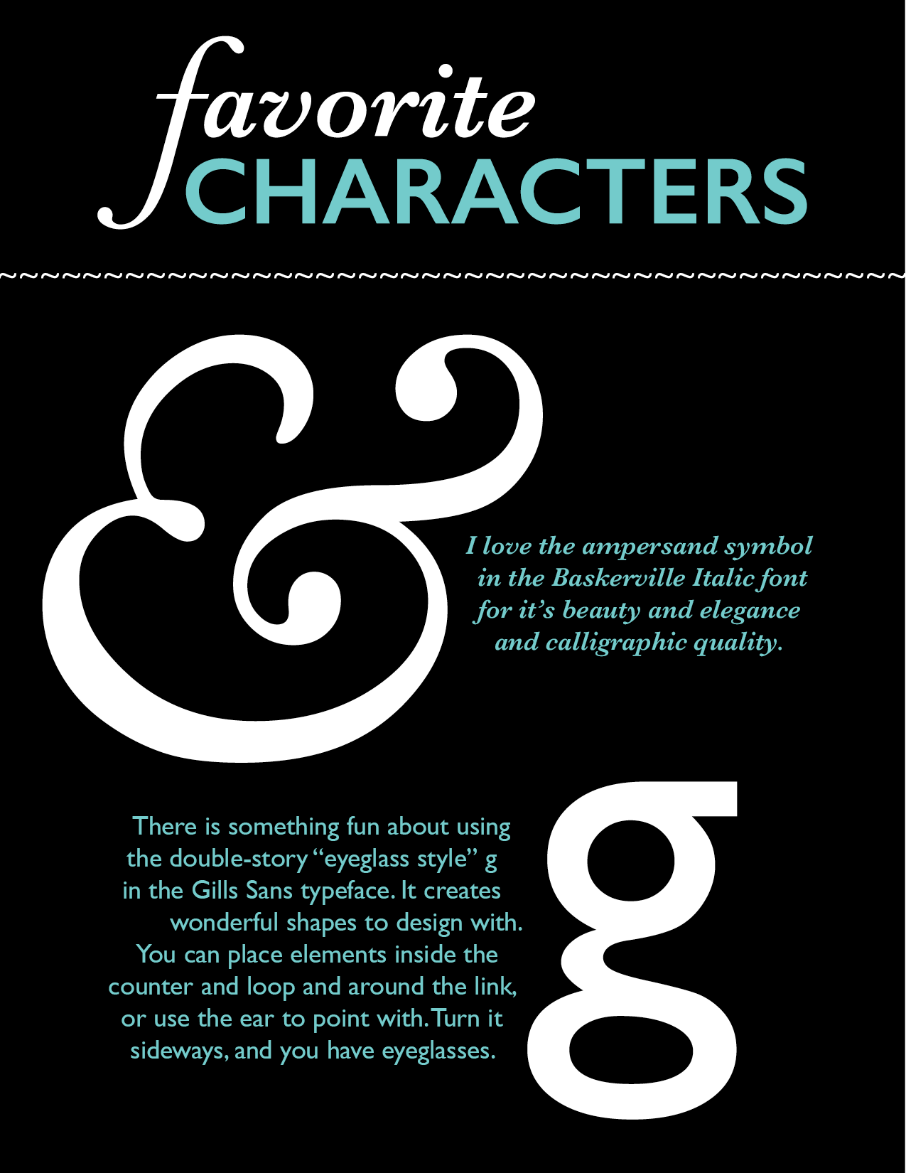
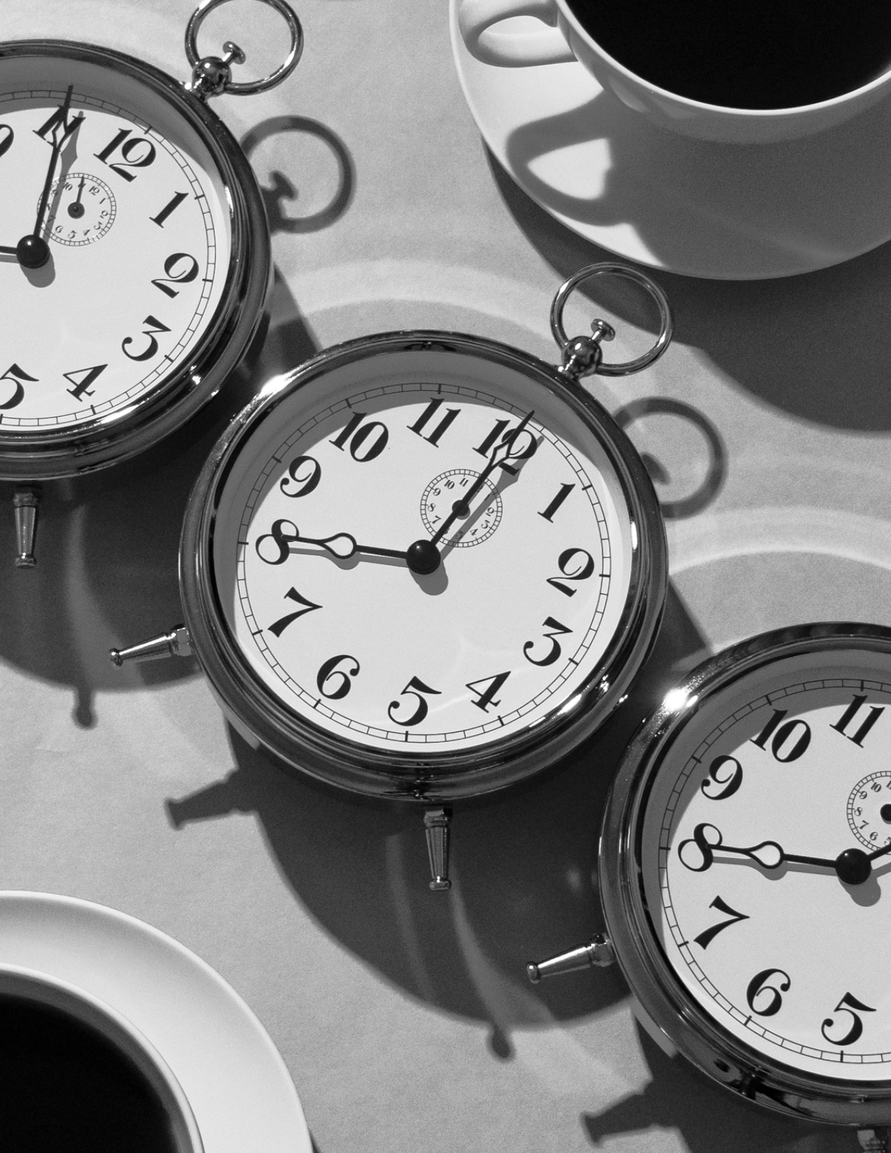
Student Project - Little Book of Type
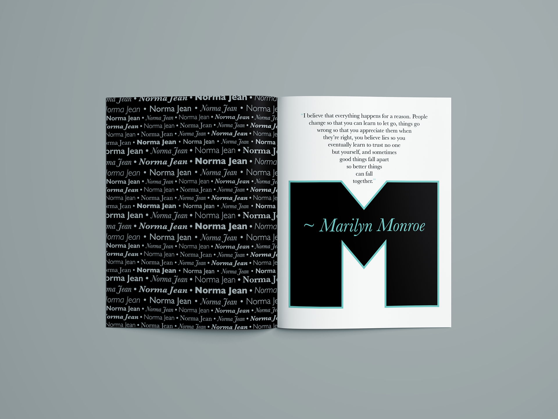
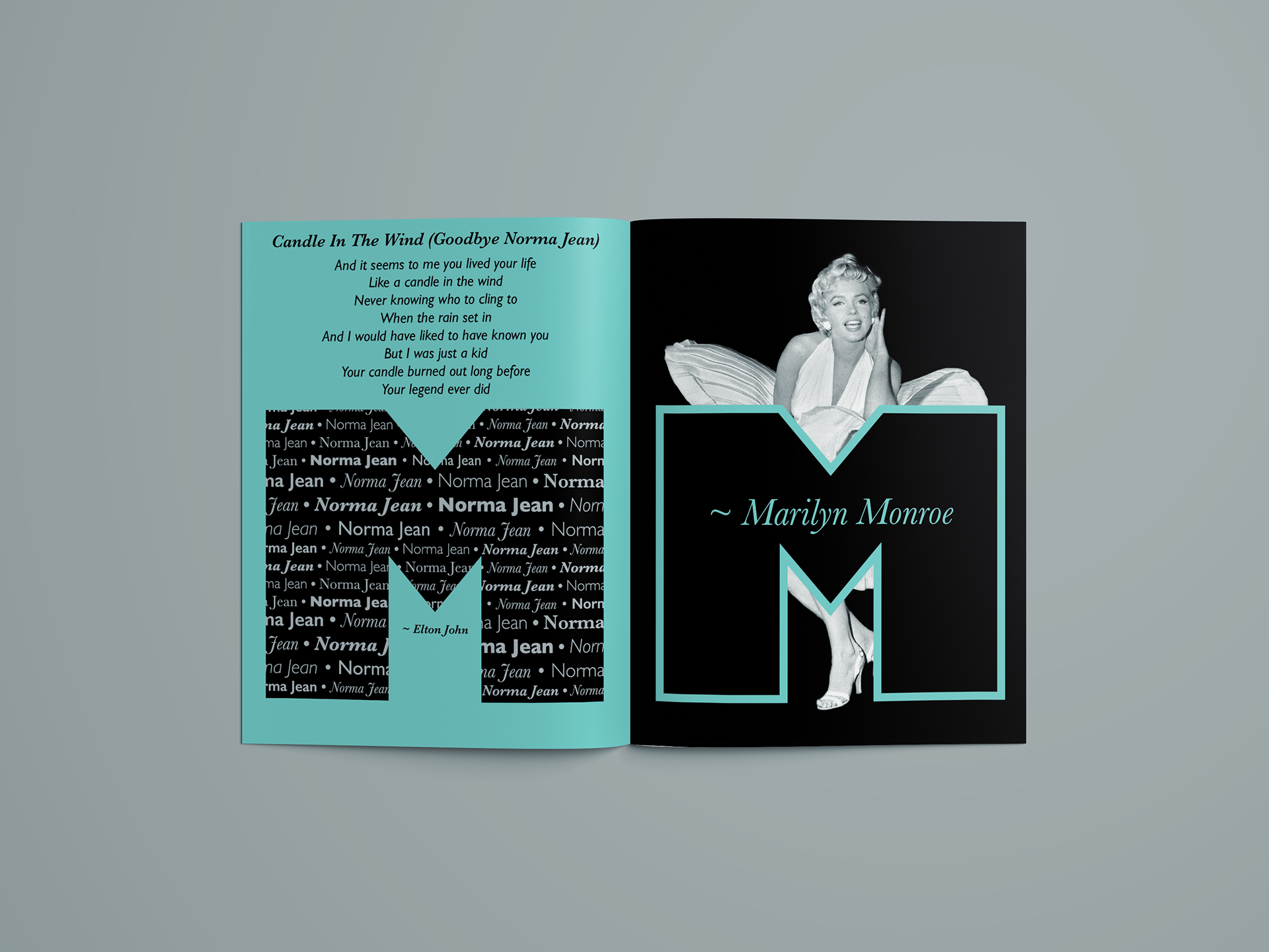
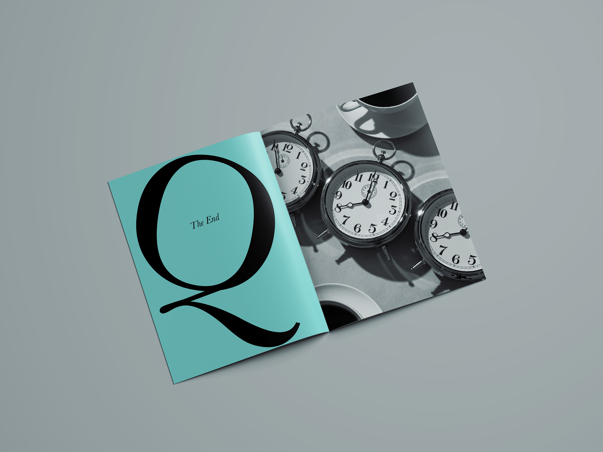
This typography project features two fonts that I really love that work together well. The cover uses characters from both fonts. Each page has a different purpose and layout. I chose to use an image of Marilyn Monroe to go with the letter M, and used the Tiffany blue color because it reminded me of diamonds and Marilyn's Diamonds Are A Girl's Best Friend. The clock image went well with the feel of the Baskerville Q and complements the rest of the book.


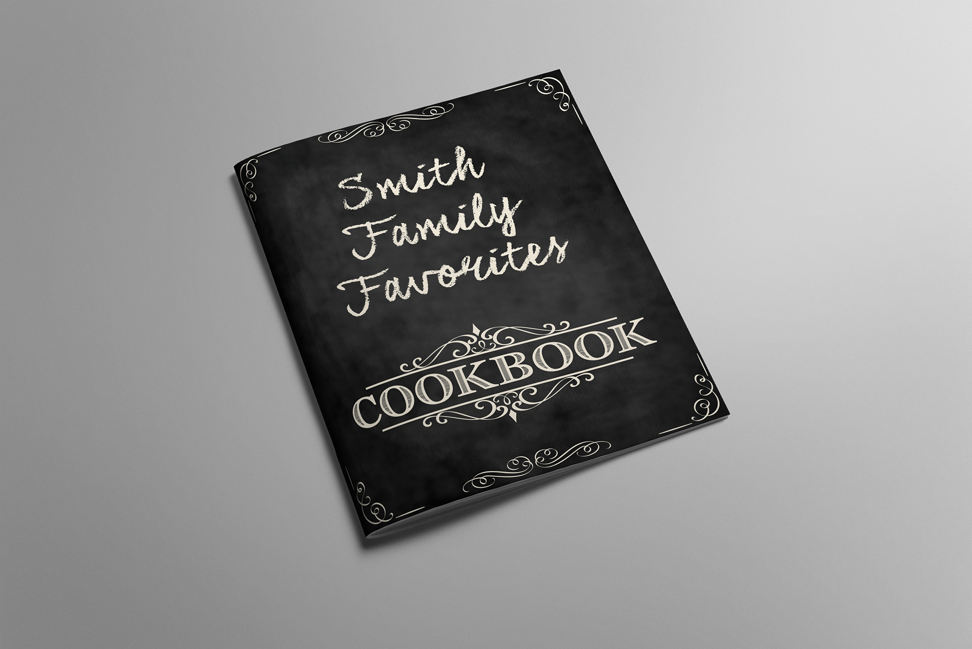
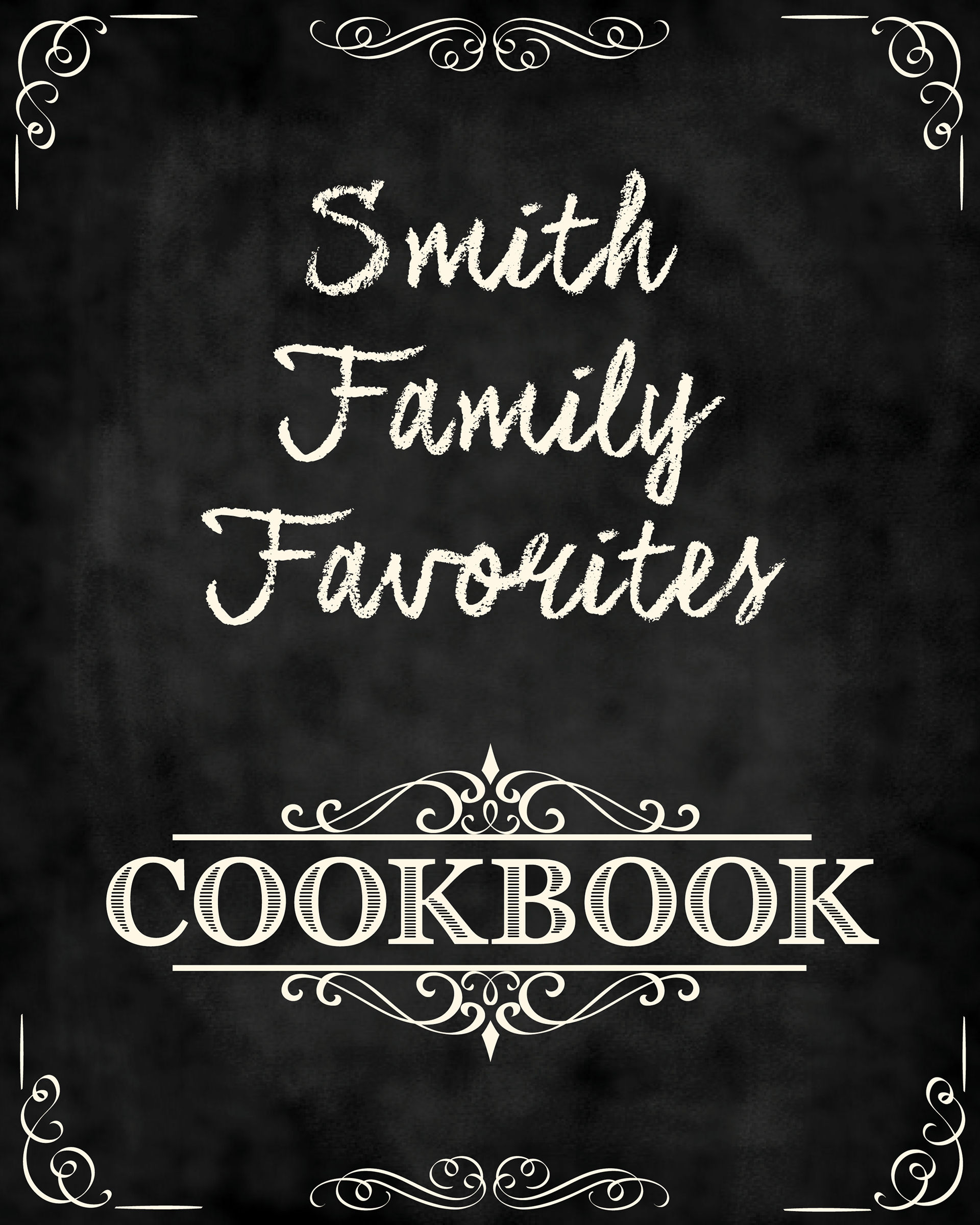
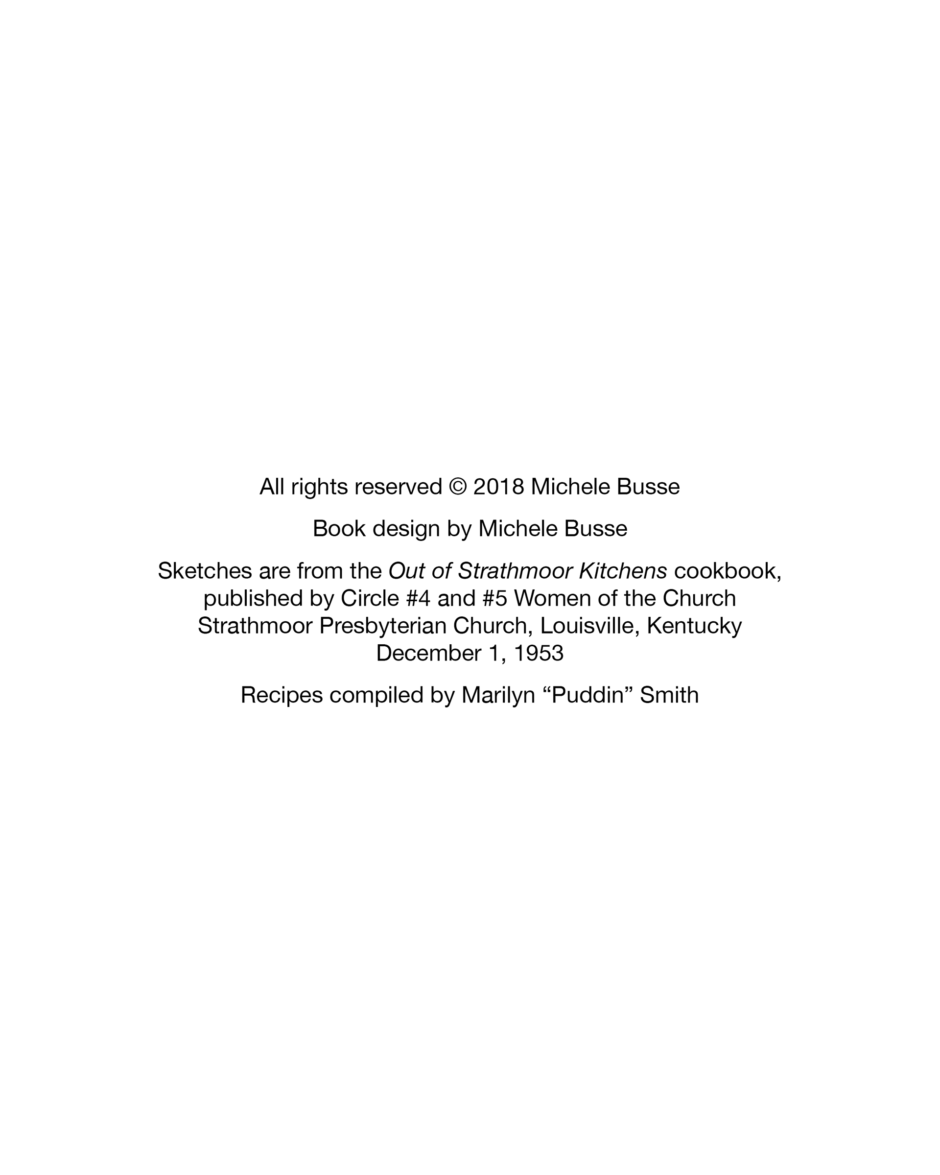
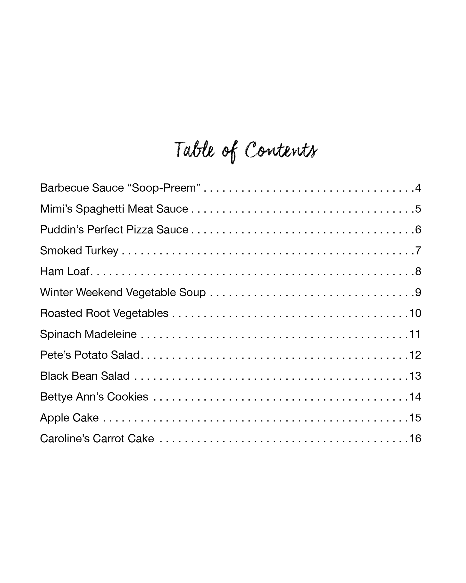
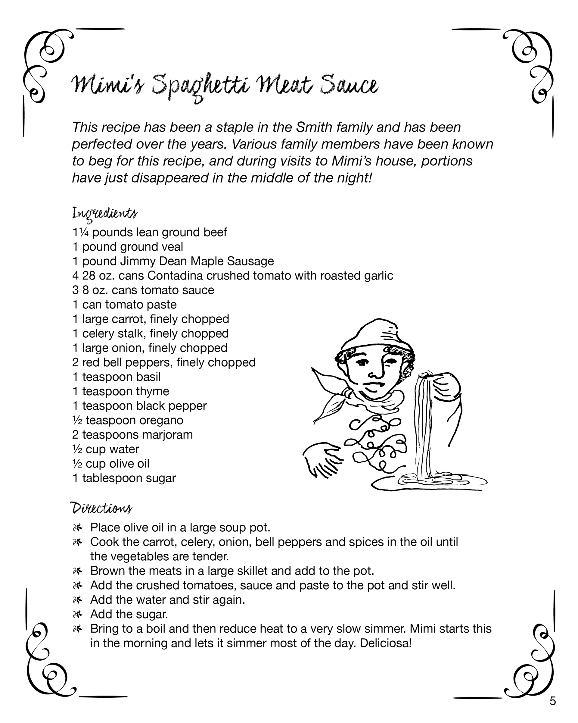
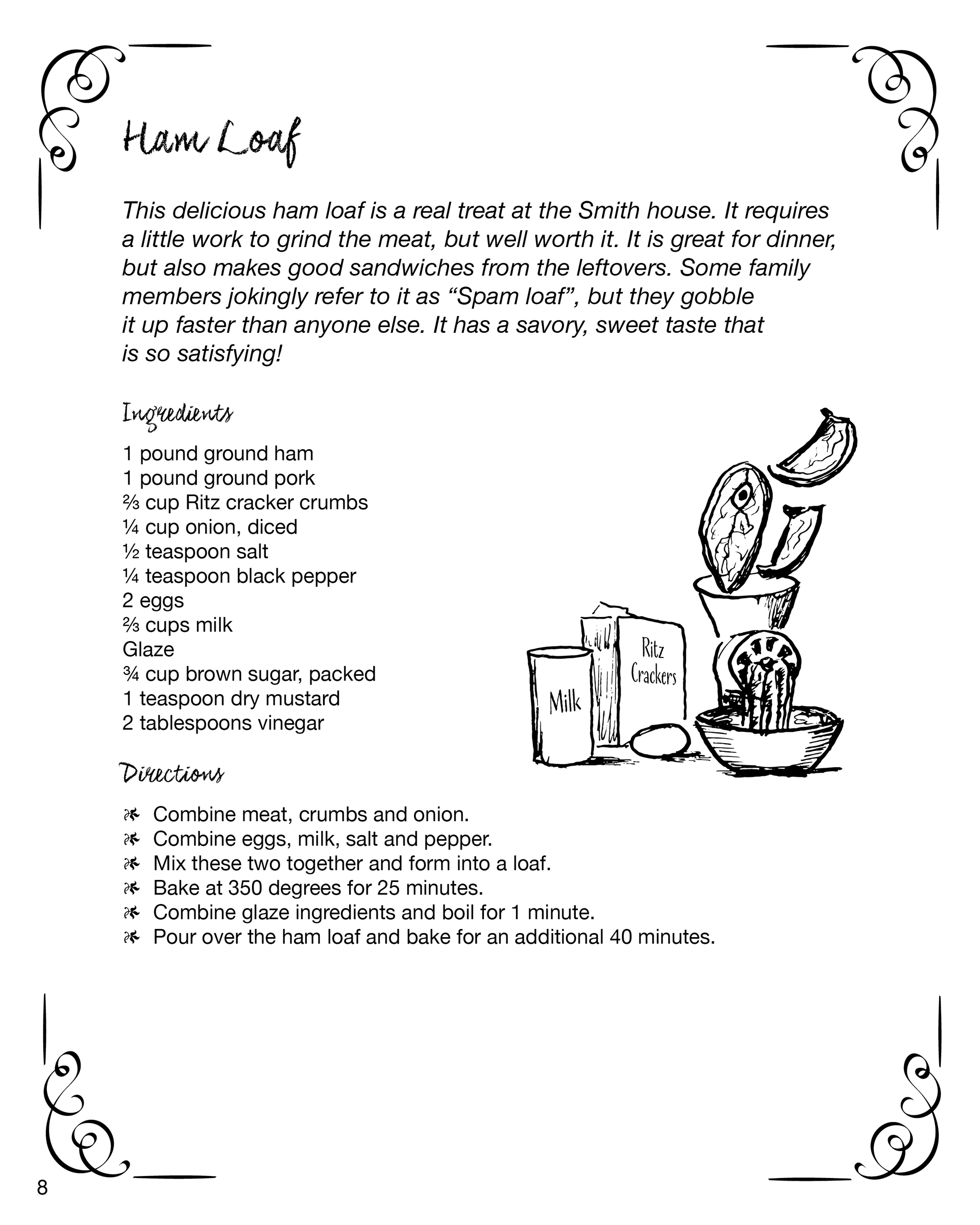
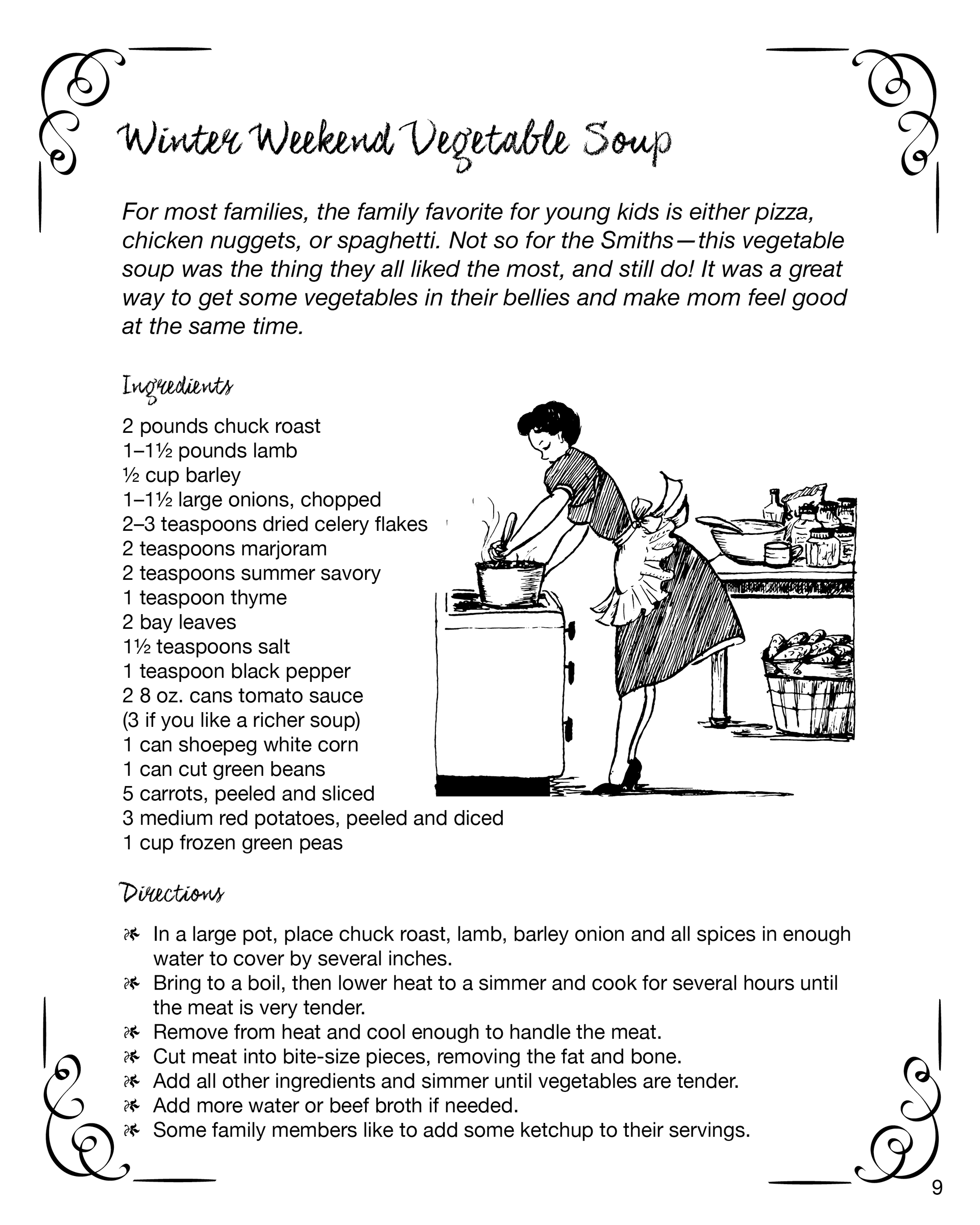
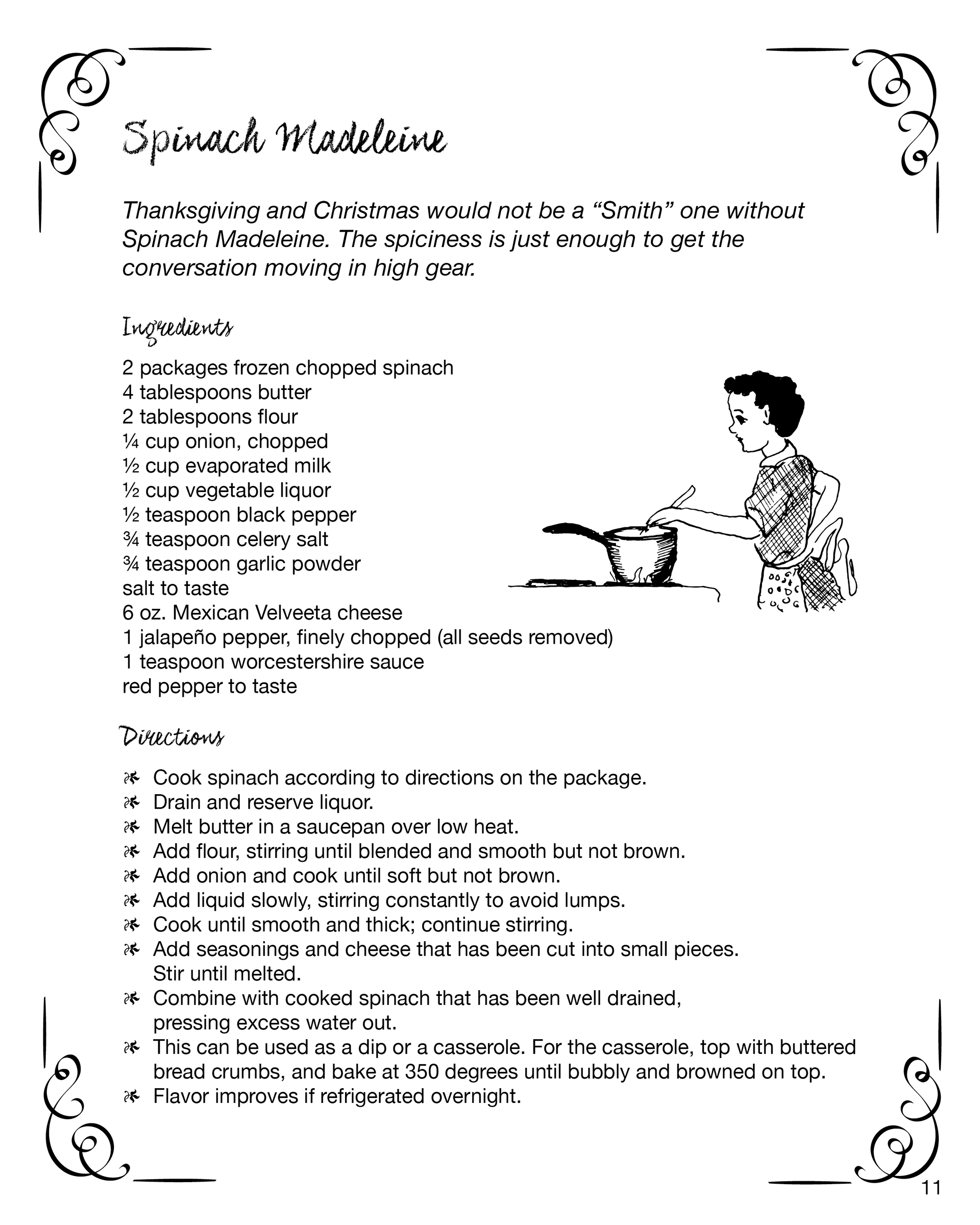
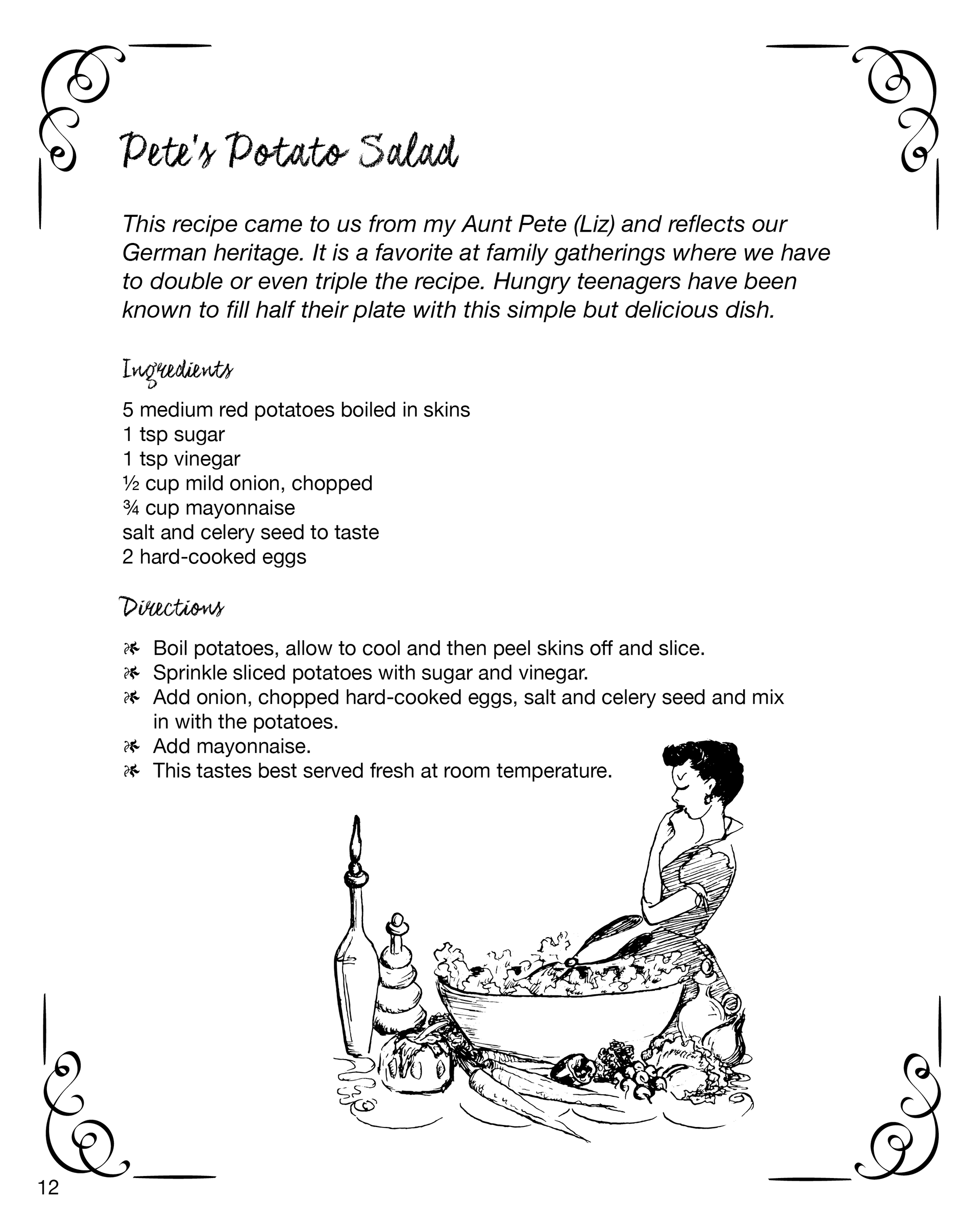
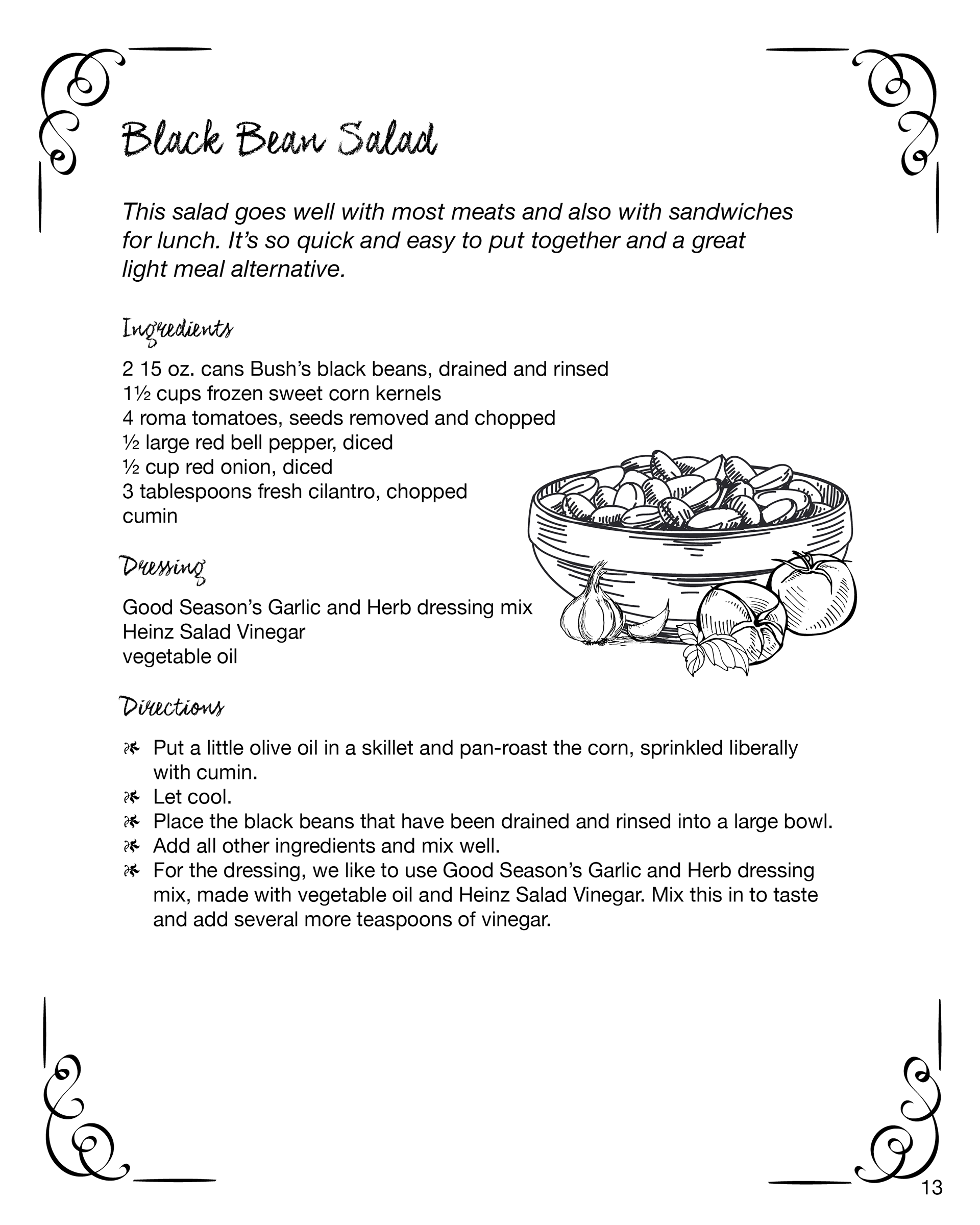
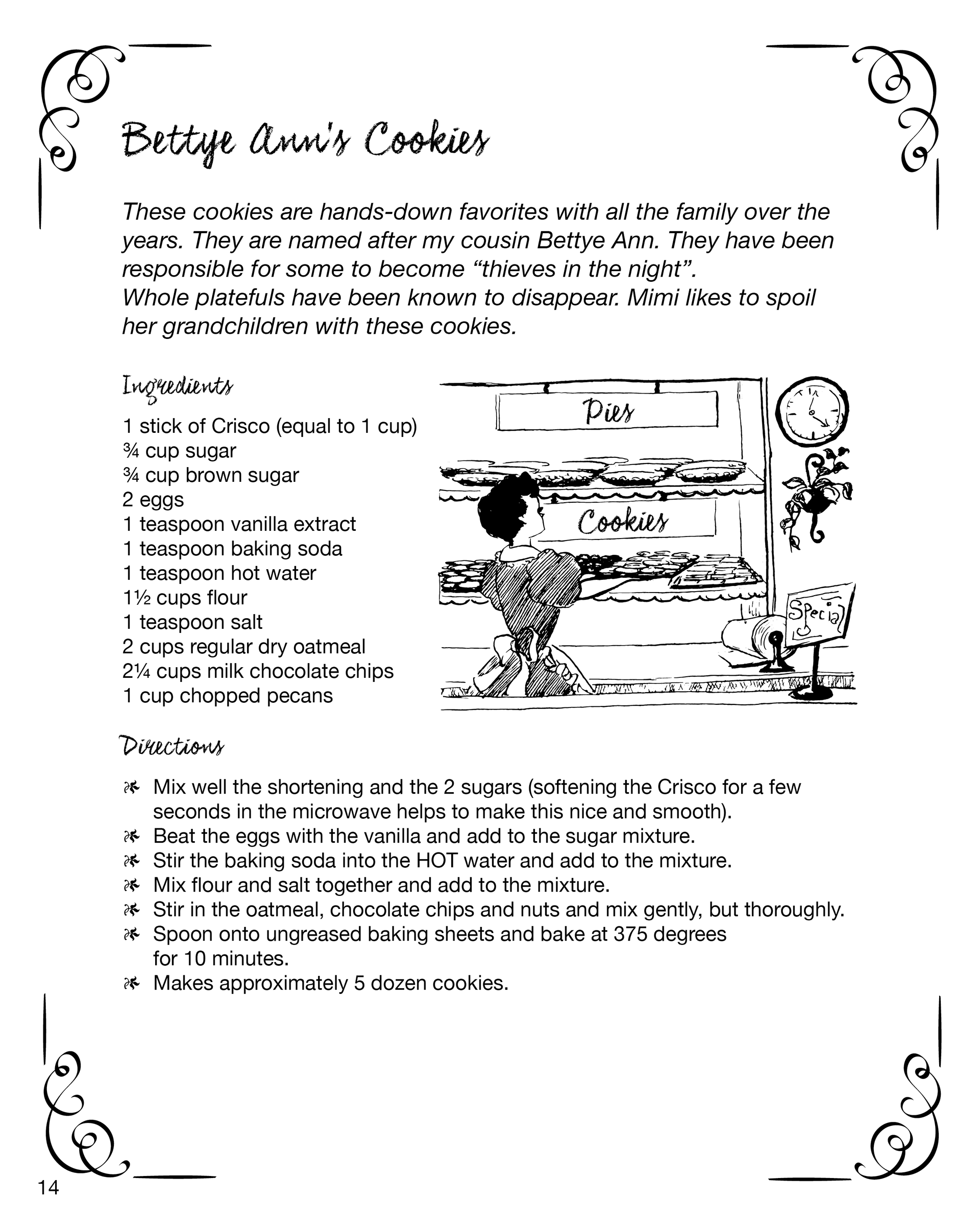
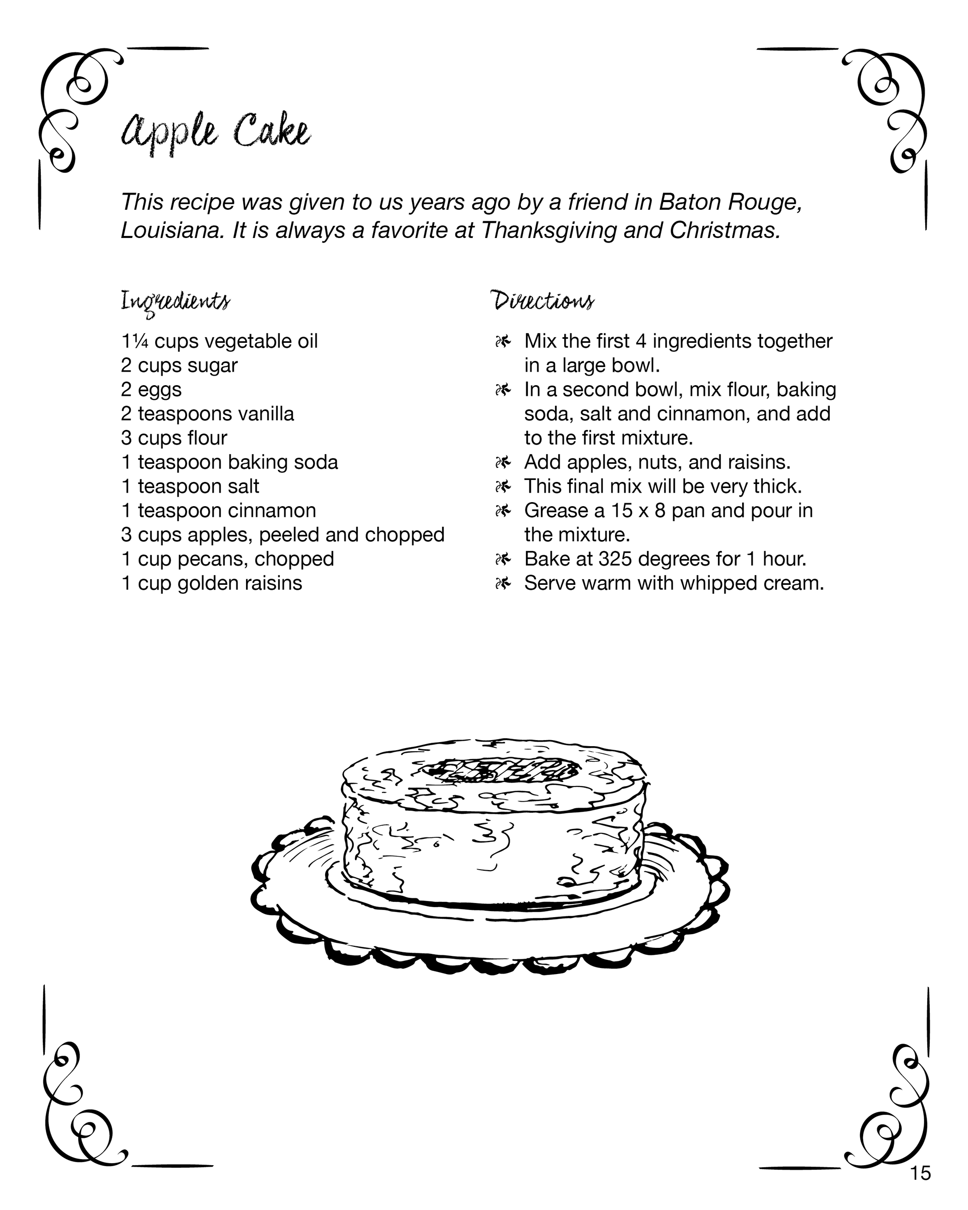
Student Project - Smith Family Favorites Cookbook
This is a cookbook that I designed for my family. It includes recipes that are favorites among my family members. The design is meant to have a vintage feel to it. I used sketches from an old church cookbook, and the covers have a chalkboard image as a background. The book includes a title page, the colophon, table of contents, and recipe pages. Each of the recipe pages has master page elements such as the borders and page numbers. The recipes start with a story about where it came from and how family members like to eat it.


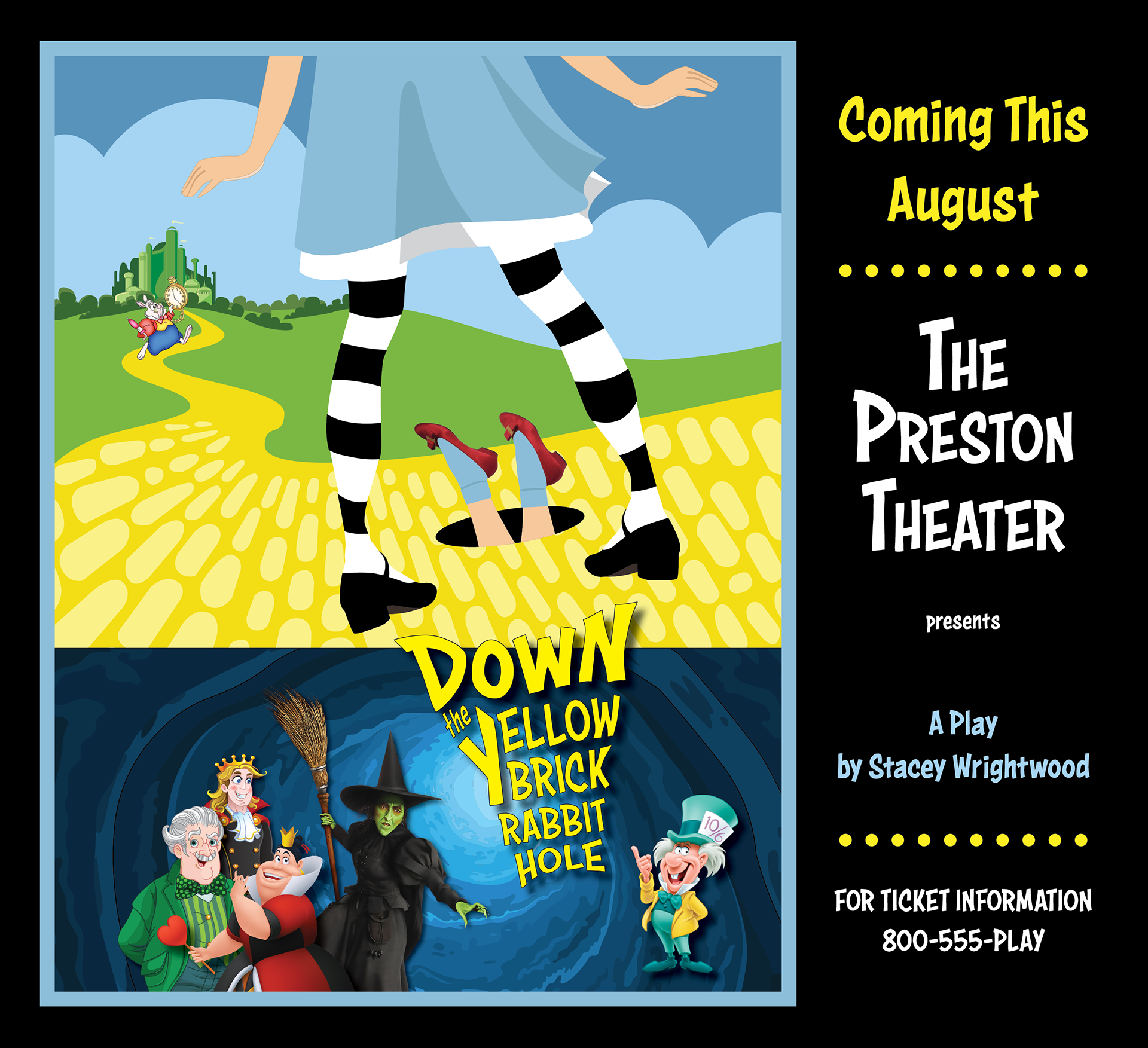
Independent Study - Poster for a Theatre Production
Down the Yellow Brick Rabbit Hole
Down the Yellow Brick Rabbit Hole
This poster is part of a project for a self study assignment. The case study was to create a poster, a full page magazine ad, and a 1/2 page newspaper ad for a local theatre group's production. The play is about the characters of The Wizard of Oz and Alice In Wonderland getting all mixed up in a zany production of Down the Yellow Brick Rabbit Hole. I was to find or create images that would communicate what the play is about. I chose to use a composite of images that were familiar to people, that would provide quick clues as to what the play is about. All of the images are either licensed for use or by permission. There was some editing to the images that were necessary for them to fit together. The typography is original as well as Dorothy's legs and shoes. The font and colors chosen were used to communicate the zany nature of the play.


This is the newspaper ad for the self study assignment described above. I used the same layout as the poster for continuity. I felt this would help reinforce the marketing efforts by presenting the same visuals in different formats.