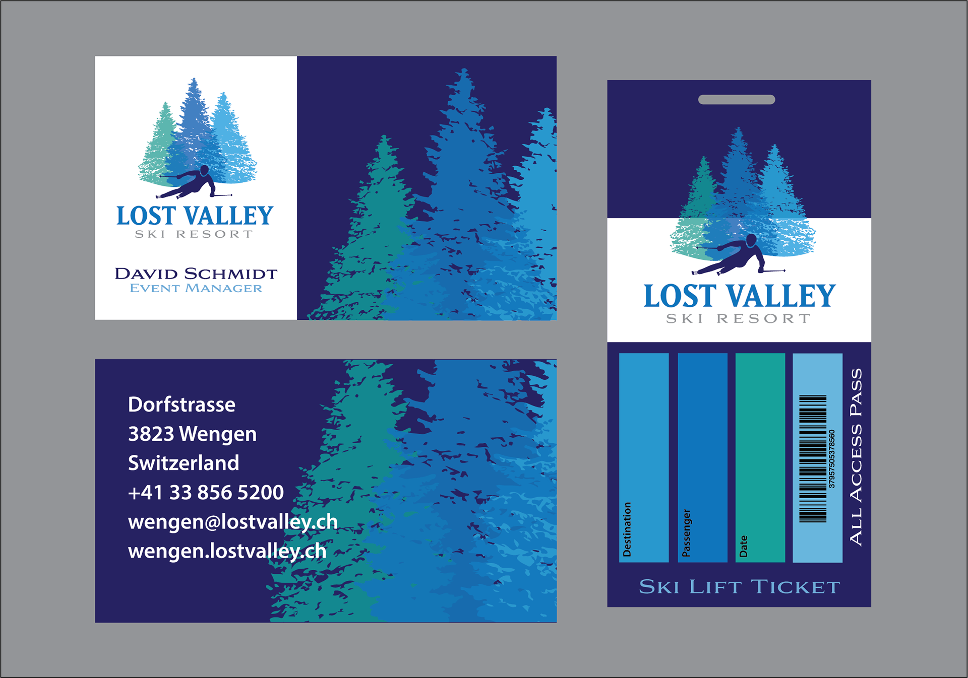
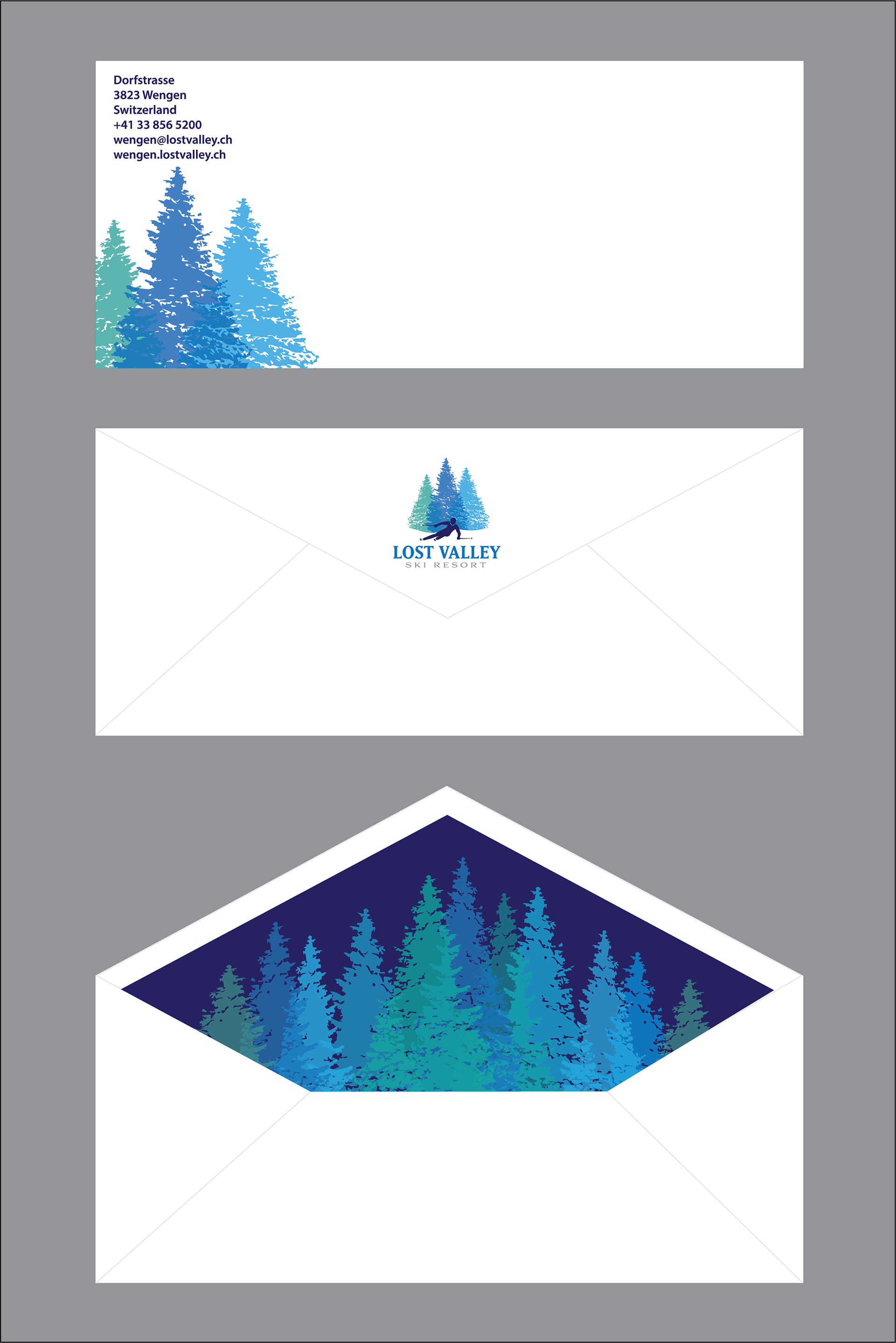
Student Project - Brand Identity for Lost Valley Ski Resort
CASE STUDY: ‘Lost Valley’ is a family friendly resort situated in an affluent mountain village, Wengen, Switzerland. The resort hosts international conferences, events and is popular among tourists because of its location. The main annual sport activity is skiing and there are ski competitions every year, the famous ‘Lauberhorn ski races’. The classic ski races have been held in Wengen since 1930, and traditionally consist of a downhill, a slalom, and a combined event. In addition to being one of the technically most challenging downhill races, the Lauberhorn is the longest race in the FIS World Cup circuit and arguably the most scenic.
The resort needs new brand identity which will be suitable for their international fame. They want to incorporate the symbol of skiing in their logo and stationary design. They need a new logo, stationary, and a new design for their ski lift ticket.

Student Project - Logo Samples
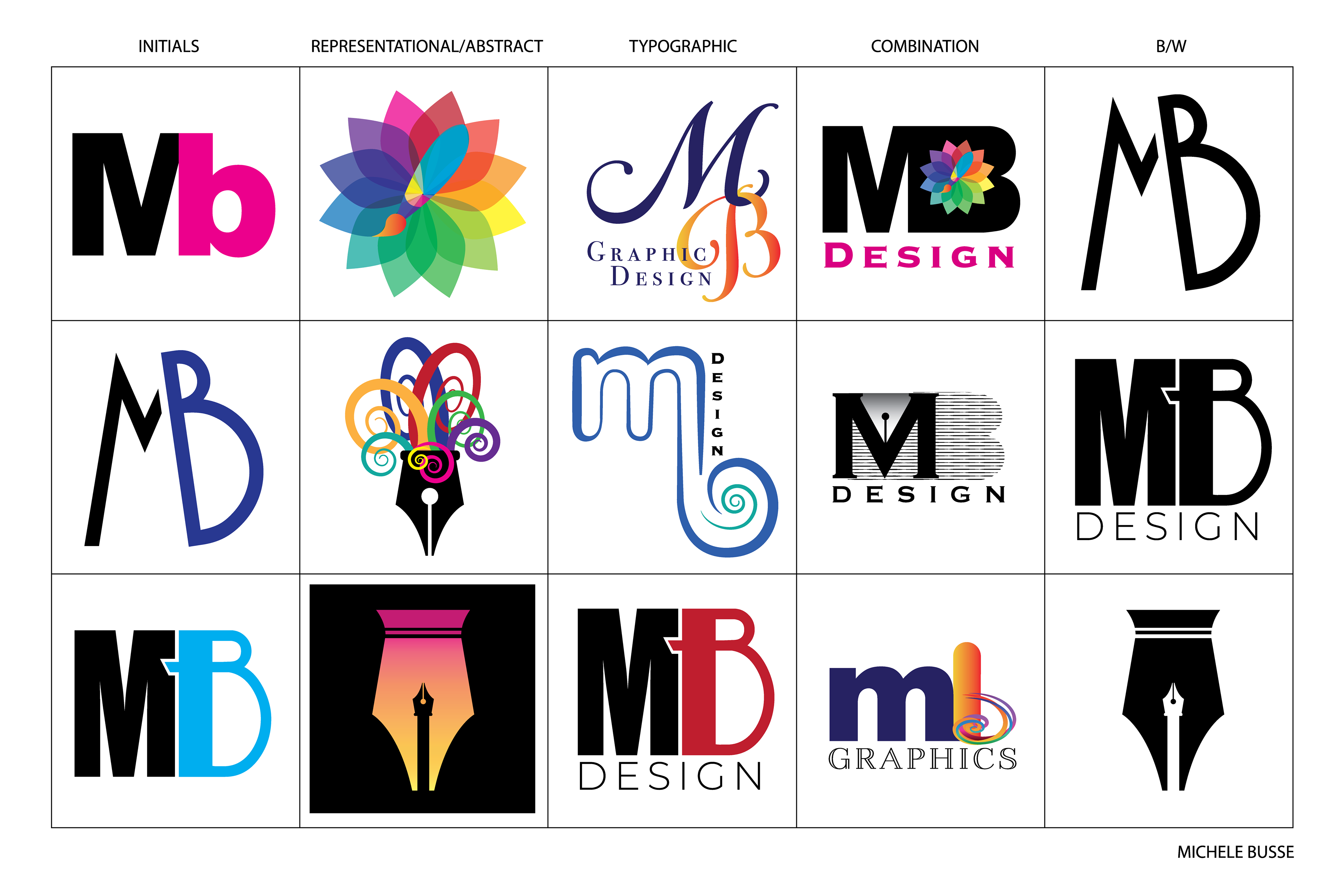
This project involved creating a series of logos for a new Design firm, using my initials and/or name. The logos were to communicate the mission and tone of the firm.
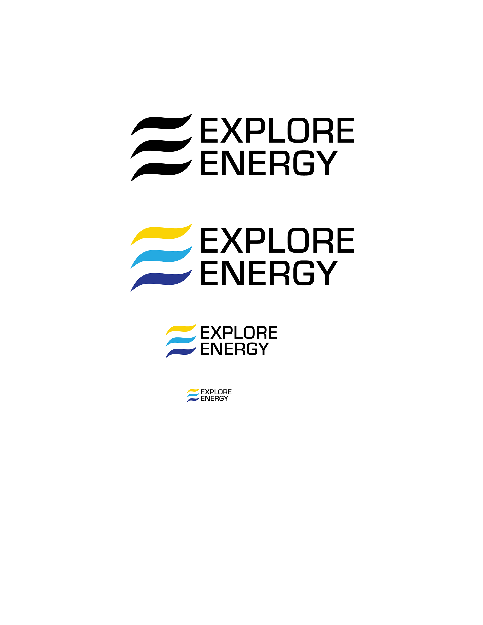
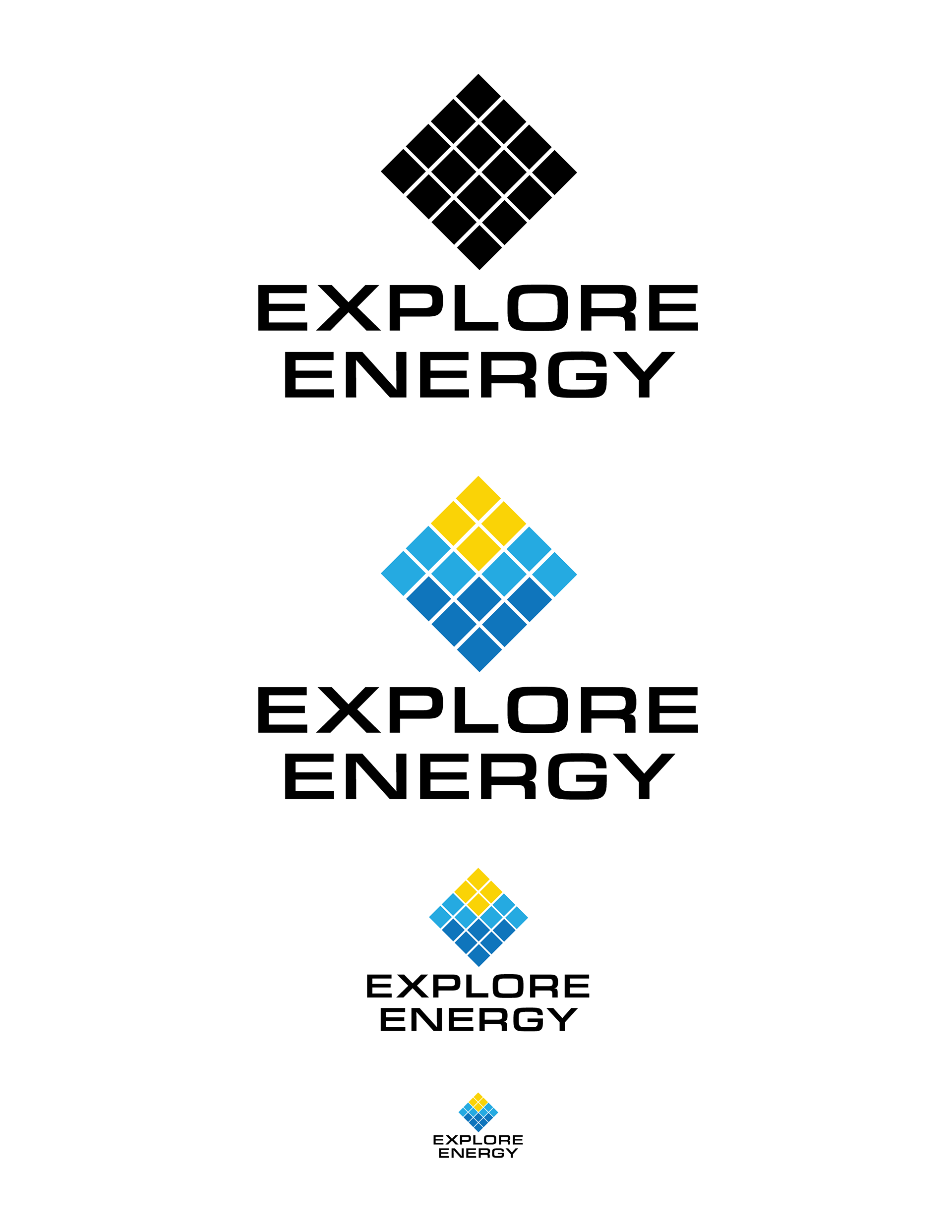
Student Project -Brand Identity for Explore Energy
CASE STUDY: Major oil producers are charging ahead with clean energy projects, but at a slow pace amid a price collapse in alternative energy markets.
An energy company in San Antonio, Texas, which receives power from natural gas, coal, nuclear and a growing amount of renewables, is trying to diversify its energy portfolio with solar, wind and other alternative sources of power. The company needs a new name and brand identity for their new image. The name of the company is now going to be ‘Explore Energy’.
Texas is the largest producer of wind energy with more than 17,000 megawatts of installed power. The peak wind production recorded in Texas provided nearly half of the state’s electricity needs. But that was an exception, not a rule. Companies are looking at ways to harvest the power when it is producing during non-peak times. One of the main purposes of the company’s research and development department is to figure out how to decarbonize our energy. The company is looking for a fresh approach to the ‘energy logo designs’ and establish a corporate logo design which is respectable and modern.
My focus on these designs was to communicate clean, renewable energy. The three colors I chose for both logos represent the sun, the wind, and water, all renewable sources of energy. The wavy lines in the first logo form a stylized letter E and the Eurostile font gives it a modern appeal. The second logo is meant to represent a solar panel and is also paired with the Eurostile font.